
Beyond Spreadsheets: How Interactive Power BI Dashboards Quietly Revolutionize the Way We Learn
Last updated on Oct 8, 2026
For an exceptionally long period of time, learning from data has been a predominantly one-dimensional affair. One would look at a page in a textbook or a PDF report, find a bar plot in gray or primary colors printed on the page, and attempt to extract some meaning from it. Perhaps the caption would say something about trade between two countries growing steadily throughout the period depicted in the chart or a steady increase in carbon emissions following a particular innovation. However, the student would have little opportunity to analyze factors influencing how much trade occurred or how emissions increased year after year as the figure had been printed decades ago, its analysis fixed and time-locked. A similar issue occurs when students are introduced to the real-world application of data analysis in the classroom setting. They are presented with a chart or graph, a table, or a figure and asked to extract information from it. In the modern-day classroom, such an approach presents a severe disconnect with the way humans tend to engage with data these days outside of the educational environment. After using various dashboard applications that update content depending on their interaction with the user, having to quietly observe a chart or graph is an oddly detached sensation. Moreover, the student is forced to observe a chart or graph in a sort of a detached, archaeological manner, trying to determine the conclusions the original author of the research might have wanted them to read into the numbers. The interactive dashboards, the type that allows users to manipulate the tools the dashboard offers, offer a far more engaging, multi-layered experience, asking the participant to engage with a body of work not as an observer but an investigator.
Power BI dashboards provide a unique insight into the ways data analytics and data science can be used outside of the narrow confines of the traditional corporate environment. Most people are aware of the tools in this space, its business intelligence reports, and the focus on helping businesses achieve their narrow financial goals using data and analytics. But if one were to take a closer look at the core of this industry, at its foundational stone, one would realize it is, in many ways, a set of tools offering human minds an opportunity to learn, to question, and to improve. It is a tool that has existed in the past in the form of an updated chart or a dynamic graph, but its principles remain the same. By introducing it into a setting where it has been scarcely used before, such as a classroom, a lecture hall, or a personal learning space, one provides the learner with an opportunity to learn data analysis in an exciting, engaging environment different from most experiences they might have outside of the educational environment.
Moving Beyond Static Textbooks to True Interactive Learning
The move from reading to active doing is one of the most important ideas in modern education. Teachers have known for years that people learn better when they are involved, not just watching or listening.. In subjects that depend on a lot of information—like history, economics, environmental science or sociology—it has always been hard to make learning active. A teacher might ask students to write a paper or create a chart in a spreadsheet.. Gathering data, fixing errors and setting up charts took too much time. Students spent eighty percent of their effort dealing with problems and only twenty percent thinking about what the data meant.
Interactive dashboards change all that by handling the parts first. Educators or curriculum creators can take datasets, clean them up, connect the pieces behind the scenes, and give students a clear working visual space. Instead of starting from scratch, students open a dashboard that is already alive and responsive. They click a button, drag a slider across years or focus on a country, and every chart updates instantly. This immediate feedback makes interactive learning powerful. It lets learners test their ideas quickly and see results without spending time on number-crunching.
This new way of learning changes how students think during class. When a student reads in a textbook that global temperatures rose sharply in the twentieth century they can either memorize it for a test or believe it without question.. When the same student works with a dashboard that shows weather records from thousands of stations around the world they can check the claim for themselves. They can compare regions with polar areas, look at coastlines versus inland spots and study differences across seasons over many decades. By choosing what to focus on they discover the answer on their own. The conclusion isn’t given by a teacher. It comes from their exploration.
Analyzing The Past: A Study Of Historical Settlements
History is widely taught as a linear process. True history is intricate, convoluted and deeply interconnected over countries. Such interrelations remain invisible when taught through printed books since they consist of words in straight lines. In one section of the book the reader learns about one war, in the next - about trade legislation and then he jumps to a different chapter, still discussing changes, while all these events were progressing together. By introducing timelines through visual aids, teachers can help to outline these connections to students. Suppose a student wishes to study ancient trade along the Silk Road. After going through a couple of texts, the student should be able to watch a virtual display of maps and trading data. For example, when clicking on the event that took place in a1010 AC, the map will change, and the student will be able to see all of the routes used in that year.
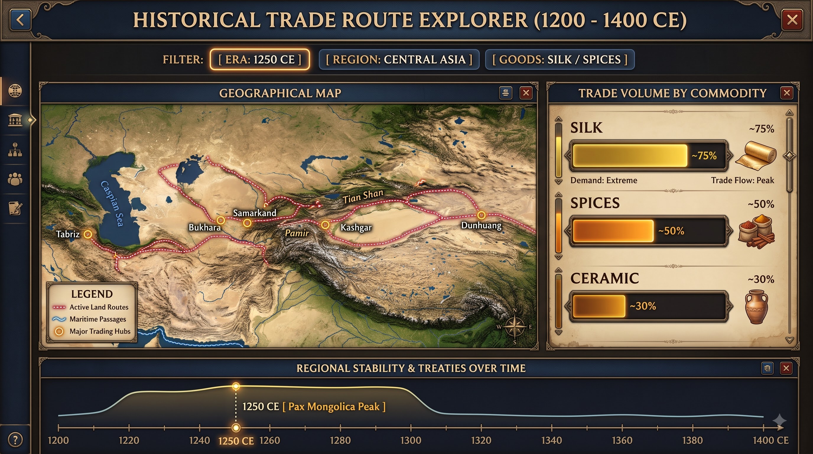
As the student moves the timeline slider forward into the fourteenth century, they witness dramatic changes across the dashboard. Trade paths shrink, specific commodity volumes drop, and regional stability markers turn red as the Black Death moves through Europe and Asia. The student doesn't just read about the decline of trade routes; they watch the network collapse visually as epidemic metrics spike and conflict boundaries shift. They can pause at any point, zoom in on a specific port city, and analyze how local economic output plummeted while neighboring regions adapted.
This interactive approach helps answer the constant student question: "Why does this matter?" When students can toggle different factors—such as agricultural yield, taxation rates, or treaty signatures—and immediately see how those toggles alter population distributions or military movements, history stops feeling like a list of dead dates to memorize. It becomes a dynamic system where decisions had real, measurable consequences that cascaded across continents over generations.
Decoding Nature: Scientific Data Modeling in the Classroom
The challenges of science education are similar when attempting to understand massive environmental or biological systems. Climate feedback loops, acidification in oceans, and migrations of species, are all impossible to fully understand in a textbook due to the number of interacting variables that all change at different scales in an environment. A graph displaying carbon emissions versus temperature change provides general trends, but not the subtleties of response and adaptation in specific ecosystems
With a scientific dashboard made up of worldwide environmental data, students take on the role of researchers in their own right, exploring real-world models of study. Say a class of biology students are analyzing global carbon emissions and the effects on oceanic life; their dashboard could be displaying various data visualizations such as atmospheric sensors, oceanic temperatures, coral reef bleism reports, and factory emissions reading over the course of forty years. Instead of viewing the entire world's data at once, students may choose to view specific facets of an area of study that interests them
If a student determines from these general trends that increasing water temperatures may be affecting coral reefs at a faster rate than changes in water acidity, they may choose to use the dashboard to create a graph that displays temperature changes in certain coral reef areas in conjunction with occurences of coral bleism over twenty years. They could then overlay carbon emission data to see how changes in atmospheric carbon dioxide may affect these trends, and determine what the projected reef recovery may be if emissions rates begin to drop within fifty years' time.
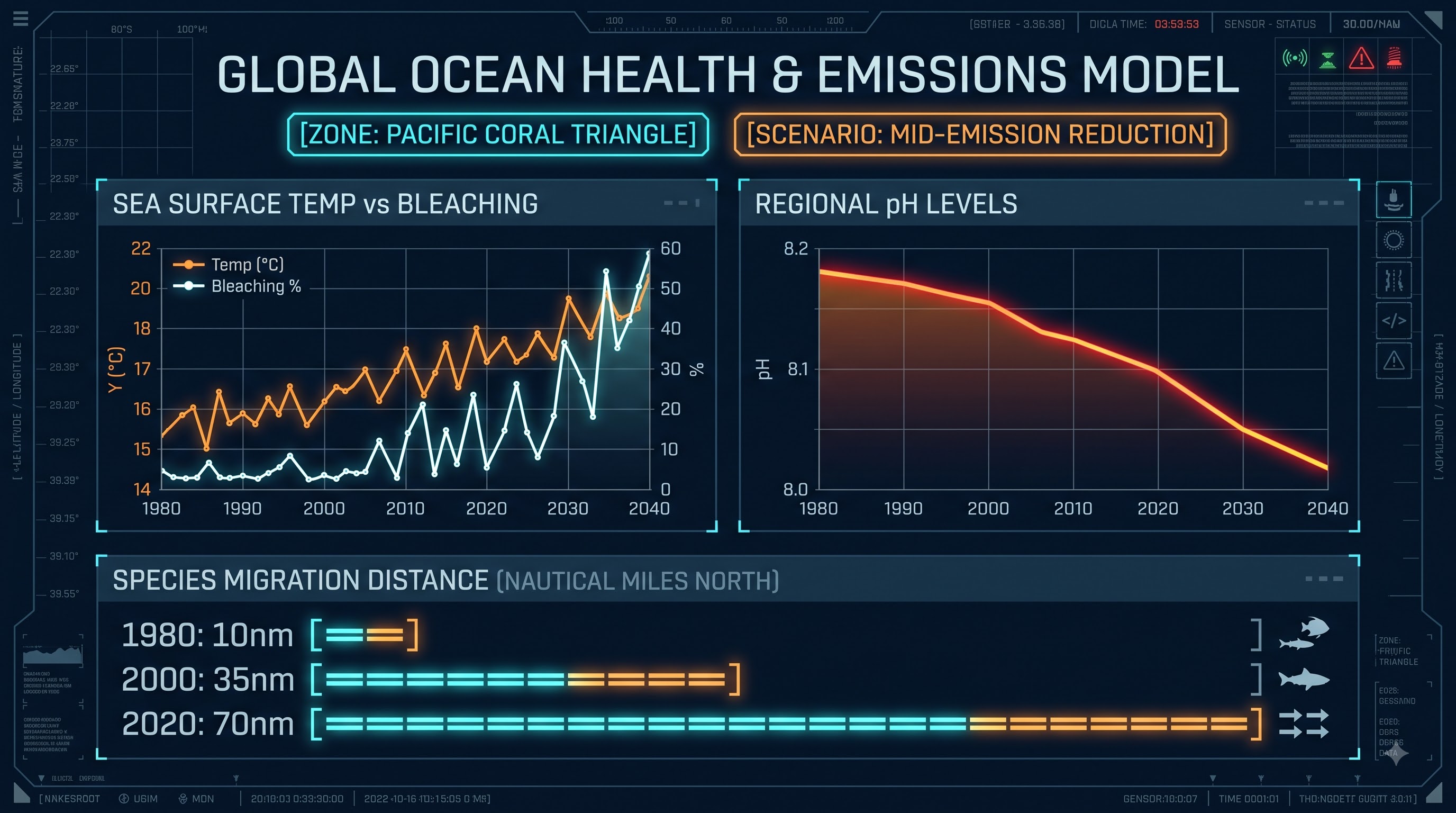
The hands-on manipulation of data brings abstract concepts of environmental alarms into tangible and real manifestations. Students don’t have to rely solely on sources, such as books, and can manipulate data, facilitate anomaly years, like El Niño events, and observe how different ecological signals respond at the same time.
Similarly, the same techniques can be implemented in the tracking of wildlife migration patterns. A group focused on the study of the migratory behavior of birds can apply interactive dashboards that use GPS localization data from birds equipped with tags. Students can change time intervals and visualize birds’ journeys around the globe, simultaneously showing weather conditions, wind velocity, and land cover changes over the migratory route. If they observe that the group unexpectedly changes its way or stops somewhere, they can check the local logging data in this precise place.
Exploring Undiscovered Forms: Literary & Linguistic Examination
Using business intelligence instruments for literature analysis may seem like a paradox at first sight. We generally believe that works like novels, poems, and speeches fall strictly under the qualitative genre. Nevertheless, advances in computational linguistics and digital humanities show that studying patterns, structure, and word occurrences can reveal artistic and social insights about a text that standard reading often misses.
When all the texts from one book (for instance, Shakespeare’s works, Gothic novels of the nineteenth century, or speeches of politicians) are converted into structured data, it becomes possible to use visual dashboards as advanced means of analysis for students of English and linguistics. Instead of counting words manually or using pure intuition, students can make deep comparative analyses of thousands of pages in a matter of seconds.
For instance, a literary student studying characters’ communication in a long play may use a dashboard with a character coincidence matrix. If a certain character is selected, the whole interface shows all scenes with this character, whom he/she communicates with most, what is the length of speeches, and what emotions vocabulary prevails.
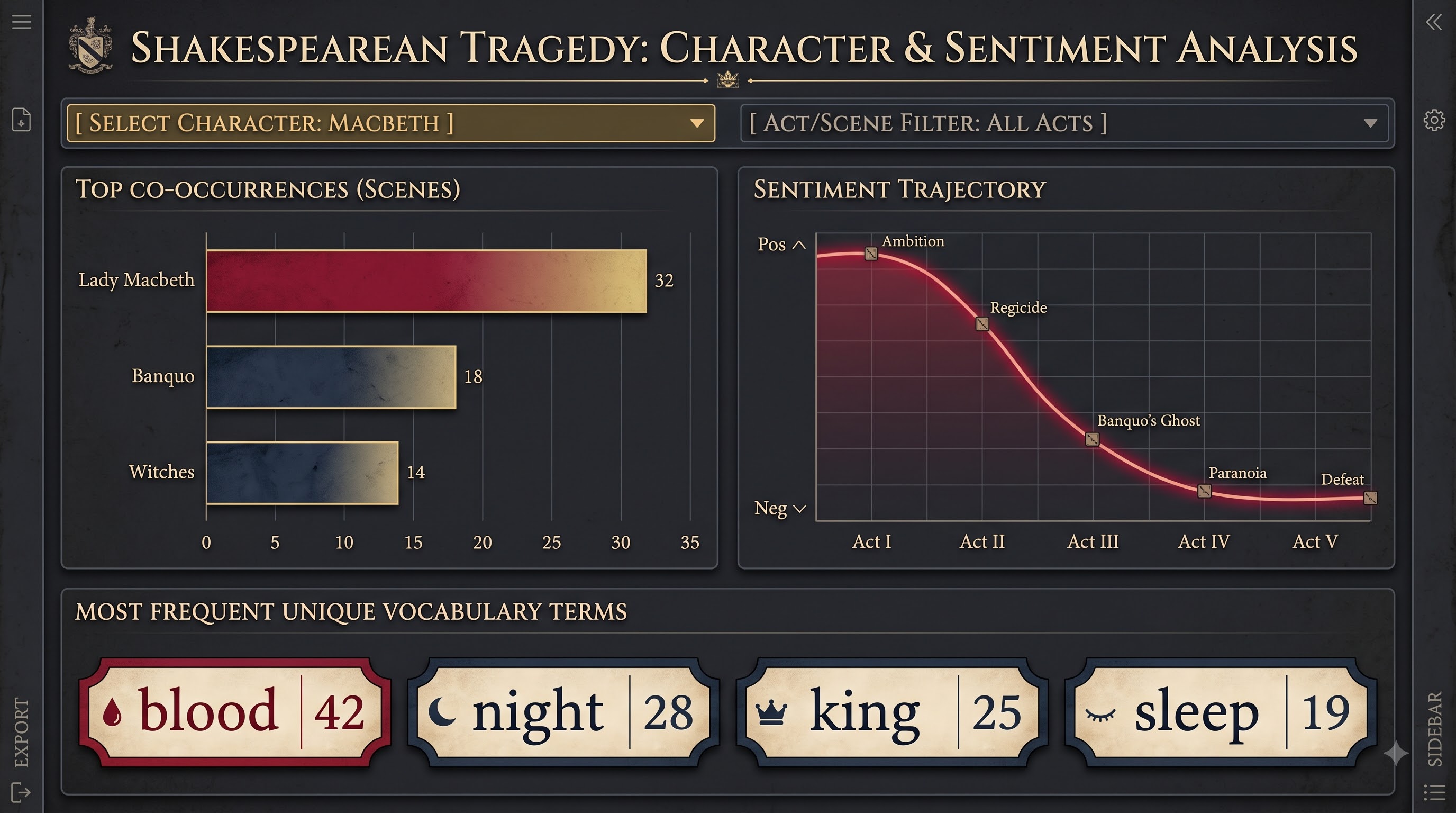
If students switch their attention from the beginning acts to the more advanced ones, then they can track the change in the way vocabulary is used. The graphs showing emotions can illustrate a dramatic decline towards darker expressions of thoughts. The co-occurrence diagram can also help track which characters become distant from their friends. This does not take away the importance of the close reading method; on the contrary, it provides students with an easy but still informative skeleton of their readings.
The same applies to linguistic analysis. For example, students who study the language used by political leaders can identify general trends in the development of language, take advantage of frequency and growth charts, and analyze linguistic shifts within public speech. They may analyze specific words, find out when it started to be used, and observe the changes in both word formations and sentence constructions.
Establishing a Culture of Inquiry: Moving from Passive Learners to Proactive Investigators
The true advantage of utilizing interactive visual tools in education does not simply lie in freshening up old graphs and making them colorful but in redesigning the way learners interact with their subject matter. Conventional educational materials portray knowledge as a completed entity, i.e., a collection of facts that needs to be memorized and reproduced for an exam. Conversely, through interactive visualization tools, knowledge can be more accurately represented as an ongoing inquiry.
The moment students discover that simply pressing a button allows them to answer certain “what if” questions, their curiosity is triggered. Instead of sitting and waiting for the teacher to answer the question, they begin to ask their own. "What if I eliminate this region from the whole figure?" "How come this word became so popular in this particular decade?" "Is there any connection between ocean temperatures and the economic development in this coastal area?"
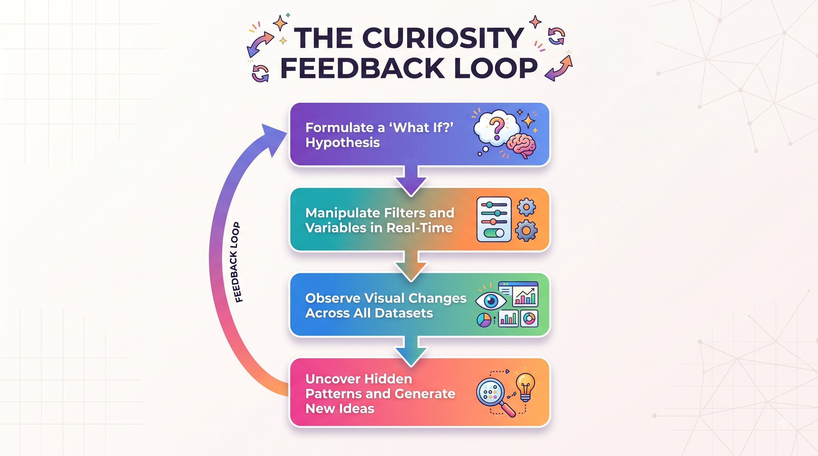
Also, it prepares students for a world full of complicated information. Reading, critically assessing, and getting around in a more complex visual environment brings about a deep acquaintance with data; it becomes a skill that is fast becoming a necessity in many careers. It teaches them not to go off on a tangent and take attention away from factors about the final takeaway. Instead, students will check the variables within and analyze how particular perspectives can sway the results in a completely different direction.
Getting Started with Interactive Dashboards for Educators
Starting such experiences does not mean that a university has to completely change its IT department. Many educators start with just one template and build a single interactive report so that they can gauge how their students will react. Software for producing these reports can be found easily, and there are even courses available helping educators pick the skills they need to quickly build dashboards.
To launch a successful interactive data initiative in an educational environment, consider this practical roadmap:
Begin with a Defined Learning Objective: Do not create a dashboard just for the sake of using impressive visuals. Identify a particular concept that students have difficulty accessing from standard textbook formats such as disruption of trade networks, ecosystem feedback loops, and dynamics of character interactions and create the report based on that issue.
Collect Sound Data: Look for high-quality open data available from credible sources like government portals and academic research repositories or international organizations such as UN or NASA. Assess the dataset in advance so students can focus on making observations.
Employ a Clean and Simple Design: Watch out against cluttering the interface with too many charts and illustrations. It is best if each view features for maximum four key charts corresponding with a set of filters or sliders.
Suggest Guided Questions for Research: Although exploration is useful, it helps students if they are provided with some specific mystery cases or investigation questions which help them get engaged into exploration.
Promote Student Creativity: Once students get the hang of working with dashboards and using the data they find, it is advisable to let them create their reports using the original datasets. This is how students can acquire
As educators look to upgrade their technical toolkit, understanding options around power bi course fees allows institutions to budget effectively for staff training without overspending on unnecessary enterprise packages. For schools aiming to provide their faculty with high-tier training, finding the best power bi course tailored specifically for academic research and dashboard design ensures that teachers learn how to build intuitive, accessible reports that keep students engaged.
The Prospects for Engaging Learning
The conventional teaching methods, which can be described as rigid and uniform, are gradually becoming obsolete as education adopts a more personalized approach that promotes interactive discovery among students. The rise of open data and the increasing accessibility of user-friendly software tools are contributing to bridging the gap between complicated datasets and teaching processes. The use of interactive dashboards enables the conveyance of information in a flexible manner, linking raw data with user perception and granting students the opportunity for hands-on practice.
Becoming active explorers of information rather than simply passive readers enables students to study educational materials in a much more engaging way. It involves the gains not only from the perspective of making lessons more captivating, but also developing such skills among bi course students have critical thinking, confidence in analytical abilities, as well as data literacy, which is so important for today’s society. The process of using active tools will help students investigate various historic patterns of trade, explore environmental changes happening in vulnerable ecosystems, and examine literary forms used by writers throughout different epochs.