
Build a High-Impact Tableau Portfolio and Ace Certifications
Last updated on Sep 1, 2026

In the modern world, merely citing software skills in a resume is not sufficient to gain an influential identity in the development of the analytics domain. In a scenario where competition among recruiters teases them to consider people who would prove their ability to align numbers with business goals, design data into simplified models, and deliver insights in a visually-appealing manner, a strong Tableau Public account serves as a virtual laboratory proving your creativity, design potential, and technologies' knowledge.
In addition to that, proving yourself by obtaining certifications like the Tableau Desktop Specialist certificate or the Tableau Certified Data Analyst certificate shows theoretical background and ability to either put this theoretical knowledge into practice online or offline. The best way to accelerate this process is by taking a good tableau course online with OnlineITGuru.
Tableau Public as a Powerful Tool for Career Development
Tableau Public is the foremost global platform for visual analytics, featuring millions of dashboards designed by students, amateurs, industry professionals, and Tableau Visionaries. For an individual looking to start or grow in the analytics field, the presence of a live portfolio transforms the interpretation of the technical job interview.
In traditional recruitment processes, organizations depend on resumes that highlight key responsibilities in bullet points—and those points sound nearly identical for each candidate. Typical practices include trend analysis, report writing, and working with business partners. The existence of a portfolio offers tangible proof instead of any allegation made. By simply clicking on the link to see the beautiful interactive dashboard, recruiters and hiring managers will be able to assess your visual skills, data modeling capabilities, UX knowledge, and business sense.
The existence of a great portfolio makes technical interviews go from an abstract process of asking questions to a tangible process where you control the story by showing the decisions that you made, data modeling techniques that you used, and why you decided to use certain charts.
In terms of strategic portfolio construction, the most frequent mistake made by beginners is using Tableau Public as a random storage space. Putting multiple workbook examples, samples from mock projects, or simple bar graphs may reduce the effectiveness of previous projects. Stats say that recruiters spend less than an entire minute reviewing the portfolio before making a decision.
Let’s treat your portfolio as an elite digital catalog.
1. Apply the rule of five
It is unnecessary to have dozens of dashboards, it’s enough to prepare four-six top-notch projects that cover various domains, sectors, and types of data visualization. When everything presented in your portfolio is done perfectly, recruiters can draw the conclusion about your skills after one glance at your work.
2. Do not use ready-made datasets
Avoid including standard datasets that were initially available with a software tool unless you have changed them so much that they became more than just beginner-level tutorial samples.
3. Create a Profile Presentation
Professional Headshot and Bio: Write a short bio describing your analytical specialty, tools used, and contact information.
Projects (Pins): Use profile pinning to pin your top three project dashboards at the top of your page.
Custom Workbook Thumbnails: Check the dashboards in the profile and make sure the aesthetic thumbnails of all dashboard previews look nice and neat.
Building a Dashboard that Attracts Employers
A successful dashboard combines impressive design with practical business utility. Although some dashboards may be visually extraordinary, organizations prefer clear, simple to maintain dashboards, which provide usable business intelligence solutions. Each flagship dashboard should have five main features:
Visual Order and Tidiness of Layout
Users need to know instinctively about where to focus their attention. The primary performance measures should be placed on the upper-level banner. The analytics breakdown should follow in the middle section, while detailed analyses should be placed in the conclusion.
Make use of white space. Trying to fit eight different views onto one page leads to cognitive overload. Arrange views according to a well-defined invisible grid with the help of structured containers.
Deliberate Use of Colors
Beginner dashboards like to use rainbow colors to identify every value. Professionals are more selective when it comes to colors.
Colors like gray and other muted tones should be used for base graphics (gridlines, narrow layers, top and bottom of the lines). Bright colors should be used for key indicators only.
User-Friendly Navigation and Experience
Interactive analytics should feel easy. Instead of using annoying dropdown filters, use interactive parameter actions, visual mark selection filters and show-hide containers that make navigation easy. Customize your tooltips completely: remove the system defaults, change it to an actual sentence, highlight important numbers and put small visualizations in tooltips so that the user sees detailed information when hovering over them.
Contextual Annotations and Storytelling
Don’t leave the users wondering what the graph is trying to show. You should have a meaningful title which tells what the message is instead of using variable names. For example, if there was a sharp decline in sales in the third quarter, provide a clear text comment alongside the graph explaining what the cause was, such as supply problems.
Optimizing Performance and Layout
Enterprise users access dashboards on multiple screens. Therefore, the dashboard should have desktop dimensions that are designed for modern widescreen displays, while a separate mobile layout must also be prepared in the same workbook. The performance should be good by limiting the total number of floating elements and ensuring the data source utilizes optimized extracts.
Five Key Projects to Get Interview Calls
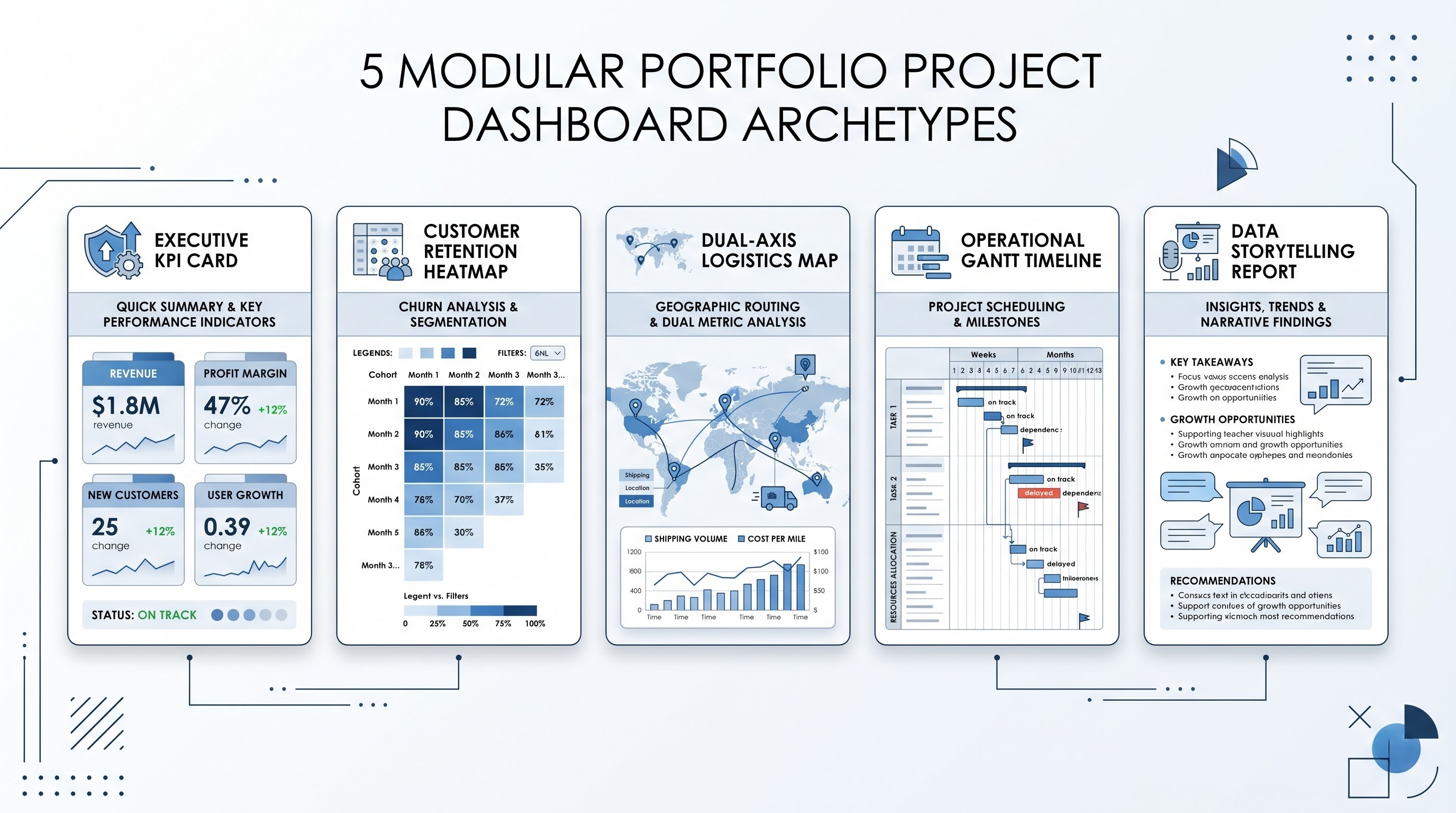
Your portfolio needs to contain several problem-solving archetypes from different business functions to show your skills:
Project 1: Executive Summary and Financial Performance Dashboard
The Situation: High-level dashboard at the level of C-level position that allows tracking organizational efficiency, profit margins, revenue variances from the budget, and repetitive growth trends.
Technical Features: Clear KPI summary elements with sparklines, switches for calculation of annual growth rate, bullet charts with actual vs. plans comparison, switches for currency or regions.
Key for Recruitment It emphasises your ability to work with executive reporting features and financial indicators. It demonstrates your ability to distilll business data into easily understood figures.
Project 2: Analysing customer segmentation and retention
Customer Segmentation & Behaviour Patterns Dashboards for e-commerce and subscription services to analyse different aspects affecting customer segmentation and behaviour patterns.
Key Technical Considerations Fixed LOD calculations Monthly customer retention rate heat maps RFM based scatter charts.
Relevance to Recruiters: The project reflects highly sophisticated data analysis skills by demonstrating one’s ability to use not just regular formulas but also a huge experience of working with advanced methods related to the retention of customers.
Project 3: Optimization of Geospatial Processes and Supply Chain Management
Situation: The logistics dashboard that contains information about stocks in warehouses, bottlenecks in distribution, shipping routes, and delays.
Key Technical Features to Consider: Multi-level maps with custom geometries, density markers, calculation of buffer zones near fulfillment centers, and a double axis geographics chart.
Relevance to Recruiters: The project demonstrates one’s ability to work with spatial data formats and challenges the issue of operational efficiency.
Project 4: Operational Workflow and Resource Allocation
Description of the situation: An internal communication panel for a hospital unit, a customer service center, or a factory that monitors the level of staffing, queue waiting times, and the resolution rate.
Technical aspects to be emphasized: Dynamic Gantt-style timeline visualizations, custom sort features, visual alerts based on thresholds, and contextual detail tables hidden in collapsible containers.
Significance of this project for recruiters: Proof of your capability to develop functional tools used on a daily basis by managers who make decisions about staffing operations.
Project 5: Passion project/community challenge
Description of the situation: Exploring a subject that you are passionate about, like environmental sustainability, sports performance, public transportation, or urban forestry. Or join one of the recognized community projects like Makeover Monday and Workout Wednesday.
Technical aspects to be emphasized: Creative visualization, the use of custom icons, and attention to details like narratives, arcs and typography.
Importance of this project for recruiters: Proves your interest and creativity and engagement in the data community.
Reporting Your Work: The analytics case study
An attractive visualization can only present the final product. The best candidates distinguish themselves by writing documents that explain how the process from raw data to business has been carried out.
For each flagship project, create a post on your professional network or personal blog and link it directly to your Tableau Public dashboard description.
The content of each case should consist of the following four pillars:
The business challenge – define the problem of an organization, what the decision could not be made, what gap was present, who was the final consumer?
Data collection and transformation – explain what your raw data pipeline looked like, what anomalies, null values or reorganization obstacles you faced during your work?
Analytical and design strategy – tell why you have chosen particular visual designs, user controls, and calculations rather than others.
Actionable insights and business results – finish your report with a few conclusions that have been defined through the tool and strategic recommendations.
Understanding Tableau Certifications
While the portfolio is essential when it comes to keeping records of work experience in design and storytelling, the presence of certifications can be viewed as an assurance of your basic technical skills, theoretical data modeling knowledge, and enterprise administration theory. The preparation for this stringent certification exam can be helped by taking specialized tableau developer training development from OnlineITGuru that teaches you the accurate data connection processes, LOD calculations, and enterprise architecture tested in the exams by obtaining the required expertise.
The two certifications have gained importance in the industry:
1. Tableau Desktop Specialist
Target Audience: Beginners, career changers, and entry-level data analysts.
Content: Fundamentals of desktop operations, generation of simple charts, measures vs. dimensions, continuous vs. categorical fields, basic calculations, simple joins and sharing process.
Format: Multiple-choice questions, multiple answer questions and theoretical questions assessing practical knowledge without any hands-on experience needed.
Significance: Certifies understanding of the technology and makes it easier to train the user in day-to-day tasks of visualization.
2. Tableau Certified Data Analyst
Target Audience: This program is designed for experienced developers and professionals knowledgeable in business intelligence and analytics consulting.
Program Content: The program covers all steps of the analytics process. It involves sophisticated data modeling including multi-table relationships, data blending, and SQL; sophisticated calculations (Complex Table Calculations, Level of Detail expressions); dashboard development, process optimization, and Tableau Server and Cloud publishing, governance, and permissions.
Significance of the Program: This certification is considered one of the best credentials for those who need to manage the process of analysis.
Knowledge Required for the Test
For one to pass these exams, one needs to understand the basic concepts of the software.
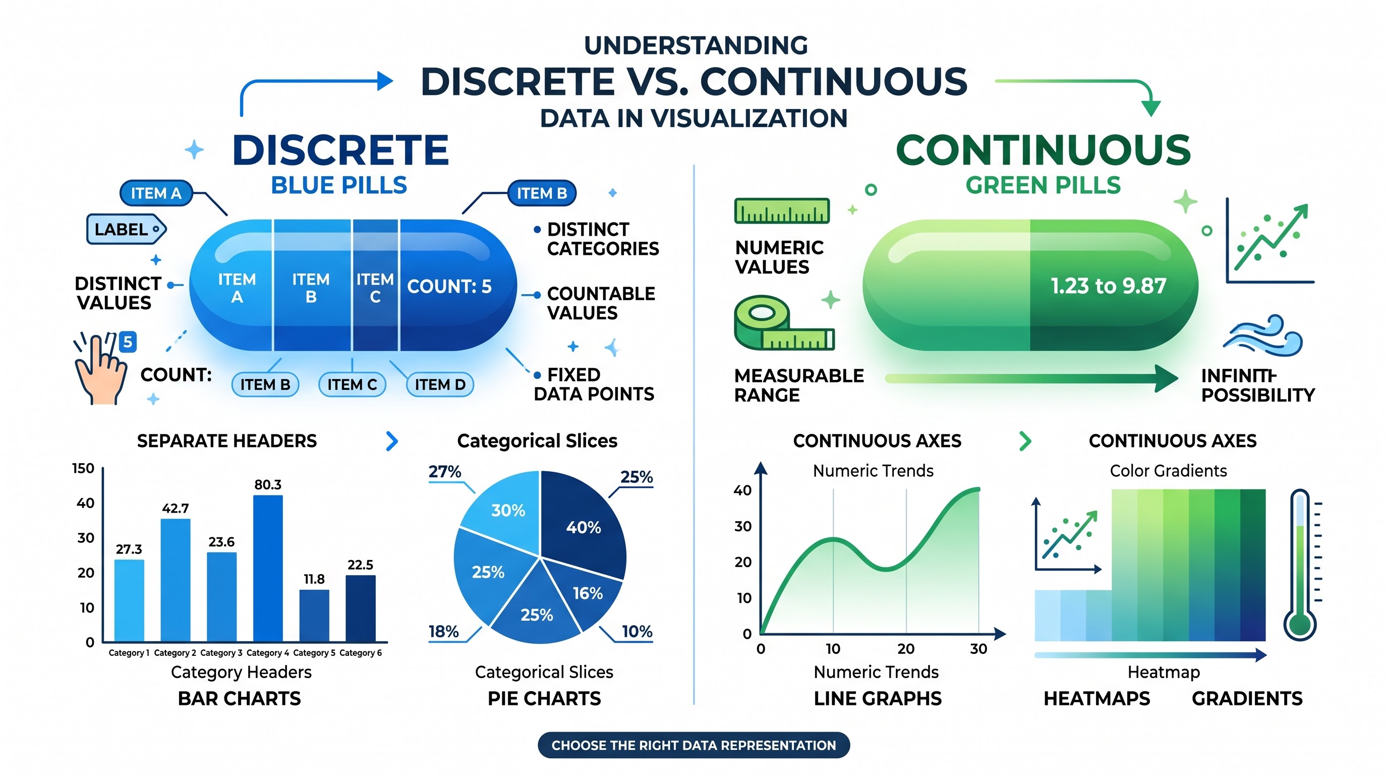
1. Discrete vs. Continuous (Blue vs. Green)
This is the most important question in the exams. One must learn the difference between Blue Pills and Green Pills.
Blue Pill (Discrete) - creating categorical variables using row headers and segmentation of data.
Green Pill (Continuous) - creating continuous numerical sequences or date axes, colors according to gradients, and trendlines.
Do note that the data type (string, numbers, date) is distinct from its visual role (discrete vs. continuous).
2. Dimensions Compared with Measures
Dimensions: Hold qualitative variables (names, regions, sections) that determine the level of detail in a report.
Measures: Hold numerical variables that can be summed or averaged, i.e., mathematically computed when visualized.
3. Data Modeling Today: Relationship vs. Physical Joins
The most recent version of the software follows a two-layered approach:
Logical Layer (Relationships): Links tables in a manner that takes into account the initial setting of the data without altering its original meaning.
Physical Layer (Joins, Unions): Traditional way of linking tables through a flat layout, leading to data replication, particularly when data has different cardinalities.
Keep in mind where you have to use Relationships instead of joins/unions.
4. What is the Tableau Order of Operations
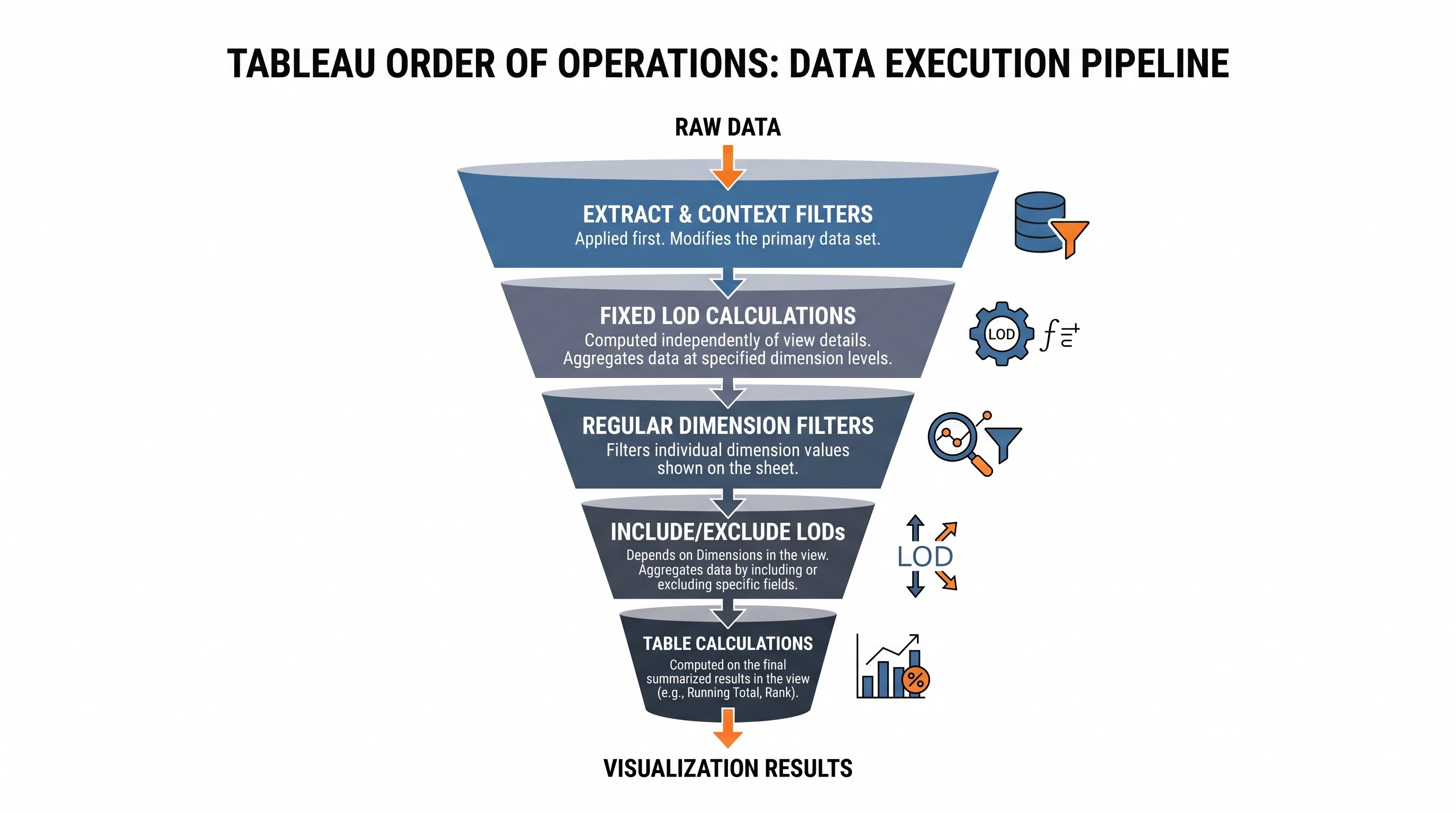
Having knowledge of the order of execution of queries is vital to performing advanced calculations and passing exam:
The first to be executed are Extract Filters, then Data Source Filters.
The second to be executed are Context Filters that create a temporary subset table.
Then the Top N and Conditional Dimension Filters begin working in that context.
At this stage Fixed Level of Detail expressions are calculated.
Then the Regular Dimension Filters are evaluated.
At this point Include and Exclude Level of Detail expressions are evaluated.
The next step is the use of Measure Filters.
The calculations of Table Calculations and Filters take place as the last step in this chain.
Understanding the order of execution gives a clear picture of why applying dimension filters does not work with Fixed calculations unless that dimension has been moved to a Context Filter.
5. Classification of Calculations
Simple Row-Level Calculations: Performed on each separate row of data in a database before any summary.
Aggregated Calculations: Performed at the defined level of detail governed by the dimensions used in the visualization.
Level of Detail Expressions: Computation done without being influenced by view dimensions. Fixed calculations are computed completely at the specific dimension level; Include calculations incorporate dimensions into the granularity of the view; Exclude calculations remove dimensions from view granularity.
Table Calculations: Done locally on the aggregated results obtained from the database and performed across or down the visualization (total sums, percentage of total amounts, moving average, rankings).
6. Interactions of Dashboard and Governance
Learn the way to set up filter actions, highlight actions, URL actions, parameter actions, and set actions. Be ready for the questions on governance such as extract refresh schedules, user filters for row-level security, data source publishing, and permission management in projects on Tableau Server or Cloud.
Step-By-Step Guide for the Certificate Preparation
Passing the certificate exam requires the planned study process with a good combination of theory and practical training:
Phase 1: Thorough Study of the Official Exam Guide
Get the official guide for the exam you are going to take. Go through each and every point and underline any unknown feature or terminology. Treat this guide like your checklist for the exam.
Phase 2: Experimentation with the Key Features
Do not merely learn about the functionalities, but actually practice them with an empty spreadsheet. OnlineITGuru's live interactive tableau classes online offer lab environments allowing learners to work on complicated scenarios under the mentorship of professionals before they sit for the official exams.
Build the exact same metric using a Fixed Level of Detail expression, a Table Calculation, and a standard aggregated measure to see the variation in the results.
Create a chart with several date dimensions and convert them back and in between discrete date parts and continuous date values to learn about temporal behavior.
Create a multi-layered dashboard and practice switching between the objects using dynamic zone visibility.
Phase 3: Simulated Practice Tests
Take timed tests that imitate the format, difficulty, and question distribution of the actual test. When going through your test results, do not only pay close attention to the right answer; open the application and recreate the question from the beginning until the topic is clear to you.
Phase 4: Planning Your Time on the Exam Day
Carefully read each question, paying attention to whether the question requires one answer or multiple.
Be extra careful of the way something is said – data types, hierarchy of filters, and how things are aggregated.
Mark complicated questions to come back to them later.
Merging the Certification and Portfolio into One Career Strategy
Getting certified and creating an online portfolio are both very effective tools, but their combination brings about a full-fledged professional identity.
1. Maximize the Online Presence
Put your active Tableau Public link at the very top of the resume, LinkedIn account, and email signature.
Add your verified digital certification badge to the LinkedIn licenses section and the Tableau Public bio.
Make sure that your resume bullets describe results of your work: how your dashboards improved efficiency in operations, saved money, etc.
2. Get Involved in the Community
The community is one of the most collaborative professional ecosystems of the technology world. Participate in every-week visual challenges, help others out with remarks regarding their works and share your insights on the dashboard creation process.
Delivering Presentations in Technical Interviews
During the presentation of your work in an interview:
Emphasize business narrative over basic software mechanics.
Give the interviewers a walkthrough of your thinking process: who the user is, what business decisions would be facilitated through the tool, what constraints had to be overcome, and the quantitative impacts of the findings.
It will be important to reveal the difficulties you faced while modeling the data and the solutions you had to implement. The interviewers will appreciate authentic problem-solving much more than a rehearsed presentation with superficial treatment of issues.
It should be noted that with the help of a stunning portfolio and recognized credentials, it is possible to set oneself apart in analytics today. Understanding the concepts of visual balance, data modeling and dashboard architecture not just makes a person a consumer of visual analytics tools. Those who prefer to accelerate the process of becoming a professional in the field with the help of comprehensive training will benefit from tableau online training from OnlineITGuru as it contains the required curriculum.