
Building a QlikView Portfolio Before Your First Job
Last updated on Sep 24, 2026
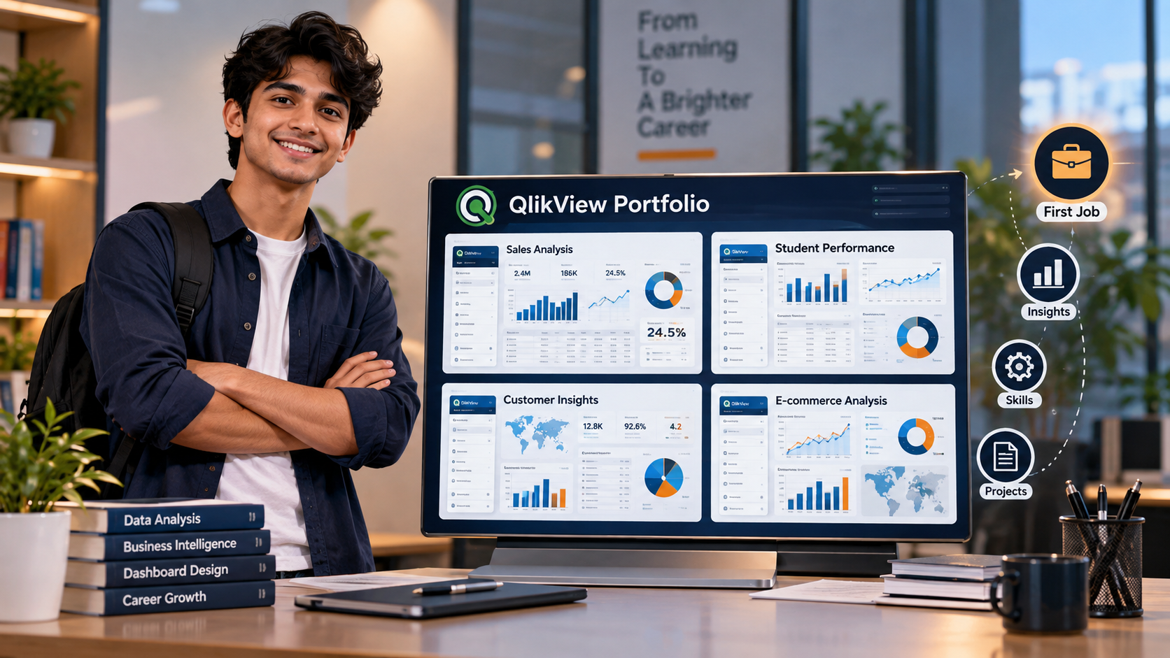
For students entering the field of data analytics, knowing a software tool is only one part of the learning process. Employers also want to understand how a student applies that knowledge to a real problem. This is where a project portfolio can become useful. Instead of simply mentioning QlikView on a resume, students can show a few projects that explain how they worked with data, created visual reports, and found useful information from a dataset.
A portfolio does not have to contain complicated projects. A simple dashboard based on sales, student performance, attendance, customer information, or another familiar dataset can be enough to demonstrate practical understanding. What matters is the thinking behind the project, how the data was handled, and whether the final dashboard communicates something clearly. For a student preparing for a first job, this type of work can also make technical concepts easier to understand because they are being applied instead of only studied.
Why a QlikView Portfolio Matters for Students
Students often face a common problem when applying for their first job: they may understand the basic concepts but do not have much professional experience to discuss. A portfolio can help fill part of that gap. It gives students something concrete to talk about during an interview and allows them to explain what they have worked on instead of relying only on academic qualifications or course certificates.
A QlikView portfolio can show how a student approaches data. For example, a project might begin with a raw dataset containing hundreds or thousands of records. The student may need to understand the fields, identify relationships between the information, organize the data, and decide which parts are useful for analysis. The final result could be an interactive dashboard that presents the information in a simpler form.
The value of the portfolio is not only in the finished dashboard. The process behind it is equally important. If an interviewer asks why a particular chart was selected, how the data was organized, or what the dashboard is supposed to explain, the student has an opportunity to demonstrate their understanding. This makes the project more meaningful than simply showing a visually attractive report. Students should also remember that a portfolio does not need to look like the work of an experienced professional. A beginner-level project can still be useful if the objective is clear and the analysis makes sense. In fact, starting with a manageable dataset can make it easier to explain every part of the project during an interview.
Choosing the Right Dataset for Your First Project
The dataset is one of the most important parts of a portfolio project because it determines what kind of analysis can be performed. Beginners sometimes make the mistake of selecting a very large or complicated dataset because they believe it will make the project look more advanced. In practice, a smaller dataset that the student understands properly can lead to a much stronger project.
For a first QlikView project, students can work with familiar areas such as retail sales, student performance, employee records, customer information, website activity, or e-commerce transactions. These subjects are easier to understand because the information has a clear context. For example, a sales dataset might contain product names, quantities, prices, regions, dates, and customer information. These fields can naturally lead to questions about revenue, product performance, regional sales, or monthly trends.
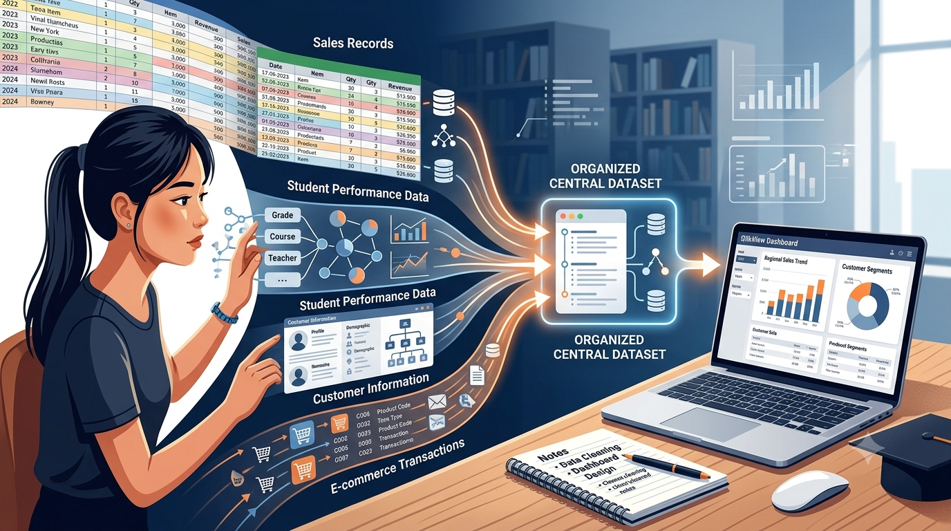
Before creating a dashboard, students should spend time understanding what the dataset actually contains. They can check whether fields have missing values, whether dates are stored consistently, whether numbers are being treated correctly, and whether similar information appears under different names. This basic checking process is important because a dashboard is only as useful as the data behind it. The project should also have a simple purpose. A student could decide to analyze monthly sales and identify which products contribute the most revenue. Another project could examine student attendance and performance to understand whether there are noticeable patterns. Having a question in mind gives the project direction and prevents the dashboard from becoming a collection of unrelated charts.
A good beginner project is therefore not necessarily the one with the biggest dataset. It is the one where the student can explain the data, understand the relationships between fields, and clearly describe what the analysis is trying to show.
Turning Raw Data Into an Interactive Dashboard
Once the dataset has been understood, the next step is to turn the information into something that people can explore more easily. This is where the dashboard becomes the main part of the portfolio project. Instead of asking someone to read thousands of rows in a spreadsheet, the dashboard can bring important information together through visual elements and interactive selections.
Students can begin with a few useful measures rather than filling the screen with every available chart. As part of a qlikview course, they can learn to select the metrics that actually support the purpose of a dashboard. For a sales project, this could include total sales, number of orders, top-performing products, and sales by region. A student performance dashboard might include average marks, attendance percentage, subject-wise performance, and performance trends over time.
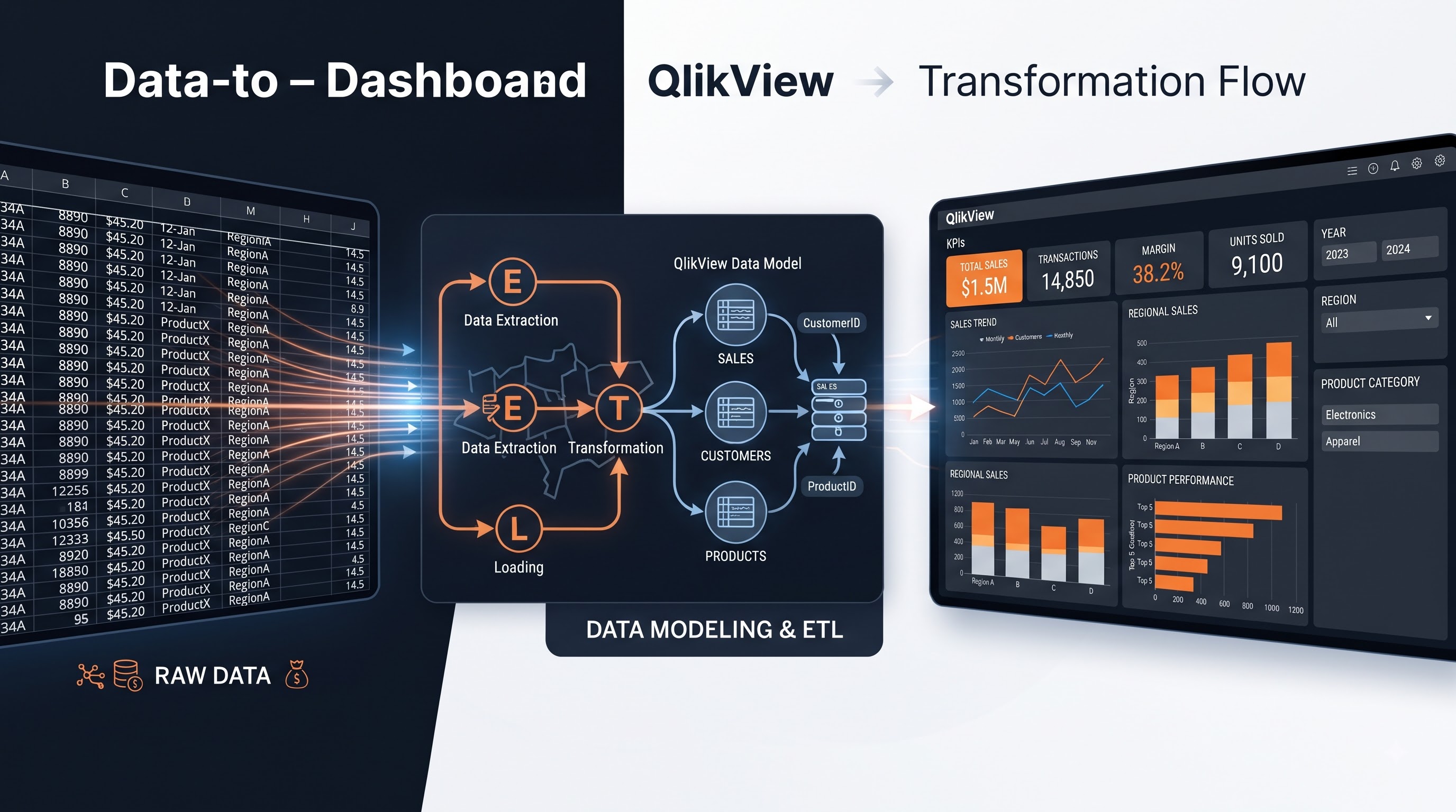
The choice of visualization should depend on the information being presented. A line chart can help show movement over time, while a bar chart can make comparisons between categories easier. Tables can be useful when exact values are important. Filters can allow users to look at a particular year, region, product, or category without creating a separate dashboard for every possible view.
The interactive part is particularly useful because it lets users explore the data rather than only view a fixed report. For example, selecting one region can change the information shown in other parts of the dashboard. This can help students understand how different pieces of data are connected and how interactive analysis works in a Business Intelligence environment.
The visual design should remain simple. A student portfolio does not need excessive colors, decorative graphics, or dozens of visual elements. Clear headings, readable numbers, logical placement, and consistent formatting are usually enough. The purpose of the dashboard is to make information easier to understand, not to make the screen look crowded. This stage also gives students a chance to consider who will use the dashboard. A sales manager may want to see revenue and product performance quickly, while an academic department may be more interested in attendance and student results. Thinking about the audience can help students decide which information deserves more attention.
Focus on the Problem Behind the Dashboard
A portfolio project becomes more interesting when there is a clear problem behind it. Without a specific purpose, students can easily create dashboards that contain several charts but do not really answer anything. A project should ideally begin with a simple question that the data can help explore.
For example, imagine a student creates a retail sales dashboard. Instead of simply displaying total revenue, the project could examine why sales changed across different months. The student could compare product categories, regions, and sales periods to identify where the major differences appear. The dashboard then becomes a tool for exploring a particular business question. The same approach can be used outside sales. A student working with college data might examine attendance patterns and academic performance. An e-commerce project could look at customer orders and identify which product categories have stronger demand. An employee dataset could be used to examine department-wise workforce information or employee turnover patterns.
This type of project also helps students understand the difference between data and information. A dataset may contain thousands of individual records, but those records do not automatically explain what is happening. Analysis requires the student to look for relationships, comparisons, changes, and patterns that may be useful in the context of the project. The final dashboard should therefore support the question that was defined at the beginning. Every major chart or metric should have a reason for being there. If a visual does not contribute to the analysis, it may not need to be included. This simple approach can make the final project easier to understand and easier to discuss during an interview.
Students can also record a few observations from their analysis. These should be based on what the data actually shows rather than assumptions. For instance, if one region has consistently higher sales than another, the student can mention the difference. They do not necessarily need to explain the cause unless the available data supports that explanation.
Document the Work Behind Your Project
A portfolio should explain more than the final dashboard. Someone looking at the project should be able to understand what the student was trying to achieve, what type of data was used, and how the final result was developed. Even a short project description can make the work easier to follow. Students can begin by writing a brief project objective. This can explain the main question the project is trying to answer. The next part can describe the dataset, including the general type of information it contains and the number of important fields or categories used in the analysis. The project can then explain the main preparation and analysis steps. For example, the student might describe how different fields were checked, how relevant information was organized, and how relationships between data points were considered. There is no need to turn this into a long technical document. A few clear paragraphs can explain the process.
Screenshots of the completed dashboard can also be included in the portfolio. If the dashboard contains interactive filters or multiple views, students can explain what each major part is intended to show. This gives the reader some context instead of leaving them to interpret the dashboard without any background.
A short section on the main findings can make the project more useful. Students can mention two or three observations they found while exploring the data. These findings should connect directly to the project objective. For example, a sales project might identify a strong difference between regions or a noticeable change in demand across different periods.
Students who are preparing their first portfolio can treat this documentation as part of the project itself. It shows that they can communicate their work, not just create a technical output. Through qlikview training, students can also develop a better understanding of how to explain their project, findings, and dashboard to someone who does not know the technical details.
Building Your Skills Through Different Projects
After completing one project, students can gradually add different types of work to their portfolio. The purpose is not to create a large collection of similar dashboards. Instead, each project can demonstrate a different part of the student's understanding. One project could focus on sales analysis, while another could use student or employee data. A third project might involve customer information or e-commerce activity. Working with different datasets can expose students to different types of fields, relationships, calculations, and analytical questions.
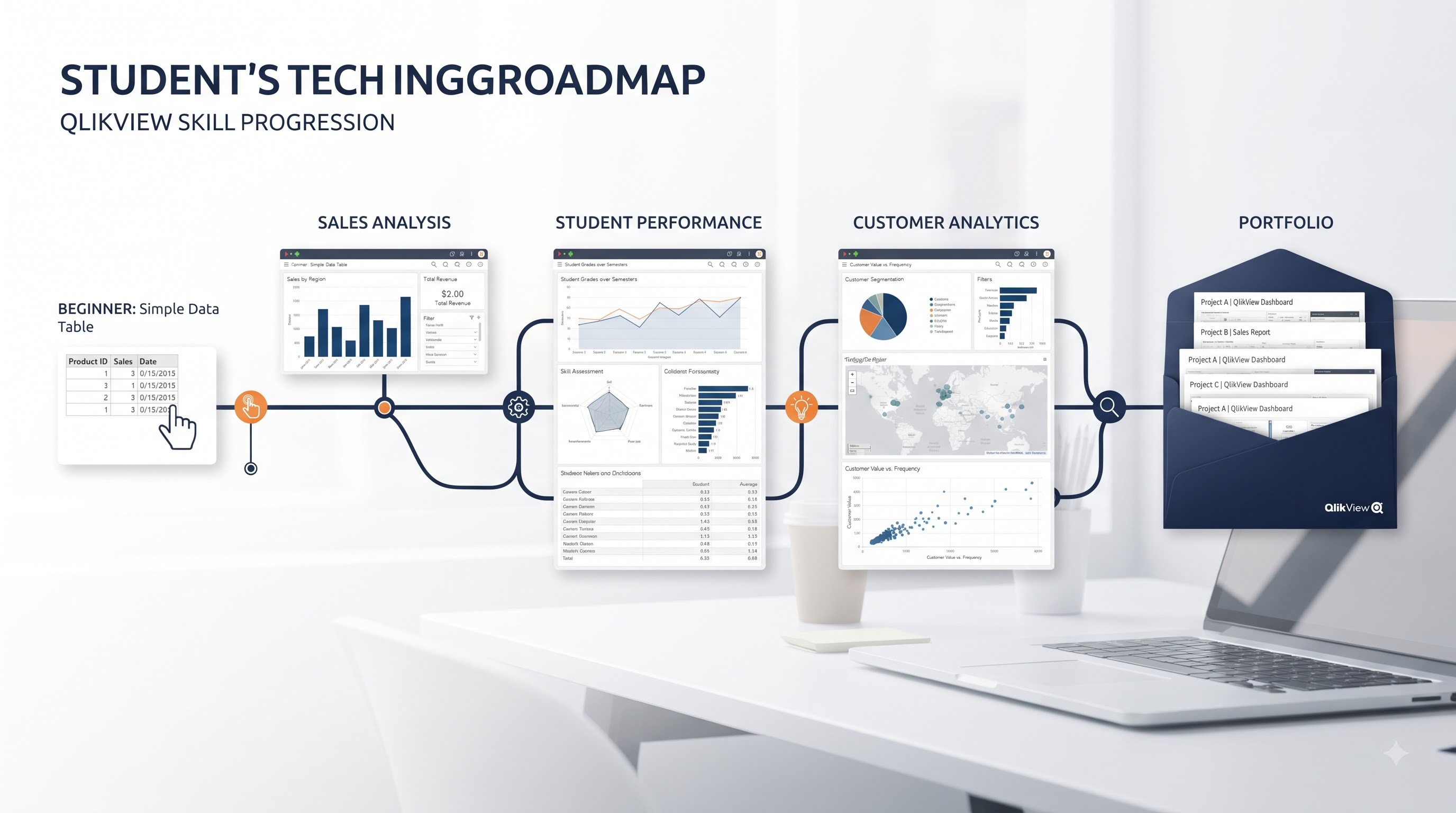
This is also where structured qlikview learning can become useful because students can connect individual concepts with practical projects. Rather than completing a topic and moving on without using it, they can apply the concept to a dataset and see how it works in an actual dashboard. The projects do not have to become increasingly complicated just for the sake of complexity. A simple project that demonstrates strong understanding is more useful than a complicated dashboard that the student cannot explain. As their skills improve, students can gradually work with larger datasets, more relationships, additional visualizations, and more detailed analysis.
Students can also review their older projects after learning something new. A dashboard that looked satisfactory at the beginning may reveal areas for improvement later. Maybe the layout can be simplified, a chart can be replaced, or the analysis can be made more focused. Revisiting previous work is a practical way to see personal progress. Over time, the portfolio can become a record of the student's development. The first project may show basic dashboard creation, while later projects can demonstrate better data handling, clearer visualization choices, and stronger analytical thinking. This progression can be more useful than collecting projects that all look almost identical.
Presenting Your Portfolio Before Your First Job
Creating the portfolio is only one part of the process. Students also need to be comfortable explaining their work. During an interview, an interviewer may ask questions such as why the project was selected, what the dataset contained, what challenges appeared, or what was learned from the analysis. The best way to prepare is to understand the project thoroughly. Students should know where the data came from, what the main fields represent, why particular visualizations were selected, and what the important findings were. They should also be honest about areas they did not work on. A portfolio is meant to demonstrate learning, so there is no benefit in pretending to have used techniques that were not actually part of the project.
A simple explanation can follow the same structure as the project itself. Start with the problem, explain the dataset, describe the approach, show the dashboard, and then discuss the findings. This makes the conversation easier to follow and gives the interviewer a clear picture of how the student worked through the project. Students can also include their projects on a resume or professional profile with a short description rather than listing only the software name. For example, they can mention that they created an interactive sales dashboard, analyzed regional performance, or explored customer purchasing patterns. The description should reflect what they actually completed.
A portfolio can also change over time. Once a student completes an internship, academic project, or professional assignment, older practice projects can be replaced or improved. The aim is not to create a portfolio once and leave it unchanged. It can develop alongside the student's skills and interests. For students starting their careers, the main purpose of a QlikView portfolio is simple: show what you can do with the knowledge you have learned. A few well-understood projects can give students practical experience, help them communicate their analytical approach, and provide meaningful examples when they begin speaking with potential employers. The portfolio does not need to be perfect. It needs to be clear, honest, and based on work the student can confidently explain.