
Career Growth: How to Build a Portfolio-Worthy Power BI Project That Gets You Hired
Last updated on Jul 28, 2026
The Portfolio Trap
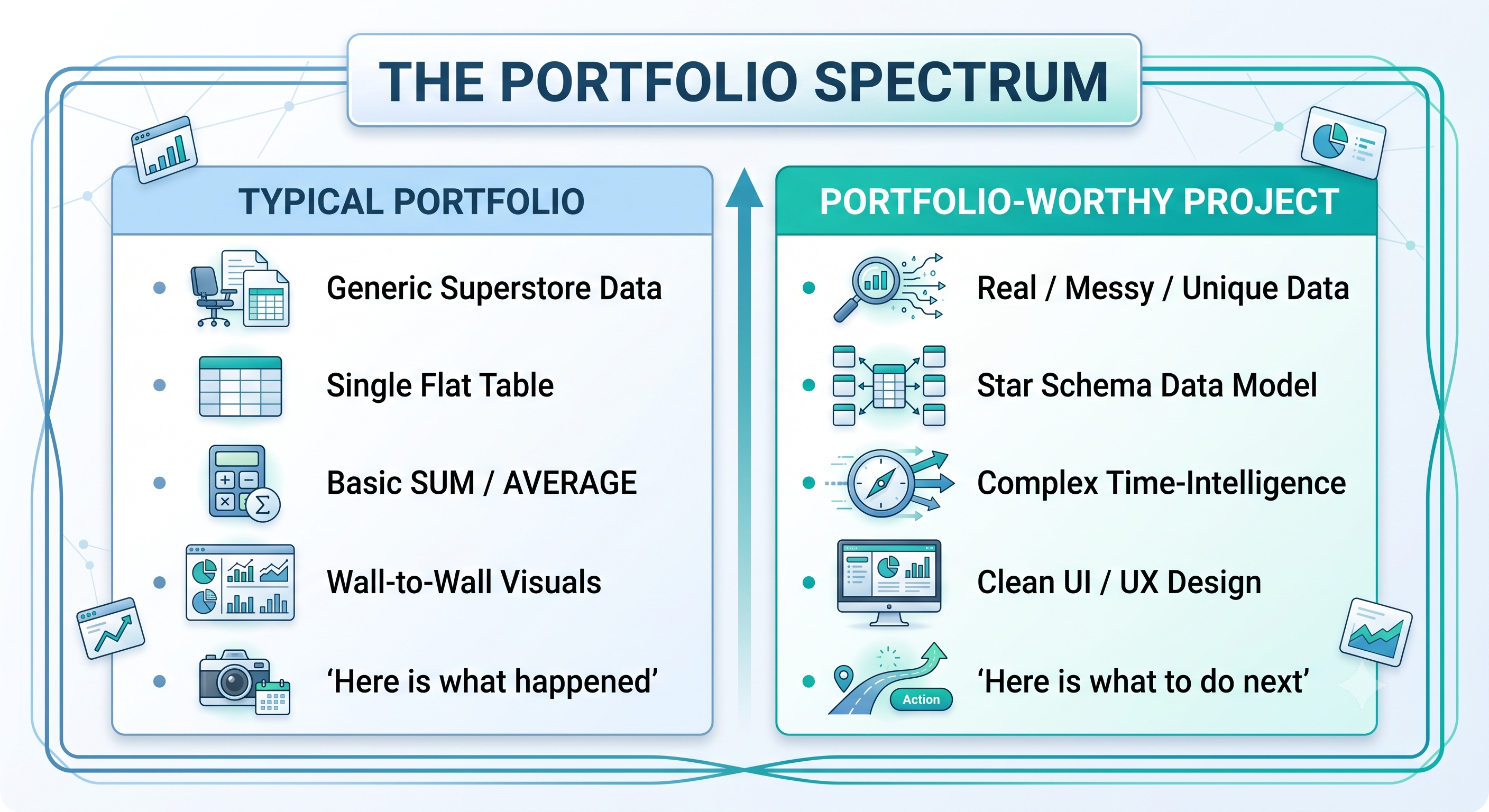
Every day, hiring managers and leading analytics professionals sift through resumes that are connected with online portfolios only to find that they are staring at the same dashboards each time: a financial overview done using Microsoft’s stock dataset, a sales dashboard built on the ubiquitous "Superstore" dataset, or a simple world population chart.
These datasets may be great for learning the fundamentals of Power BI Desktop, but using them in business portfolios puts candidates at an instant disadvantage. When all applicants provide similar dashboards with the same types of visuals, sample datasets, and standard SUM indicators, portfolios lose their importance as a differentiating factor. They just become visual noise.
An Assessment of the Hiring Manager's Point of View
When it comes to hiring new workers, hiring managers do not really bother if a candidate is well-versed with the "Stacked Bar Chart" function of Power BI Desktop. All they care about is capacity for effective risk management and problem solving.
When companies are hiring a BI Developer or a Data Analyst, they need someone to collate operational data with the help of business insights. They want to understand:
Are you capable of handling messy actual-world data?
Are you experienced enough to know how companies earn profits, control expenses, and use the resources efficiently?
Are you able to create an understandable screen for an inexperienced user?
Main Idea
A project that could impress hiring companies would not be a simple presentation of charts, but a business case that reflects an individual's commercial mentality.
In this article, we provide a step-by-step instruction on how a simple idea can become a live project instead of just an idea.
Get Rid of Tedious Datasets (Obtaining Real-World Data)
Why "Global Superstore" Ruins Your CV
When a recruiter finds the "Global Superstore" dataset, it indicates two things:
You worked in a controlled setting where every column was pre-cleaned, processed, and logically structured.
You followed an online course blindly rather than doing some independent work.
Real-world business data is unorganized, corrupt, scattered over many systems, and filled with mistakes. To show you can manage in a real-world business environment, the project needs to contain the data conveying the features of real life.
Finding Exceptional, Valuable Data
In order to get a brilliant report, one should use one of three ways to collect the data:
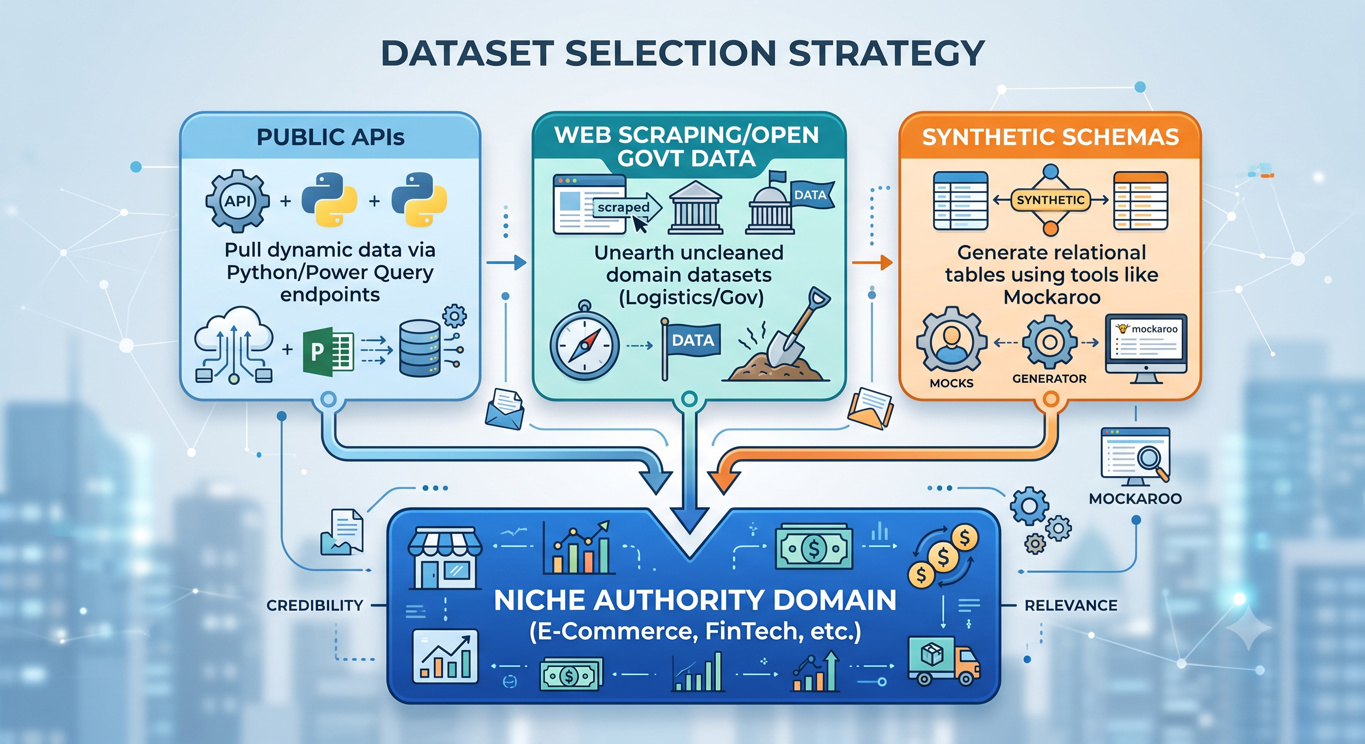
1. Public APIs & Data Connections
Instead of downloading a static CSV file, one can directly connect Power BI to the API or develop a basic Python program for getting the data periodically.
For instance: Fetch historical logistics or currency exchange rates, weather statistics for the local retail business, or current public transport performance data.
2. Open Government and Industry Repositories
Give up general Kaggle sample datasets and look for the available-source data closely resembling standard company operations.
Transport and Logistics: U.S. Department of Transportation statistics (flight delays, cargo thresholds).
Healthcare and Public Safety: Healthcare Cost and Utilization Project (HCUP) data samples.
Finance and Economics: World Bank, FRED (Federal Reserve Economic Data).
3. Combining Complicated Relational Schemas
In cases where you wish to showcase e-commerce, supply chain, or SaaS analytics, the use of actual consumer data will generally be hard as a result of consumer privacy issues (PII). In this case, create your own relational multi-table database by using tools like Mockaroo or compose Python scripts using the Faker package.
Confirm that your synthetic database contains the following:
A central sales or orders fact table.
A related returns or inventory fact table.
Dimension tables (customer, product, location, channel).
Deliberate mistakes: absent timeline, partial returns, and inconsistencies in status codes that have to be corrected.
The "Niche Authority” Strategy
Customize your information for particular areas of interest. If your aim is to work in e-commerce, create your project specifically addressing issues such as customer acquisition costs (CAC) and return rates, and customer lifetime value (LTV). If you are targeting supply chain issues, center your project around such indicators as inventory turnover ratio, fulfillment speed, and suppliers’ defective rate. There is a structured Power BI course online available for you which will provide you with basic syntax knowledge. Applying that knowledge to a particular professional area is what will give you a competitive advantage.
Specify the Business Problem and Frame the Issue
Don’t Just “Visualize,” Solve!
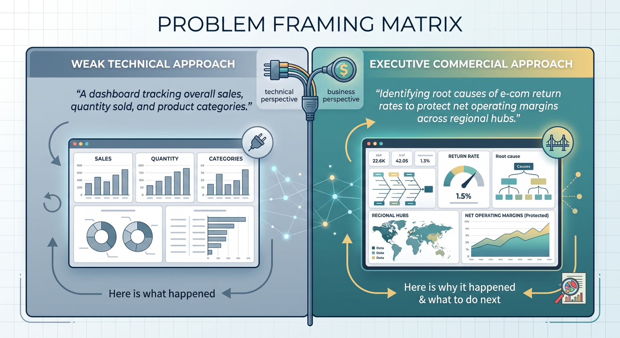
Dashboards are rarely used in organizations because they provide mere data instead of answering a question. They resemble ornamental charts instead of practical tools useful for decision-making.
Prior to launching Power BI Desktop, ensure that you determine what business problem the report is going to solve.
Weak Project Framing: “A dashboard showing total sales and revenues by region.”
Strong Project Framing: “A business analytical tool built to enable electronic commerce companies to understand product return causes, find high-cost product categories, and obtain $150,000 back.”
Bringing up Executive Question
In order to set a contextual frame, treat your portfolio project like the classical business scenario.
The Problem: High product return rates lead to the reduction of the margins in the division of Consumer Electronics.
The Aim: Develop an analytical instrument for the operational group to detect return trends, identify product, supplier batch, and fulfillment center.
The User: Operations Directors and Category Managers who need selective KPIs along with the possibility to analyze single order IDs.
Current Project Scope & Major Measures
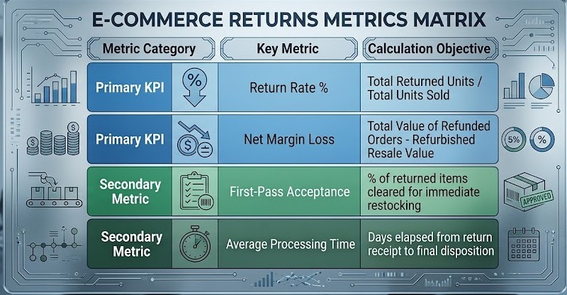
Before creating visual elements, identify 3-5 main Key Performance Indicators (KPIs) and additional metrics:
Technical Execution (Putting Your Power BI Skills to Work)
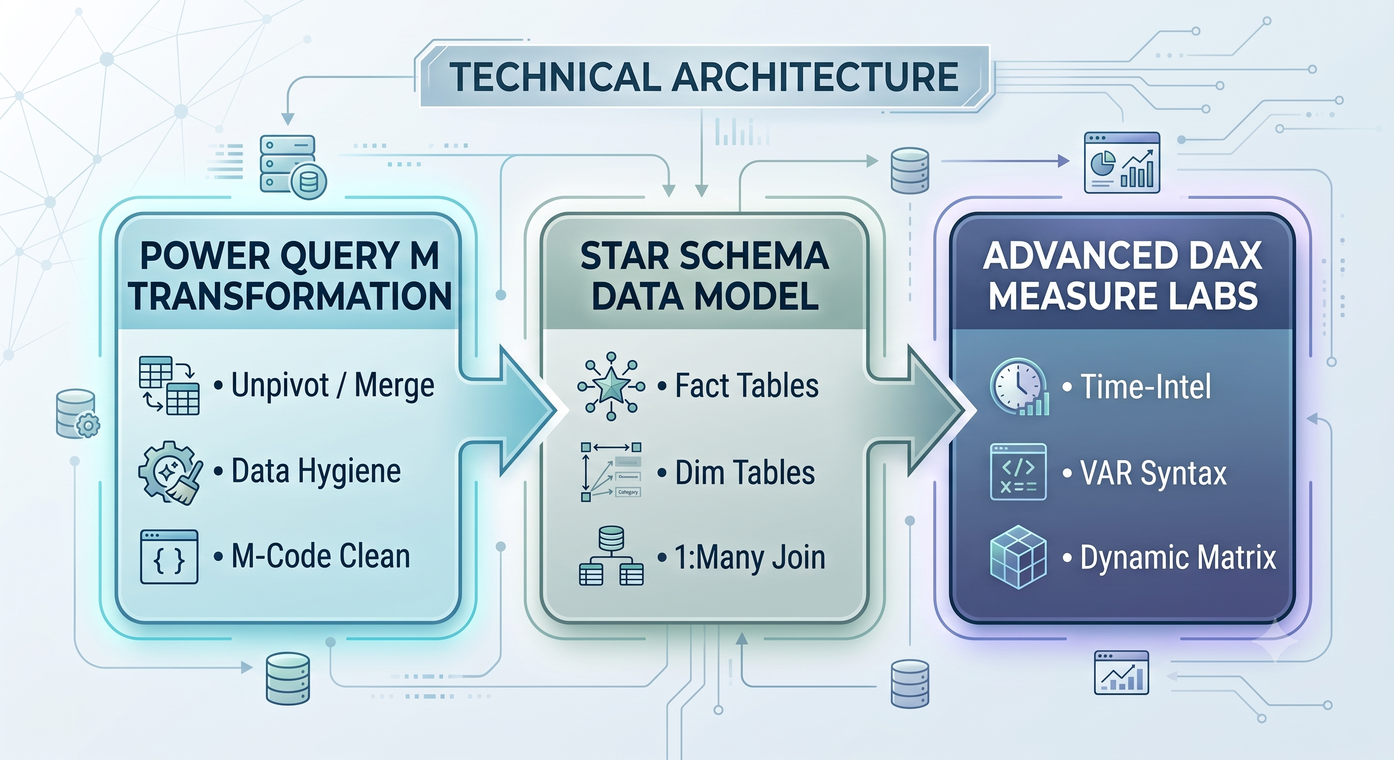
Data Transformation (Power Query & M)
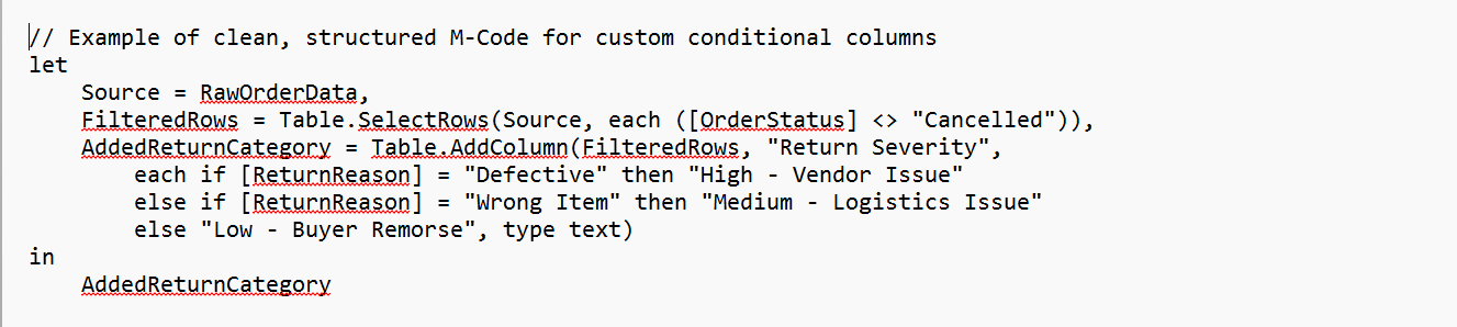
Do proper data hygiene in Power Query What employers will often do is look at the documentation of the project or steps taken in Power Query, to determine the level of hygiene of the code.
Rename Query Steps: Change generic names such as Changed Type1 or Removed Columns2 to more descriptive names such as Filtered_Null_OrderIDs or Parsed_JSON_Payload.
Unpivot Columns: Transform wide-natured data models into narrow and tall relational format.
Enforce Correct Data Types: Specify data types at the beginning of the process, as Fixed Decimal Number for financial information or Date for any time information.
Data Modeling: Star Schema versus Snowflake Schema
Many novice portfolios incorrectly load just one flat table into the report canvas instead of using a star schema or instead of creating complicated snowflakes.
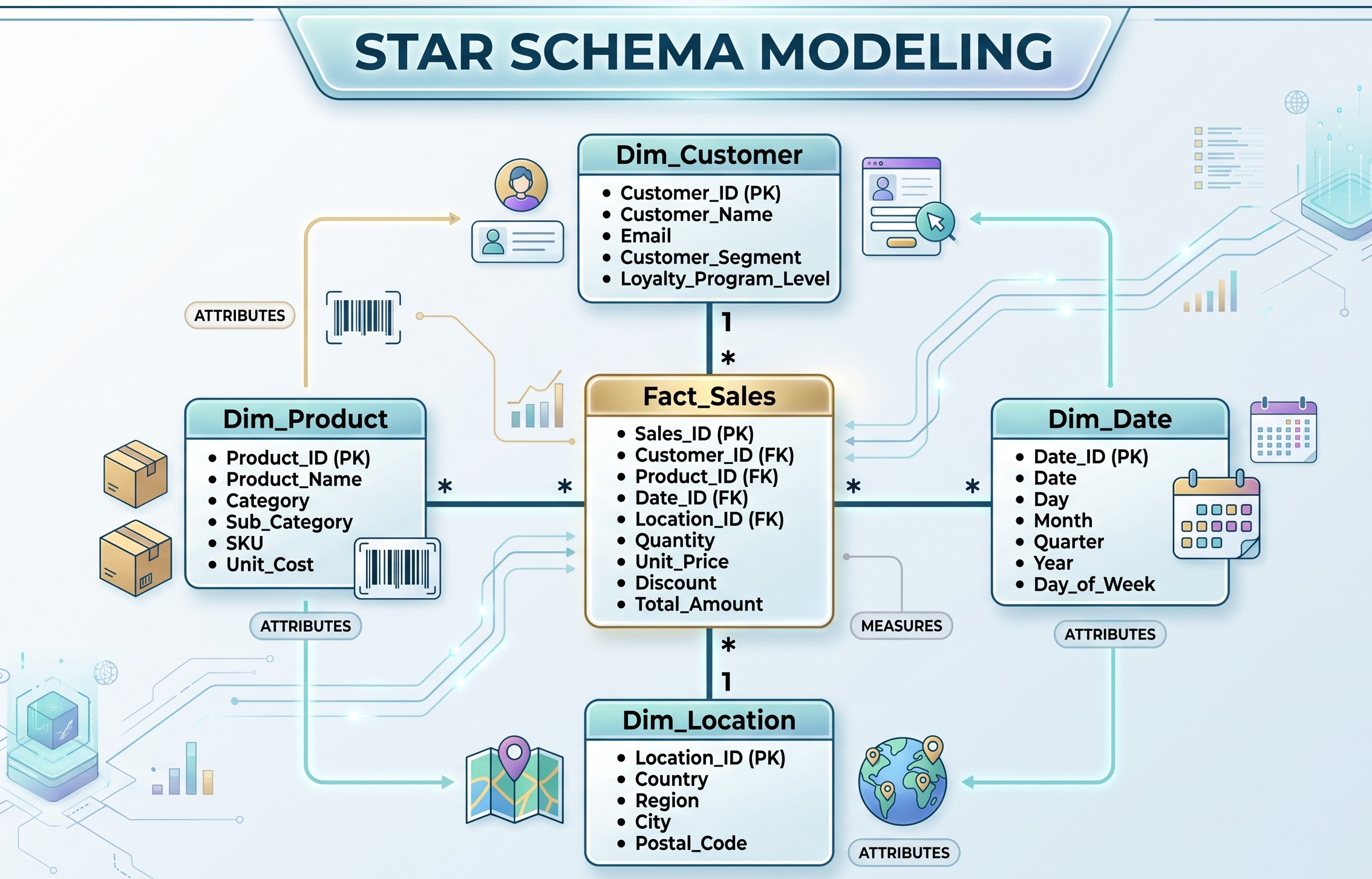
Show that you know how to implement a good architecture by creating data in a simple Star Schema:
Fact Tables: Hold figures, events, foreign keys as well as transactions (for example, Fact_Sales, Fact_Returns).
Dimension Tables: Feature attributes that give a context to the data (for example, Dim_Product, Dim_Customer, Dim_Store).
Guidelines for Relationships: Relationships between Dimension tables and Fact tables must always be One-to-Many. Ensure that the Cross-Filtering Direction is Single, and be careful not to utilize the Bi-direction filter unless required by the DAX script.
Calendar Table (Dedicated): Do not rely on Power BI’s auto date/time options.Create a Dim_Date table yourself with DAX or Power Query and get the benefits of advanced time intelligence features.
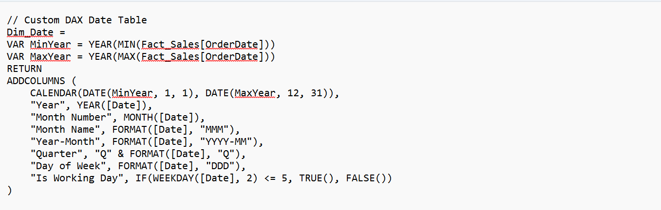
DAX Engineering
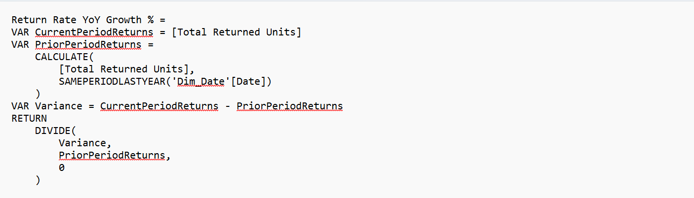
To demonstrate your proficiency and expertise, use more than just basic auto-sum calculations. You need to implement complex yet easy to read DAX code that involves VAR usage as well. The transition from traditional operations to complicated row-and-filter context switches is a struggle for many self-learned analysts. Investing the time in Power BI online training allows one to learn coding techniques that prove effective for work instead of continuing with strain operations.
Example 1: Time intelligence with Safe Ratio Handling
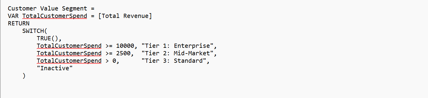
Example 2: Dynamic Customer Segmentation with Context Switch
Setting up of Code
DAX measures should be organized into multiple Measure Tables having sub-folders (01_KPIs, 02_TimeIntelligence, 03_DynamicSwitching). This gives an impression to the hiring manager that you have clear and adaptable report environments.
UI/UX & Executive Layout
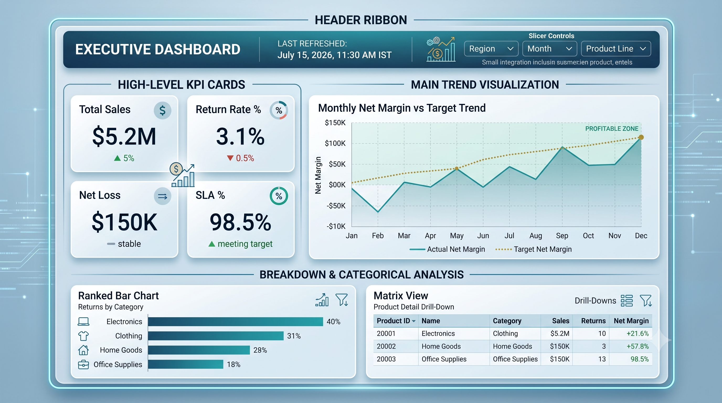
When creating a design for leaders in a company, it is important for these leaders to understand the following three pieces of information about the design within three seconds. These are:
1. What metric or business unit is being looked at?
2. How is this metric doing compared to its target?
3. How is the trend going?
There are several rules that should be followed when designing this type of presentation.
1. Spatial arrangement (F-pattern)
The designer should arrange the most important figures according to the way people read—top to bottom, left to right. The summary KPI template cards should be positioned at the top or the top left corner, while the trend charts should be in the center and matrix tables at the bottom.
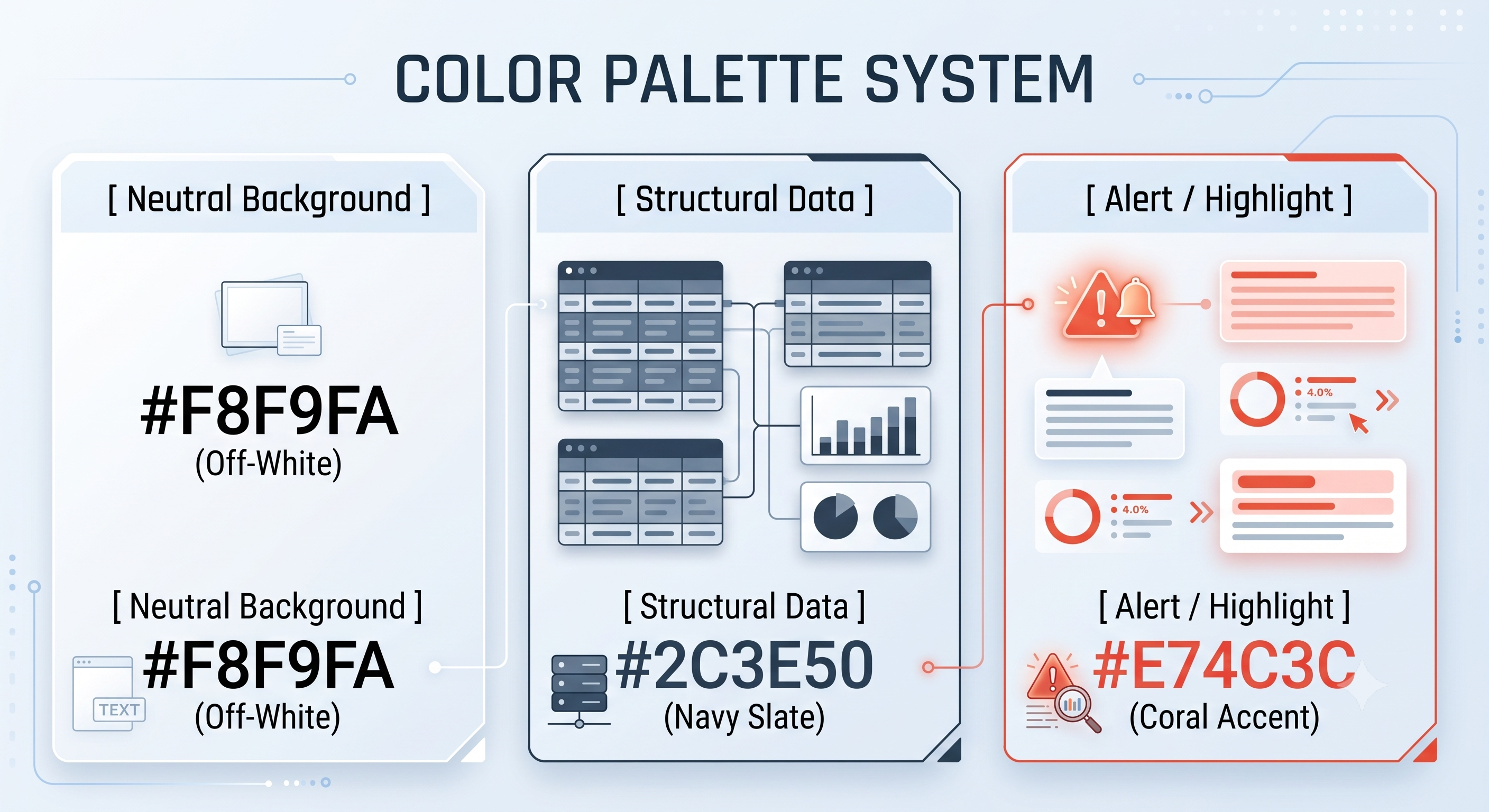
2. Color combination 60-30-10 rule
It is important to not use bright colors for all visuals.
60% neutral colors (white, light gray, dark gray) for template card and canvas background.
colors of focus—dark blue, dark gray, or muted slate for bars and lines.30%
10% accent colors—bright teal, coral, and amber to focus on exceptions and missed targets.
3. Constructing the Container Card
Group similar variables within soft visual enclosures (pale background cards having 4-8 px round corners). Avoid nasty black grid-lines and dark contrasting edges around every object.
4. Reducing "Chart Junk"
Turn off horizontal grid-lines unless absolute data reading is necessary.
Do not emphasize the Y-axis name when the visual title provides a clear name such as "Monthly Revenue ($)" which does not imply the use of "Revenue" for the Y axis.
Create clean numeric formatting. Instead of $14,231,109.82 use $14.2M and instead of 0.12419 use 12.4%.
Interactive Storytelling Features
Static visual displays cannot demonstrate the complete Power BI functionalities. Use interactive features:
Report Page Tooltips. Design customized cards for hovering that will provide fine context as top fetching item types or customers feedback while hovering across the data item.
Field Parameters. Make it possible for users to change chart parameters without using canvas space.
Collapsible Slicer Panel. You can use Bookmarks and Selection Panels to create a slide-out display to organize filters and avoid a cluttered appearance on the canvas.
Documenting and Publishing for Maximum Reach
Interactive Live Embedding
Do not send a static PDF or PNG screenshot of a dashboard as the focus of your portfolio.
Recruiters want to experience the dashboard's interactivity, tooltips, and slicers firsthand.
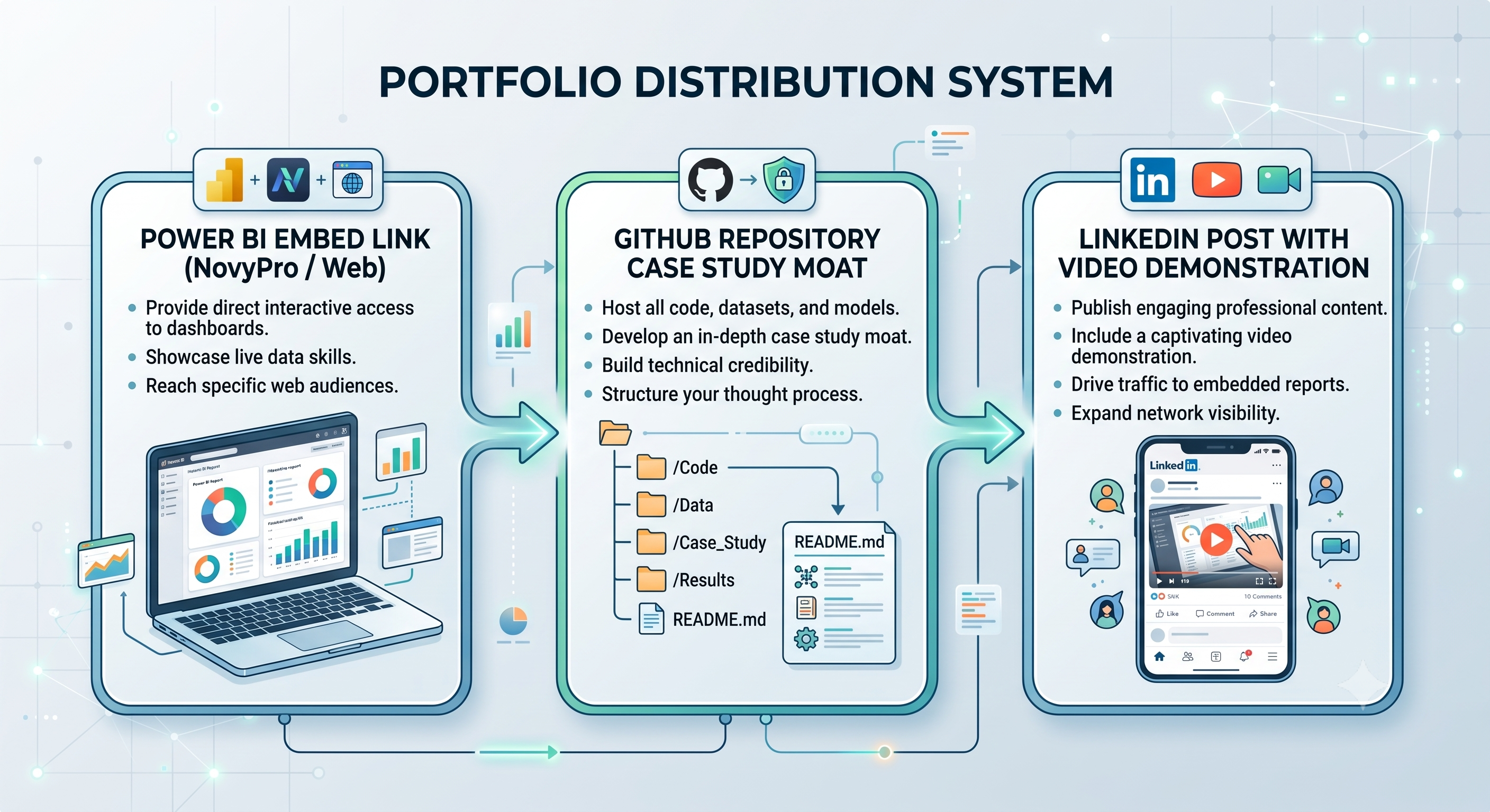
NovyPro: You can use the NovyPro portfolio platform, designed specifically for Power BI developers, to embed live interactive reports safely, without the need for costly Power BI Pro organization licenses.
Web Embedding: You can use "Publish to Web" functionality of Power BI for embedding interactive reports in your personal website if they do not comprise any classified information from the real world.
The GitHub Method of Case Study Documentation
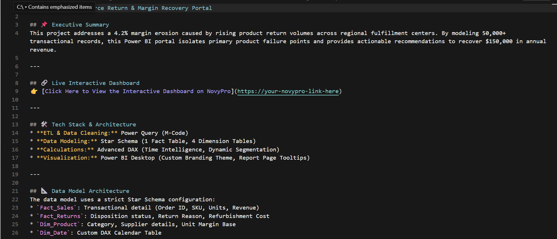
A separate GitHub repository will have to be created by you for your project together with an extensive README.md file as documentation for your project. Lots of candidates learn how to create visuals online through interactive Power BI classes online, but documenting the business value and data architecture as well as the transformation process makes hiring managers recognize that you have senior communication skills.
Strategy for Visibility on LinkedIn
Posting your report on LinkedIn can help you gain attention from recruiters and hiring managers.
Take Screenshot Videos: Prepare a 30-second screen recording where you demonstrate how your dashboard’s different functions work—like showing how to open a slicer, working with the tooltips, and accessing more data.
Mention Important Ideas: Write a short post about the problem you were trying to solve, how you solved it, and what your business insights were. In the comments, share the live link to your project.
Top 10 Interview Questions for Power BI Course
1. What distinguishes Calculated Columns from Measures in DAX?
Answer:
Calculated Columns are contemplated row by row (Row Context) as it is refreshed, thus taking up space in the RAM model. They work best as dimensions used in slicers, row headers, or axis labels.
Measures are estimated in real time when used in visual forms according to user actions (Filter Context) and take very little space in the RAM model, as they need to be calculated dynamically.
2. What distinguishes Star Schema from Snowflake Schema and which one is more commonly used in Power BI?
Answer:
Star Schema creates a direct relationship between Fact tables and denormalized Dimension tables (1:Many).
Snowflake Schema normalizes dimension tables even more through the use of sub-dimension tables (Dim_Product leading to Dim_SubCategory leading to Dim_Category).
Power BI likes Star Schema because the VertiPaq engine stores flat dimension tables in a more efficient way, which results in quick DAX query plans generation.
3. What are the different types of data storage formats used in Power BI? When do you use different formats?
Answer:
Import Mode: It is the mode where Power BI uses the xVelocity (Vertipaq) engine for loading data.
DirectQuery – Establishes a direct connection to the data source instead of storing it in Power BI. Queries are conducted live with real data which is helpful for real-time reports or imports too large to import.
Dual/Composite Mode - Mixture of both of the above modes in the same document where some tables can be stored in Import mode, while the others can operate using DirectQuery.
4. What is the difference between CALCULATE and EARLIER forms in DAX?
Answer:
CALCULATE is the most powerful DAX function since it alters the current Filter Context and helps perform context transition (Row Context is changed into Filter Context).
EARLIER is used in nested row contexts to retrieve data from an outer row context loop. (Note:Now more often VAR variables are used instead of EARLIER.)
5. What are your ways to optimize the performance of inefficient reports with the help of Power BI?
Answer:
Data Modeling: Use a star schema model but avoid bi-directional cross-filter relationship.
Power Query Hygiene: Remove all unneeded rows and columns in the Power Query stage as soon as possible.
Turn off Auto Date/Time: disable automatic date/time and select a single Dim_Date table to be effective instead.
DAX Optimization Avoid calculated columns if you can do it with simple measures. Use DIVIDE() instead of / . Use VAR to not evaluate the same logic multiple times. You will often find Power BI live training led by instructors discussing performance optimization in Storage Engine and Formula Engine in detail.
Tools: Use the Performance Analyzer tool in Power BI Desktop or DAX Studio to see why the Formula Engine and Storage Engine are taking so long to execute.
6. Row Level Security (RLS) and its various implementations?
Answer:
Static RLS is done in Power BI Desktop by creating roles such as US_Sales_Team and using DAX filters on the Dim_Region[Country] = "USA" dimension table. The mapping of the users to this role can then be done in the Power BI Service.
Dynamic RLS utilizes DAX functions USERPRINCIPALNAME() or USERNAME() against the Security/User Mapping Dimension Table. It ensures that the information accessible to the user gets limited depending on the email id of the logged-in user without the need for the creation of individual roles for them.
7. What is Context Transition in DAX. How does it work?
Answer:
Context transition in DAX refers to the case when there is an automatic transformation of filter context into row context. This happens whenever any performance measure is defined within a function that moves from one row to another, such as the ones like SUMX, or FILTER. Another case when context transition occurs is CALCULATE when performing calculations of the measure for the entire column while pressing row by row.
8. What is the difference between SUM and SUMX in DAX?
Answer:
SUM is the function that sums the total values in a column but it achieves that by looking at the whole column in one go. It does not perform the summation processing row by row.
Context Transition in DAX and functions like SUMX are different. SUMX looks at each row one by one which is called row context. It can add up many columns.
For example SUMX can look at a table. Add up many things for each row and then give you the total.
So Context Transition, in DAX and SUMX are very useful when you need to look at each row and add up things.
9. Incremental refreshes – What are they and how do they help with large data sets?
Answer:
Incremental Refresh is a process of refreshing the dataset where only newly updating data or changed data loaded instead of whole historical data.
This method is implemented in Power Query with the help of Reserved Range Parameters.
Advantages: Decreases refresh times, reduces CPU/memory load on capacity gateways and provides higher reliability of refresh for big tables.
10. What approach do you take to Time Intelligence if a company’s calendars don’t conform to the usual Gregorian calendars (i.e., 4-4-5 accounting)?
Answer:
The standard DAX time intelligence functions (e.g., TOTALYTD, SAMEPERIODLASTYEAR) need a continuous set of dates based on the Gregorian calendar.
For special fiscal calendars (like 4-4-5 or 13 period accounting), you would build a custom Dim_Date table, with some flags- FiscalYear, FiscalQuarter, and FiscalWeek.
You will then build your own DAX statements using CALCULATE and FILTER based on these respective flags rather than DAX time intelligence functions.