
Data Storytelling with Tableau: Transforming Raw Analytics
Last updated on Aug 4, 2026

Data without an approach- Introduction
The company today enjoys easy availability of data. Various technologies are utilized by firms, including cloud data storage, pipelines for data collection, and modern techniques of data analysis. Therefore businesses may have millions of data points available to them and yet they still choose intuition instead of analyzing the data available to make good decisions as far as possible.
In the first case, the issue is not the lack of data analysis. In fact, the heart of the problem is that of conveying information.
Data analysis is exploratory in nature meaning that data is being analyzed for the discovery of various facts, associations, and patterns. In turn, data storytelling represents the way of telling these findings so that they are easy for people to understand.
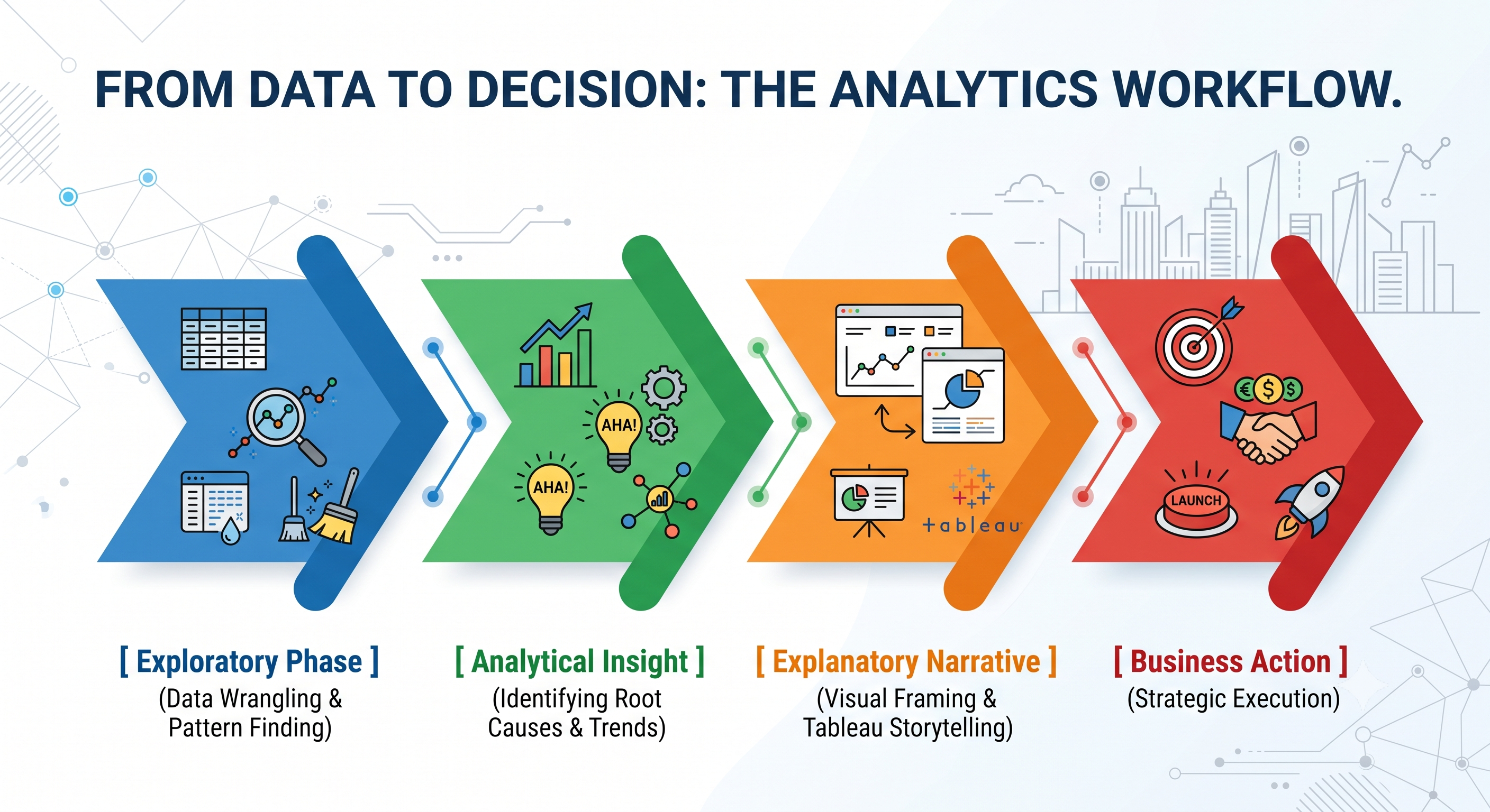
Tableau is frequently viewed as a simplistic dashboard tool – something that simply allows users to fill grids with bar graphs, line charts, and KPI cards. When utilized merely for reporting purposes, dashboards serve as information-rich but cognitively taxing repositories. Tableau is considered a medium for narrating stories, which provides users with the opportunity to construct interactive stories that connect data parameters with decision-making. Learning these techniques usually starts with attending an organized tableau online course for bridging the gap from basic chart-making to skillful business intelligence application.
The Basic Framework of Data Storytelling
A good data story is located at the point of intersection of three different fields – Data Science, Visual Design, and Narrative Building.
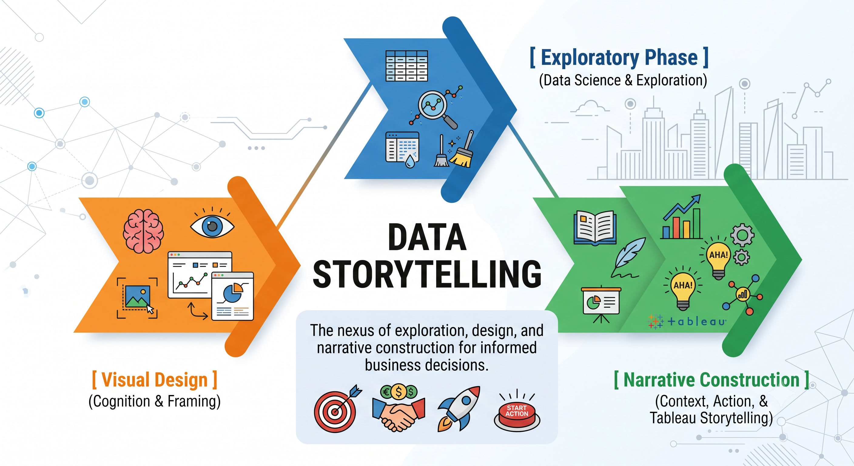
Data Science (The What): The information, its statistical legitimacy and the quality of analysis are the three pillars of data science. A story without sound data becomes a work of fiction.
Visual Design (The How): The use of principles of visual perception (e.g., preattentive attributes of perception and layout hierarchy principles) in order to communicate complex data.
Narrative Construction (The Why): The context for interpreting data into human perception.
Business intelligence adapts the classical narrative arc in literature
Classical narrative structure consists of the following five main parts: the Exposition corresponds
The Baseline serves the purpose of explaining who is involved in the story and in which aspect of it (taking the necessary KPIs, historical performance, and normal operation into account).
The Rising Action signifies The Tension; at this stage of the story, a conflict appears through the emergence of such concepts as margin contraction, churn periods, or delays in supply.
The Climax refers to The Insight; here is where the maximum tension in the story occurs through figuring out the real reasons for the situation, i.e. through using drill-downs, LOD expressions, or segment analysis.
The falling action shows the consequences of the scenario discussed in the case, which includes financial, operational, or market share effects if the issue remains unresolved.
The resolution advises what needs to be done to resolve the prevailing issue with the assistance of scenario modeling and the right steps to take.
Rule: An operational dashboard shows what’s happening while the data story explains the reasons and the subsequent actions to be taken.
Structure the narrative, considering the audience, goals, and hooks
Prior to starting a single row in a spreadsheet or moving the necessary measure into Tableau, it is necessary to determine the cognitive persona of your audience.

C-Suite (Executives): Short attention span, broad scope when it comes to strategy. What these guys care about are bottom line financial impacts, risk mitigation, and competitive positioning. So they need an inverted pyramid approach – always lead with the recommendation or conclusion and provide supporting evidence only when asked.
Operational Managers: Their approach is different with a very detailed focus and a process-oriented nature of thinking. They look at efficiency drivers, regional differences, and execution bottlenecks.
What does the term "So What?" mean?
Every analytical story should pass the so-called “So what?” test. An analyst who shares a chart stating that “Customer acquisition cost grew by 14% in Q3” will receive immediate feedback from the executive: “So what?”
To transform a raw observation into the narrative hook of analytical story, the observation should be recast in terms of business implications:
Raw Observation: “Customer acquisition cost grew by 14% in Q3.”
Narrative Hook: “Inefficiencies of paid search in European markets made costs of acquisition grow by 14% in Q3, which resulted in erosion of regional gross margins in the amount of $1.2 million. In order to recover 80 percent of this lost margin within 60 days, the budget needs to be reallocated towards organic.
Design Principles for Visualization with Tableau
It takes only a split second for us to notice visual information and take it in. The principle of good visual design is built on preattentive processing, meaning that we can notice different visual components before our mind starts to analyze them consciously. Knowing how to correctly implement these principles is one of the key aspects in any great online tableau course.
A. The Preattentive Attributes in Use
In data visualization, there are four most important preattentive attributes: color, size, position, and enclosure.
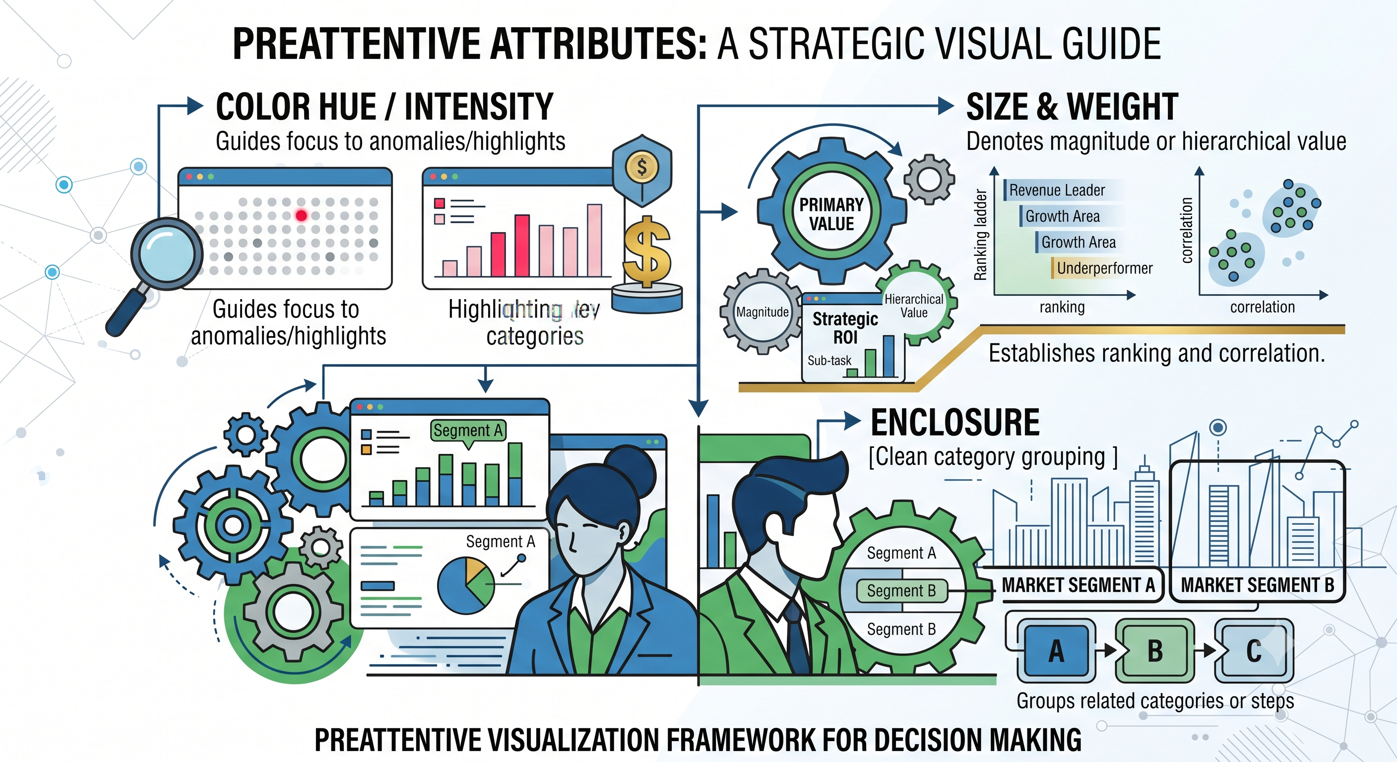
Color: Use neutral colors (grays muted blue) for background and baseline figures; keep saturated colors (deep blue burnt orange red) strictly for storytelling points.
Size: Scale marker sizes according to their intended meaning. A large item signifies a more important idea strategy-wise but not statistically.
Spatial Placement: Position the primary part of the story in the top left of the dashboard, according to normal reading method (F-shaped).
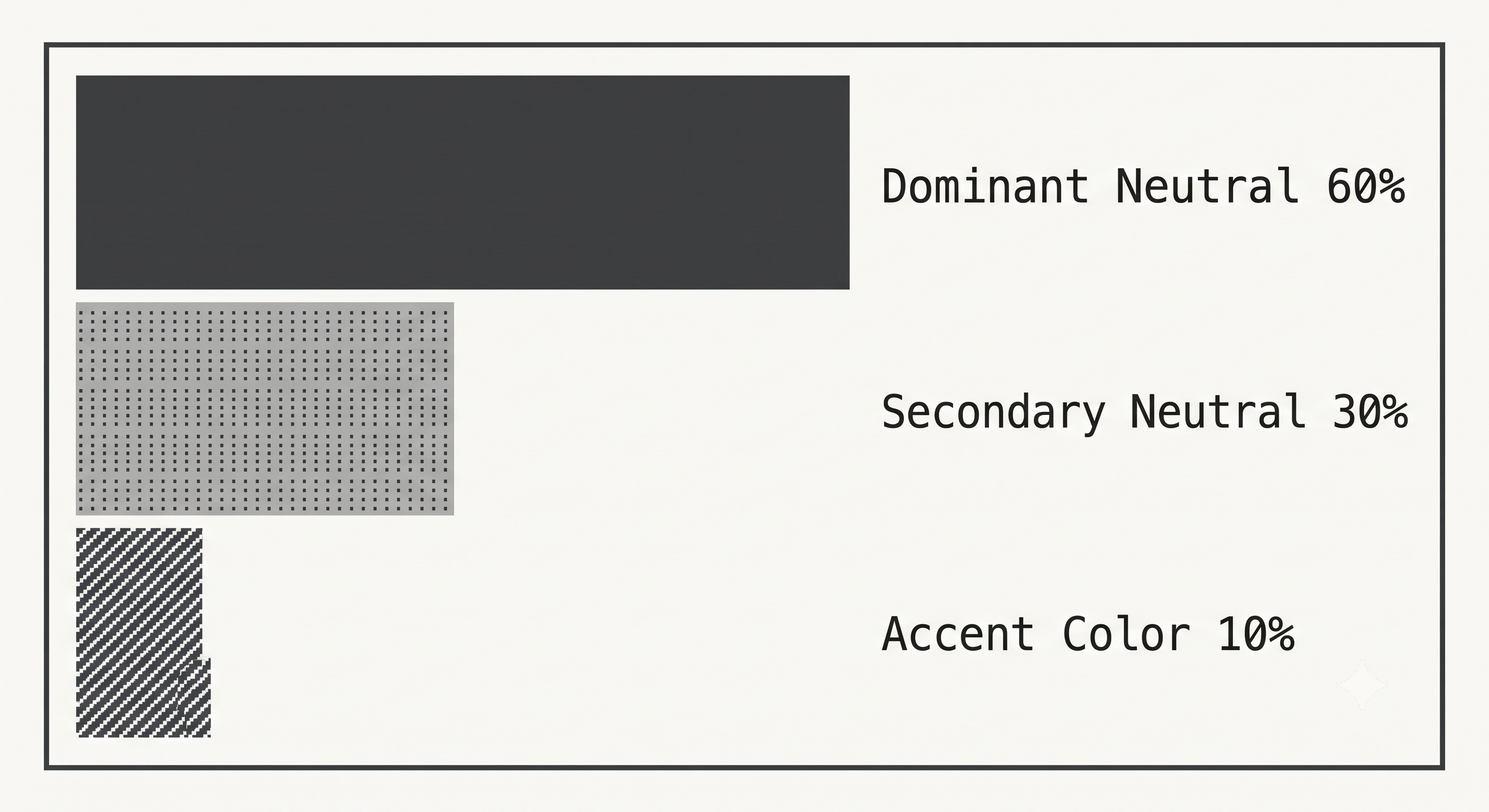
B. Strategy Colour Scheme (The 60-30-10 Principle)
The most common cause of eye strain when building a dashboard is the misuse of colour. Implement the 60-30-10 Design Principle:
60% Main Neutral Backgrounds, grid lines, axis titles, and container borders (grey, white, light black).
30% Minor Neutral: Data bars for construction, base line charts and historical reference (Gunmetal grey, dull blue)
10% Highlight Colour: The main point of the story – the deviation, winning sector, or target (Light blue, orange, dark red).
C. Guidelines for Selecting Narrative Charts
Different narrative patterns require different types of charts to communicate them.
Monitoring time series relative to benchmark requires the use of a combination chart (i.e., line chart with a reference band) that helps easily identify deviations in performance when compared with previous periods or projected values.
Breaking down input contributions is best done with a waterfall chart that shows how the outcome is reached step by step.
Representing ranking and degree of dispersion of categories is achieved with lollipop or slope charts that minimize visual clutter.
Depicting processes and structure is best done through a Sankey diagram or treemap that allows visualization of movement through several levels or through branching distributions.
Tableau Technical Playbook: Elements that support the Storytelling process
Tableau has several features that are especially useful for creating Guided and Explanatory visualisations.
A. Native Tableau Story Points vs. Interactive Dashboards
The two primary ways of story delivery offered by Tableau include:
1. Story Points- a multi-captioned container format similar to deck presentations. A “point” means a specific state of either an underlying worksheet or dashboard is saved.
2. Interactive Single- Page/Multi-Tab Dashboards- a visual canvas that facilitates the interaction of the audience with the narrative using action filters, dynamic parameters, or hidden containers.
Best Practices: Use Story Points for a linear presentation to executives, and Interactive Dashboards when introducing self-guided explorations to operational teams during weekly reviews.
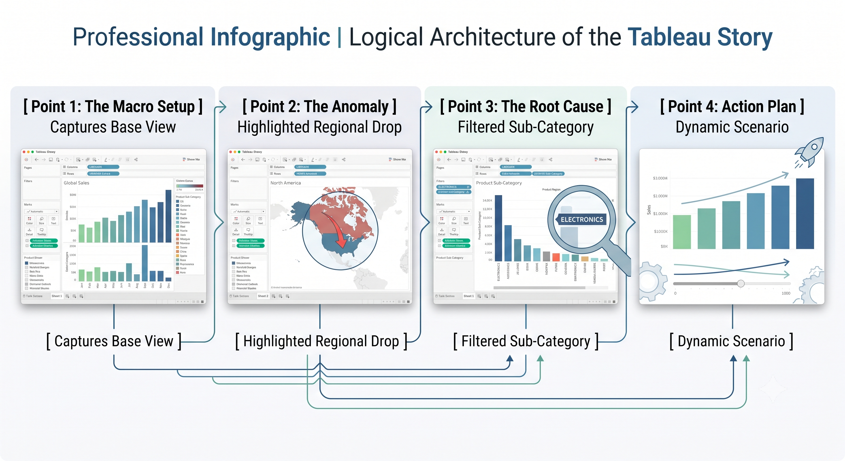
B. Dynamic Zone Visibility for Progressive
DisclosureThe problem of cognitive overload is a common challenge in dashboard design—too much information is displayed at once. Tableau has Dynamic Zone Visibility that can be utilized to either hide or show different containers based on parameters or user actions, creating a more coherent narrative experience.
Technical Implementation Pattern:
Create a boolean parameter called [Show Reason for Anomaly] (True or False) and prepare calculated fields to check the used action or option. Link the action to the Parameter Action in a way in which selecting a specific anomalous chart part turns the parameter into True revealing thereby an additional deep-dive chart directly next to it.
C. Using Level of Detail (LOD) Expressions to Create Narrative Baselines
When writing a data story, the story must be compared to a reference point that does not change. For example, "What does this reduction in the region tell us about the overall average for the company?" If the filters are applied as required, we will not have any aggregated data because we will lose the meaning of the data.
The LOD expressions are useful in forming story baselines without the need to worry about any filtering of the view. Since it is not easy to grasp advanced calculations such as FIXED, INCLUDE, and EXCLUDE, practical tableau training online helps one understand the practical applications of using these complicated expressions.

To determine how a certain area differs from the overall benchmark:

What this does is to guarantee that while users maneuver through various regional story filters, the national benchmark remains unchanged thus safeguarding the framework of comparison for the story.
D. Viz-in-Tooltip: Micromoments at Your Fingertips
Instead of producing a crowded canvas, use Viz-in-Tooltip technology to place tiny explanatory charts inside the explanatory big-picture tooltip.
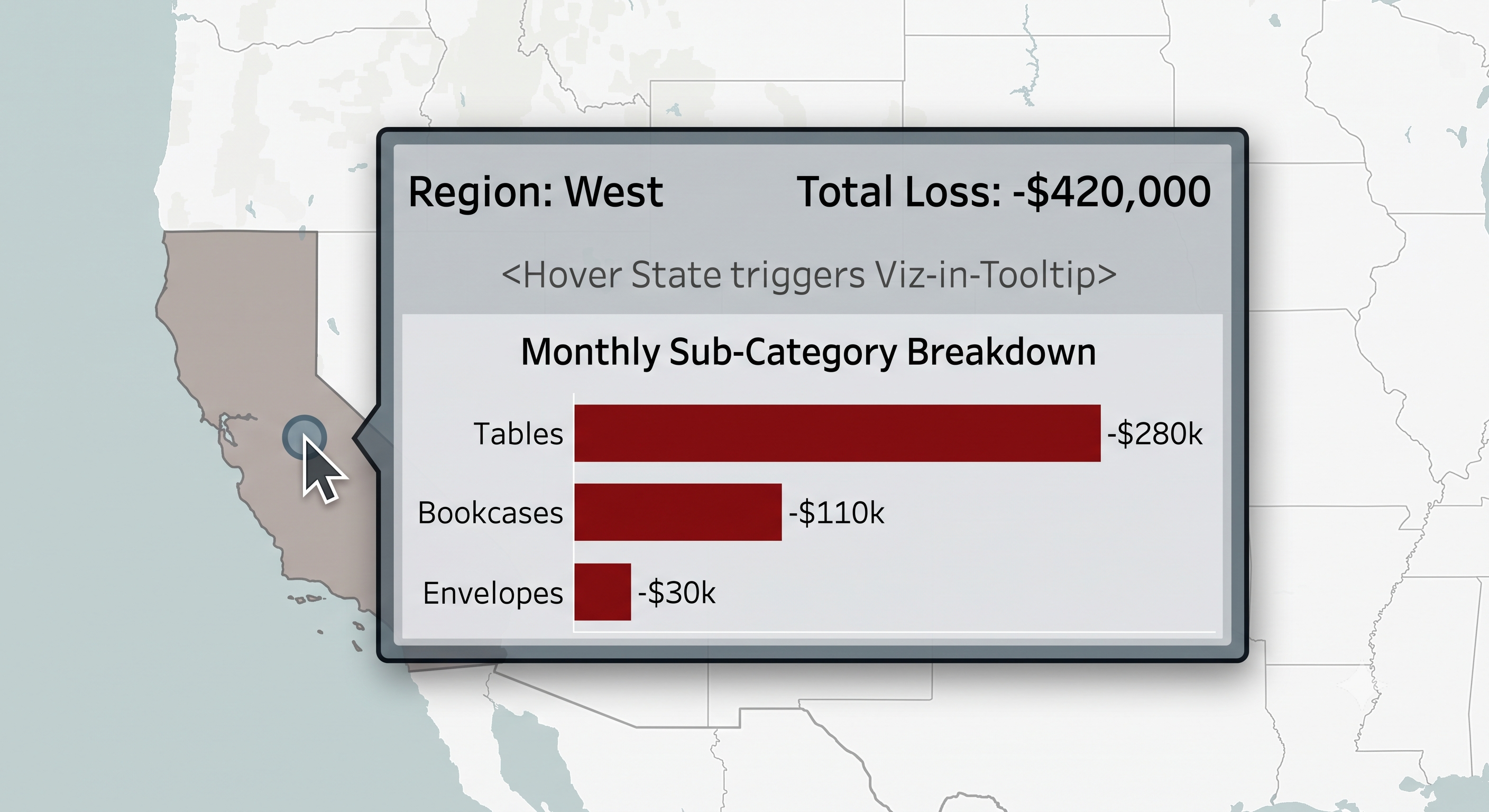
Understanding the steps of configuring Viz-in-Tooltip:
First, one needs to create a target worksheet which is detailed at a granular level (for instance, [Sub-Category Monthly Trend]).
Next, the original narrative worksheet should be opened, from which Tooltip has to be clicked on Marks Card.
Then, one must click on Insert ,Sheets, [Sub-Category Monthly Trend] and change the attributes max width and maxheight in the code string received.

Step-by-Step Guide to Creating an Executive Data Story
To better understand the process of creating an enterprise data story in Tableau, let us take an actual company’s example, as discussed below.
Context of Scenario Company: Global Supply Corp
Main Problem: Even though total sales have increased by 18% Year-over-Year (YoY), at the same time, net profit margins have decreased by 6.5%, which has raised concern among the executives.
Objective: To find the reasons for loss, explain the root cause, and offer the remedial measures to end users through Tableau.
Step 1: The Setup (Establishment of A Benchmark)
The first step consists of creating the executive overview that comprises the macro economic context of revenue growth and decline in profitability.
Macro Indicators: The revenue stands at $24.8 million (increased by 18% YoY), while Net Profit Margin has decreased to 4.2% (decreased by 6.5% YoY).
Movement Per Month: Revenue moves up from $1 Million to $3 Million, Profit Margin falls significantly during January-June period.
How in Tableau : The Dual axis Chart was used to chart Revenue (on Line) against Profit Margin (numbers shown as bars).
Step 2: The Analysis (Gap Identification in the Area)
Map Geography & Soul in order to understand where the areas of profitability loss lie.
Summary Regional performance:
East Region produced sales of $8.2M and made profits of $1.1M (+13.4% margin).
The West region was profitable with the sum of $0.9M (+12.0% margin) for sales of $7.5M.
The sales of the Central Region were in the sum of $5.1M and the profit amounted to $0.4M (+7.8% margin).
The South region had sales of $4.0M but made losses in the sum of $0.6M (-15.0% margin).
Tableau Mechanics: Highlight Table or Map visualization with custom Diverging colour palette centered at 0% Profit Margin.
Step 3: The Peak Point (Identifying the Root Cause Using Visualization Tools)
In order to find the exact reason behind the losses faced by the South Region, it is important to identify the key factors leading to the problems felt in the operations of the business: Discount Promotions and Expenses related to Transport Shipping.
Discounts Ladder Breakdown (The South Region):
No discount applied: Sales created in the sum of $1,200,000 and profit in the sum of $240,000 (+20 percent margin).
Standard Discount applied below 30 percent: Created in the sum of $1,500,000 in sales and +$100,000 in profit (+6.7 percent margin).
Aggressive Discount (over 30 percent): Generated $1,300,000 in sales, but resulted in a loss of $940,000 (-72.3 percent margin), which helps to identify the main reason for troubles.
How to Manage Tableau: Create a scatter graph by placing Discount Rate on X-axis, Profit Margin on Y-axis and Number of Orders on Mark Size. Add a mean trend line showing the negative slope of the graph which has its lowest points reached at the point at which discounts increase over 20 percent.
Step 4: The Solution (Scenario Modeling and Suggestions)
Instead of concluding with a static diagnosis, use the What-if Scenario Model with the help of Tableau Parameters, which will enable executives to test solutions live during the meeting.
Scenario logic
Explain a variable that allows the executives to set a discount threshold from 0% to 50%, having the default value of 20%. Demand elasticity will be calculated algorithmically, based on the premise that discounting limitation leads to a decrease in sales by 10% and margin increase.
Financial consequences of the proposed solution will be: The South Region will be able to turn the current negative performance of -$600k into positive result of $320k using 20% discount limit variable and thereby obtain the financial gain of $920k.
Tableau mechanics: KPI Summary card. The story shows a smooth transition from the problem of $600k loss in the South to an actionable policy of putting the discount cap at 20% that created the $920k difference.
The Issue of Presenting Data Effectively
Even the best professionals fall into the traps of effective data presentation:
Kitchen Sink Dashboard Trap
Mistake: Squeezing every conceivable KPI, pie chart, and filter into one view due to concern about missing any details regarding the data.
Solution: Follow the rule of having a maximum of three main questions answered in a dashboard view. Provide additional context through the use of sub-tabs and Viz-in-Tooltips.
Too Much Visual Friction
Mistake: Keeping the default gridlines, too many axis ticks, borders that are too thick in the chart, and unnecessary data labels.
The Correction: Set the formatting on the spreadsheet in order to get rid of the elements that are not needed. Change the background gridlines and zeros to none or light gray dots, eliminate duplicate title entities when the title is enough to show the message and remove the field labels for columns/rows when the name of the category is very clear.
Confusing Exploratory Visualizations with Explanatory Stories
The Mistake: Showing a complicated scatterplot matrix or network diagram directly to the executives and waiting for them to make some sense of it.
The Correction: Change the exploratory charts into clear explanatory visuals. Highlight the important data point with the help of color and add an annotation explaining the finding in simple language.
Calculating Data Storytelling ROI
To determine how successful your Tableau data stories are in your company, instead of looking at traditional BI usage statistics (like how many people visited specific pages, the loading time for the dashboard, maximum number of active users, etc.), look at the following measures:
Time-to-Decision: This is the time that passes from when the dashboard makes it to your senior management and when they finally approve the new strategy. The successful data stories reduce this time from weeks to just days.
Action Rate: This is the ratio of analytics that lead to some change in the operations of the company, including its policies.
Self-Service Alignment: This is the number of "follow-up requests" sent to the BI department to ask for definitions of some terms used in the reports.
Before releasing or showcasing your next Tableau project, verify your work against this production checklist. If you or your team want to continue improving these dashboard-building skills, completing professional online training in Tableau guarantees every report delivered follows executive presentation standards.
Narrative Blueprint Checklist
Prior to the act of releasing or showcasing the subsequent Tableau endeavor, check your work against the following production checklist:
Audience Framing: Is the founding question of the organization captured in the title of the dashboard?
Visual Hierarchy: Does the flow of the visuals progress in a rational and sensible manner?
Preattentive Color Focus: Is there intense color used for those data points that play the role of actors in the narrative created?
Baseline Context: Are the measures compared to both the past data and standards?
Decluttered Design: Have all the excess gridlines, the extra labels and junk been removed?
Explanatory Notes: Are considerable abnormalities occurring in relation to the data along with the text description?
Actionable Resolution: Is the visual a basis for a set of recommendations?