
Mastering Responsive Mobile Dashboard Design Using Native Tableau Device Designer
Last updated on Sep 23, 2026
Rethinking the Interface: How Mobility Changed Modern Analytics
Fewer than 50 years ago, business intelligence was almost entirely desktop-based. Data visualization interfaces were engineered as expansive dashboards with numerous charts, tables, parameter cards, and filters. Analysts designed the dashboards assuming that the executives would be consuming the information on similar desktop devices.
This assumption has become outdated. Today’s executives absorb business analysis data at the airport, while changing rooms at a conference, during lunch at the factory, or on their phones while watching a game. When an executive tries to access a desktop-oriented dashboard on his or her phone, the user experience fails completely. Pixelated scatter plots appear as an indistinguishable array of colored spots. Horizontal scrolling requires constant user effort to move the chart across the screen.
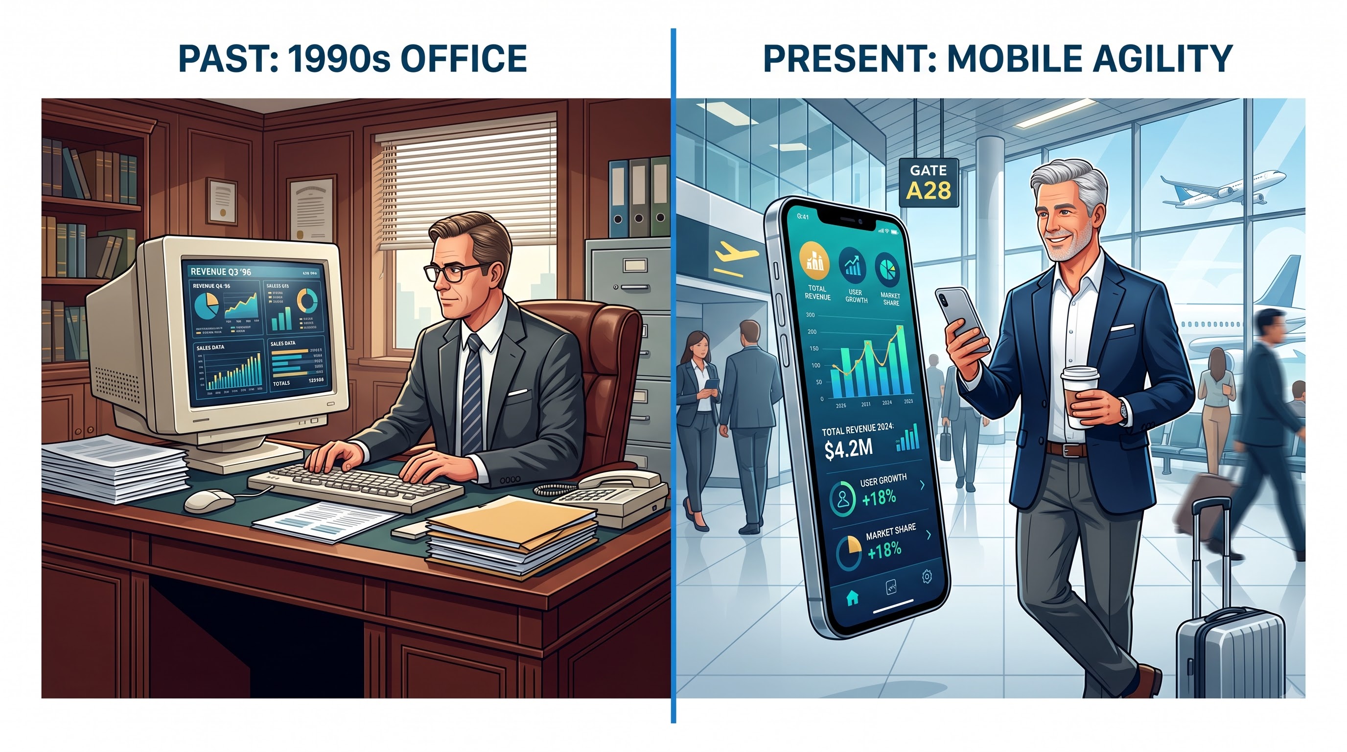
Workbook duplication was an inefficient and common historical practice. Analytical teams would make one workbook for desktop monitors, save another version of it with a mobile reference for smartphone users, and sometimes have a slightly different version for tablets.
Workbook duplication creates much technological debt and administration hurdles:
Overhead of Duplication Maintenance: All changes made in terms of company policies, calculation fields, styling templates, and sources of information need to be updated with changes being made separately in each workbook.
Users experience discomfort: Sending various links to users creates misunderstandings, the manager receiving one file on a computer will not be capable of copying the link and getting the same data on a phone.
Server bloat and resource issues: Storing unnecessary data and making copies of the same reports cause waste of resources and overload the server.
Spreading of reports: From time to time, a workbook gets a necessary update while its duplicate does get forgotten.
Tableau's Device Designer feature allows us to resolve this challenge in an effortless way. It is a unified solution where a single primary dashboard called The Default layout is taken as a basic architectural structure. From this one point, we can easily create customized responsive layouts for smartphones, tablets, or PCs all in the same file.
In order to take advantage of the Device Designer functionality, it is important to have more knowledge than just the menu options. This requires a change in mindset towards the mobile-first responsive design. Those who want to acquire these skills must sign up for a comprehensive tableau developer course. Professionals looking for the best training in tableau often turn to OnlineITGuru as a specialized platform that can help them connect basic desktop reporting with mobile-first analytics through their expert-led online training tableau.
Composition of Tableau Device's Designer
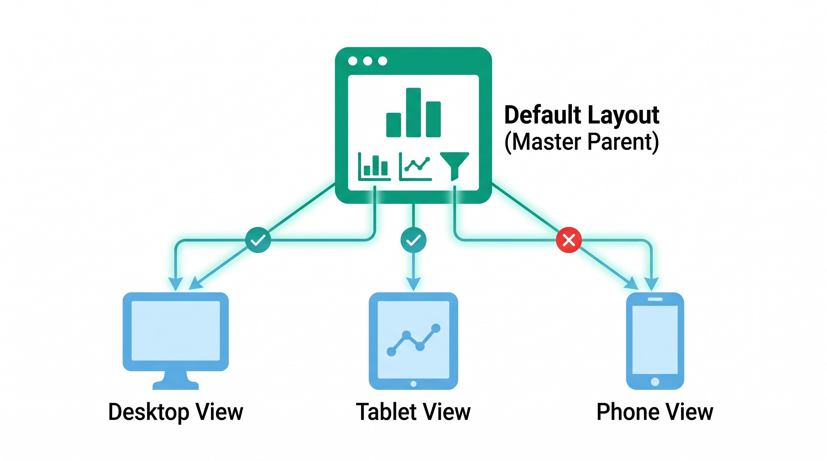
In order to make the best use of Device Designer without ruining your analytics, you need to understand its structure hierarchy first. The functioning of Device Designer is based on inheritance.
Default layout: Master Parent
The Default layout is not just the view which you see on your computer screen but also the overall base of all the visual elements, filter settings, parameters, actions, and data connections for this dashboard tab. Every worksheet, image, web object, text box, filter control, and parameter must exist in the Default layout first before they can be included in the specialized device layouts.
Should an object be removed from the Default layout, Tableau will erase it systematically from all layouts, including the layouts for Phone and Tablet. However, if an object is removed from a Phone layout, its availability will be only hidden from the specific device layouts but not alter the Default layout and master layout logic.
Due to this system-design dependency, professional designers view the Default layout as a basic master layout with all necessary analytical components for various devices.
Device-oriented layouts are three layouts adapting Default canvas
Once a dashboard is opened on Tableau Server or Tableau Cloud, the device will be discovered by the browser’s user-agent and its pixels. After that, the system will find the most suitable layout.
Desktop View: This is what you see when you view the site on a regular monitor, laptop, or wide enough browser.
Tablet View: This view applies for medium viewport sizes such as when assessing information on iPads, Android tablets, and slim convertible laptops.
Phone View: This view is triggered whenever the viewport falls in a smartphone-range width.
Tableau allows different device layouts as either default or custom.
The default device mode means that the full screen view will have a structure and layout that is identical to that of the master canvas.
The custom device mode breaks the relationship and allows any changes to be made with the arrangement of objects, removing unnecessary content, and adjusting the dimensions, while also ensuring that the desktop version is not affected.
The Philosophy of Mobile-First Analytics
Being truly responsive means more than just squishing an 80-character grid down until it fits on a screen; it means prioritizing the content.
An analyst using a multi-screen desktop setup has both the bandwidth of the mind and the screen space to examine large exploratory views, check high cardinality tables, cross-filter different metrics, and analyze small details upon request.
When using a smartphone, the nature of user intent changes completely: the interaction is geared towards transactions, real-time, and diagnostics. The user usually wants to answer the following three questions:
1. What is happening now?
2. Is it good or is it bad?
3. What exactly needs my action?
Mobile-first design means designing for glancing. It is about creating vertical hierarchy, using simple fonts, working with spaces, and making sure there is no unnecessary visual noise. When you think in a mobile-first manner, you force yourself to focus on the core of your message. Once this core is obtained, it is just a matter of expanding it to fit the tablet andPC styles.
A Stepwise Process: Making Use Of The Good Views
Making a full-responsive dashboard on various devices within one workbook is based on five defined steps.
Step 1: Information Planning and Inventory
Before beginning the actual work of placing raw information on the dashboard surface, you should first get the details of the used information.
Classify Visualization According To Their Use: Differentiate between the charts that are most important and need to be shown on all devices and those that serve the purpose of providing detailed information.
Design Worksheets That Allow Multi-Device Visualization: Create your charts considering the restrictions toward touch handling and space usage. For example, if you have long axis labels, make adjustments to make them visible.
Step 2: Creating the Default Layout
Since the Default layout is a parent container, take your time when developing it.
Set Fixed Dimensions: Set the Default layout to fixed height and width instead of Automatic dimensioning. Automatic dimensions may cause problems with rendering on different hardware platforms. Use standard fixed dimensions instead.
Make a Complete Show: Place all the intended sheets on the canvas. If you have created a simplified alternative of a plot for a mobile format, like a small sparkline instead of a dual-axis complex plot with many reference lines, then put that chart on the Default layout too.
Utilize Layout Containers Only: Do not disperse floating objects randomly on the screen. Construct your dashboard from a combination of horizontal and vertical layout containers. Layout containers create understandable hierarchies, prevent overlapping in variations of resolutions and offer a simple way to pass objects down.
Separate Worksheets for Phones (The Hidden Stage Methodology): If you have designed special worksheets for mobile applications, do not let them clutter the desktop view. Place them into a vertical container on the Default layout and make that container collapsible, or move it away from the screen to the less prominent area. This will still keep the visibility of the object in the master workbook.
Step 3: Activating Device Preview and Setting Up Desktop
From the Dashboard pane located in the left sidebar, click on the Device Preview button. The control bar appears on the top of your canvas with an interactive selector for Device Type, Model, and Orientation.
Select the Device Type as Desktop and click on the Add Desktop Layout button on the right top corner of your screen.
The Desktop shows Default settings but as per organizational standards, you may have to set the size differently. Lock the view to ensure all global dashboard actions, hover highlights, and the filter linkage work perfectly.
Step 4: Developing the Phone Layout
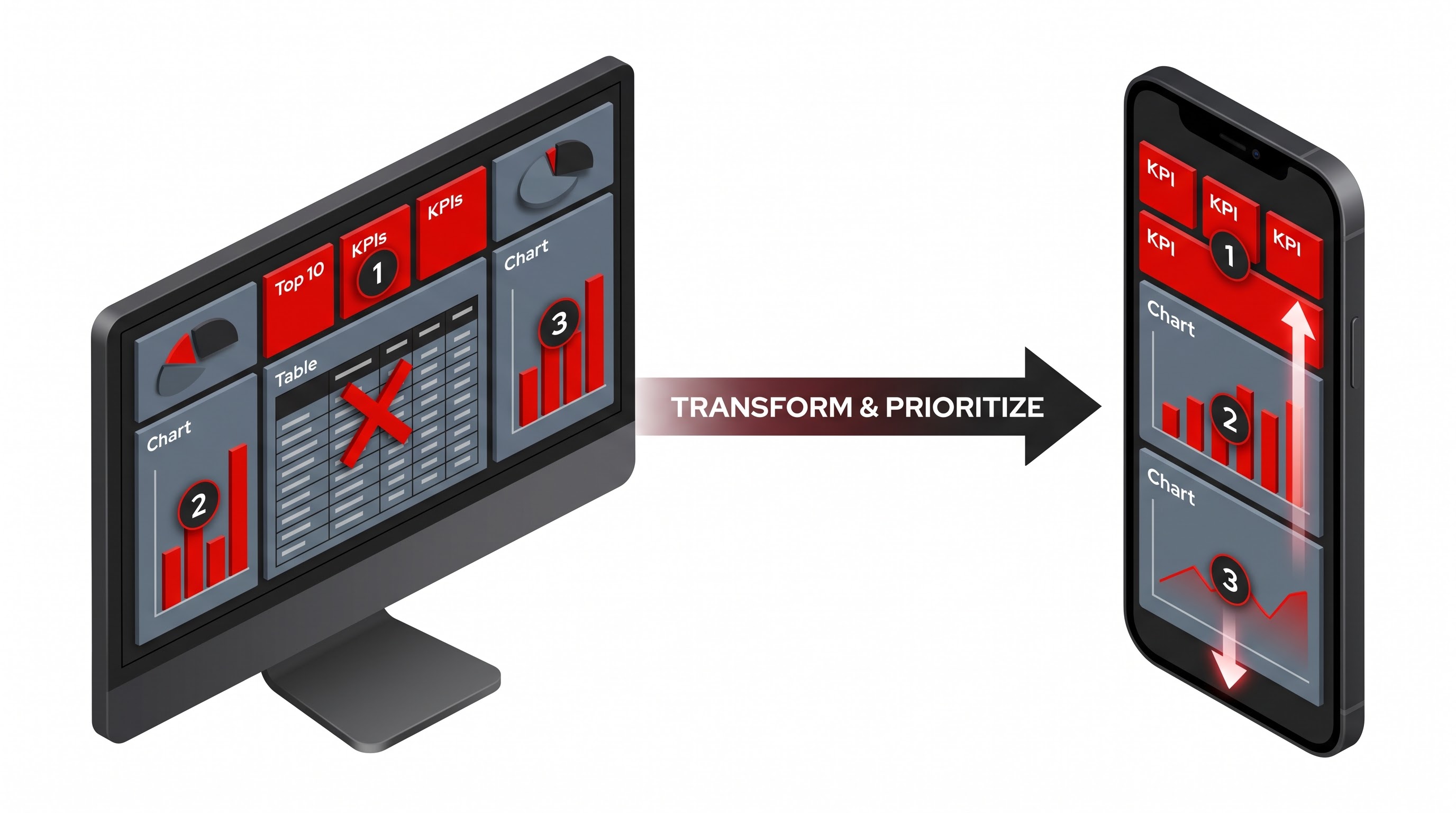
At this point in the process is where the real transformation happens: the creation of an interface made specifically for smart devices in a vertical format.
First, go back to Device Preview, select Phone under Device Type, and click on Add Phone Layout. Now check the left pane under Phone Layout settings; normally, this is set by Tableau to Default. Choose Custom from the setting, which will unlink the visual part allowing you to manipulate the objects as you like.
Set up your Canvas sizing: Click Fit Width in the phone layout size settings. Do not specify fixed height or fit the entire view; mobile users are used to and expect vertical scrolling. Using Fit Width makes sure the horizontal space is locked and no side-to-side shifting takes place while the canvas goes down.
Clean Up the Clutter: In the tree structure of the dashboard, you must identify those secondary charts, decorative dividers, scatterplots with high density, and informative text boxes that are not necessary. Click on one non-essential element at a time, and remove it from the layout. Note that removing it from the layout applies only to the Phone view but does not delete it from the workbook or default layout.
Put Them on Top of Each Other: The remaining objects should be arranged in a single and proper vertical flow. You should never place two charts that are side by side on a phone screen, as this will compromise the visual horizontal dimension of the images.
Change the spacing, both inside and outside the objects: Default computer spacing (usually from four to eight pixels around each container) may cause losses of pixels needed for mobiles. Select the containers and sheets in Phone layout to eliminate unnecessary margins that will help in making proper use of all mobile screens.
Stage 5: Developing the Tablet Layout
A tablet is a combination of two formats—the comprehensive analytical screen of a desktop and the narrative composition of a smartphone.
To proceed, locate the Device Preview panel, select the Tablet option, and choose Add Tablet Layout.
Change the orientation setting from Default to Custom.
Decide on Target Orientation: Unlike phone users who hold their phones in portrait mode for the majority of the time, tablet users have the option of using them in landscape mode, particularly when in meetings with people of importance or when using keyboard folios. Make sure both options work in the previewer.
Create the Modular Grid: Since tablets have enough width for two-column compositions, a good solution is to place the high-level summary cards with the major data line on the upper half of the screen and leave the bottom half for the two-column secondary dimensions.
Adjust the Touch Targets: Tablets have bigger screens than phones; however, they still require touch inputs.
Learning the Technicalities of Mobile Layout Design
Creating an effective mobile layout involves consideration of ergonomics, rendering technologies, and human behavior.
Designing for Touch Screens
A mouse pointer is accurate to within one pixel, while a finger affects a surface approximately forty to forty-eight pixels in size. Thus, mobile designs must consider how touch targets will be used by human fingers.
Avoid Using Hover: A desktop dashboard often utilizes hover to show tooltips, associate one visualization with others, or display certain statistics. Mobile OS does not work with prolonged hover states. Using a touchscreen, selecting a visualization also makes it show a tooltip, which may lead to wrong filtering or the appearance of the tooltip box blocking the visualized data.
Filter Positioning and Usability: On desktop devices, filters are usually found on either the right-hand side or at the top of the screen. However, on tall smartphone screens, trying to reach both top corners of the display requires difficult maneuvers with either one hand or both hands. When implementing global filters, ensure that they are easy to reach. It is better to use drop-down menus rather than multi-select lists, as they will not take up the entire vertical space of the screen.
Always Include Apply Buttons for Filters: The quick executing of filters on desktop browsers with constant connectivity gives users a sense of fluidity. However, on mobile devices, the use of mobile networks makes every finger press count as a server query and a redrawing event. For example, if a user presses three different filters one after another, the dashboard without the apply button will complete three successive server queries at once, which can lead to a freeze in interface.
The option of "Deactivating Pan and Zoom in Maps": A major annoyance of using mobile technology is the experience of a person trying to scroll down a dashboard only to accidentally place their finger on an embedded map. Instead of scrolling the page, one ends up panning the geographical view into the middle of the ocean or zooming in at an irrelevant place. To fix this issue in Tableau, go to the map settings of your mobile sheet and deactivate the pan and zoom options. Fix the map framing to the desired area and scroll the page smoothly through the map.
Hierarchy and Readability
A good mobile dashboard acts the same way as an expertly written article - it presents the headline first, followed by the background information and the details.
Basic KPI Presentation: Your phone layout should start with well-defined and large KPI cards that provide the main KPI with a small arrow indicating the movement of the value or its deviation from the target. KPI cards should not be cluttered by other metrics, marks, or complicated subtitles.
Simplified Chart Types: Use simple and understandable charts instead of complex charts. Horizontal bar charts are ideal for mobile screens because categorical labels can be read in the same direction as the chart. Continuous line charts successfully convey the idea without complex axes.
Addressing the Problem of Redundancy in Legends: Legends that states the colors, sources, and sizes take large horizontal and vertical spaces. Hence, whenever feasible, allow direct labeling on lines and bars instead of making the users’ eyes to move back and forth between legends and charts. If only one attribute is utilized, for instance coloring the bar in green for positive variance and in red for negative variance, place descriptions of the chart within the header of the worksheet or apply standard logic without having to use a legend.
Optimizing Performance for Mobile Devices
A dashboard that generates in two seconds when utilized in a fast connection disposal generates data for more than 10 seconds while being accessed using an unstable phone network. Performance optimization cannot be completed without improving performance.
Keeping the Number of Worksheets Low: Each worksheet used on a dashboard brings costs of executing queries, moving data, and displaying processes on the client side. Even if a desktop version can handle 10 or 12 worksheets at the same time, a mobile version cannot include more than three to five work views at the same time.
The process of Optimizing Extract Aggregations: While working on workbooks that will be utilized by different users in an organization, ensure that data extracts are where it is appropriate. Data that has been processed in advance is going to make your response times far quicker and your network payload sizes smaller.
Choosing Client-Side or Server-Side Rendering: Tableau is automatically able to make the decision about the level of rendering that can occur server-side or client-side due to the complexity of various visual marks. If the shapes are complex or consist of unprocessed data points, the rendering will take place server-side; thus, images will go through the network slowly.
On the contrary, adhering to basic visual marks and thus relying on summarized data will ensure quick and effortless visualization. It takes time to get the feel of how to combine performance requirements properly. If you would like to put your knowledge into practice to optimize dashboards within enterprise surroundings, then you need to attend a specialized tableau developer course. OnlineITGuru provides the best tableau training online, which will offer real-life projects along with in-depth pdf to assist you in improving your skills in desktop as well as mobile performance-synchronization techniques.
Common Pitfalls and How to Avoid Them
Even experienced authors face challenges while moving towards multi-device workflow. Preventing these mistakes ensures that you make progress in your projects and dashboards remain stable.
The Auto-Generated Trap
Whenever you switch on a phone layout, Tableau often thinks that it is helping users out by automatically generating a stacked layout based on your default view. This automatically generated layout puts each and every sheet, filter, parameter, and legend into one big column, which remains wholly unedited.
Many authors publish their projects at this stage believing that they have completed mobile-adjustment. The result is a huge confusing layout where a lot of scrolling through ugly filter cards and unadjusted legends is necessary. Always switch the layout option from default to custom. Treat the automatic position of Tableau as an opportunity to start something. Then curate the content, removing unnecessary items, changing heights, and adjusting padding.
The Situation of Broken Inheritance and the Problem of Unplaced Objects
"Since designs for devices are derived from the standard default draft, it is not uncommon for developers to make adjustments to their screens, but they are perplexed when the changes do not show up on the mobile device.
When you change the Phone layout to a Custom one, you move away from the inheritance of design coordination. When a new sheet is added to the Default Canvas, Tableau will not automatically modify the corresponding customization for the Phone device. Tableau adds the new sheet to its internal hierarchy of objects but leaves it out of the Phone design, so that the information is not muddled with the custom layout you already prepared.
In order to move the recently added object to a mobile screen, follow the steps given below:
Change the tab to Phone layout.
Locate the Layout panel on the left side.
Find the new sheet among the new gadgets (the one that has not been placed yet) or in the overall list of sheets.
Drag and drop it in your vertical container."
If you notice that changing a formula or changing the color of a marking on a desktop will also affect the view on a smartphone, keep in mind that formatting data in a worksheet is therefore linked globally. Changes in the original worksheet affect every device showing that worksheet. Only the arrangement of the layout, the visibility of the object, the size, and the structure of containers are kept separate by device.
Too Much Dependence on Floating Containers
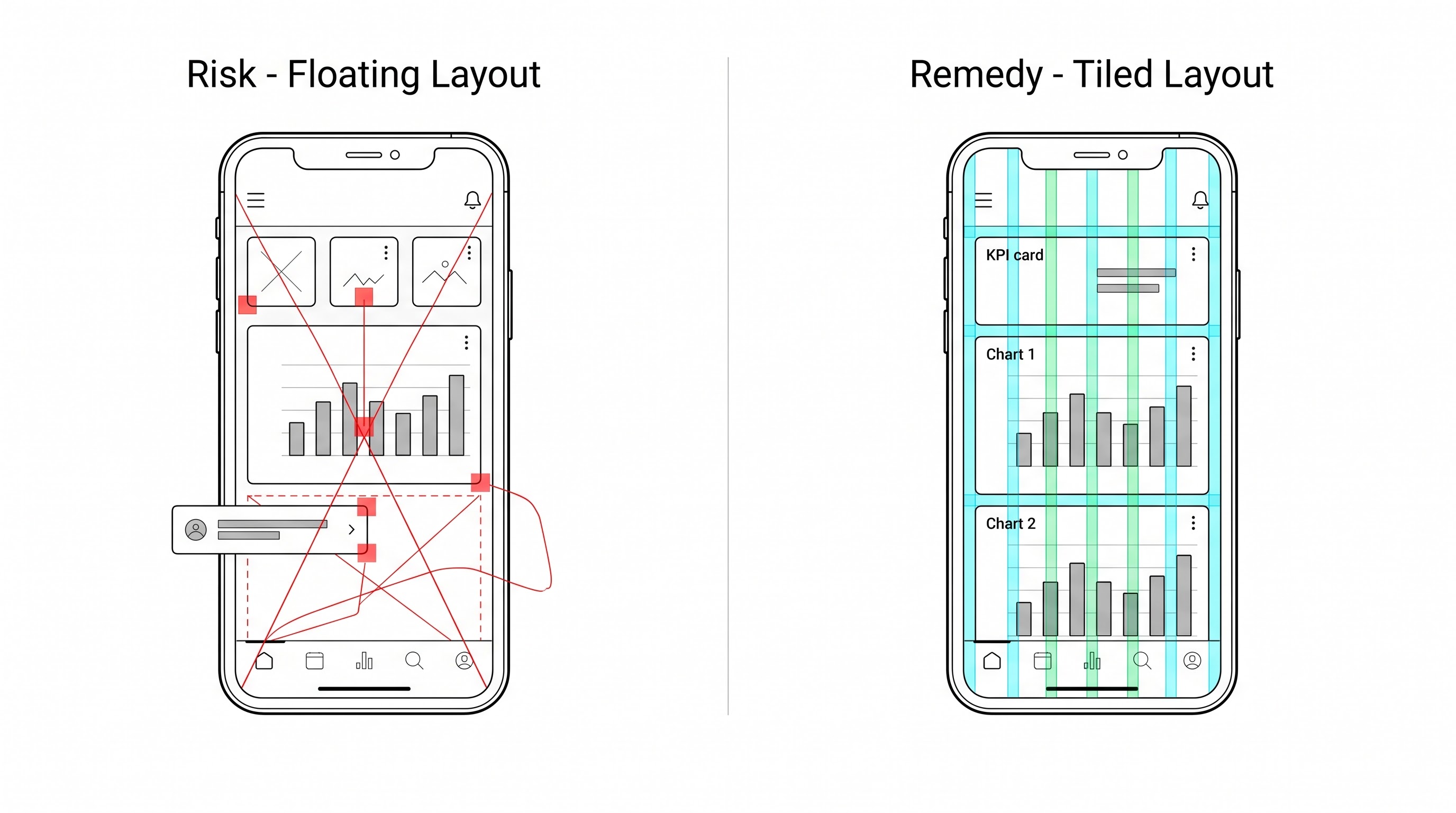
Floating objects can be handy when used for creating composition on desktops when the operator wants to have pixel-perfecting arrangement of images on the composition over background images.
Using floating containers on mobile screens is risky. Floating containers configured using absolute pixel coordinates can cross each other, block important text, or be out of the screen because parameters of smartphones differ widely in terms of resolution and aspect ratio.
It is always recommended to create a mobile layout using tiled containers. Tiled vertical containers expand and contract when the user scrolls vertically, while they also allow adjusting to changes in width of the smartphone screen.
Overlooking Font Size Differences
A typeface that looks clean and sophisticated on a 27 inch desktop screen may be hard to read on a high definition mobile screen. On the other hand, large section headers that might appear as a single line on a desktop monitor could end up spilling over to three lines on a mobile phone, thus rendering important visual information unseen.
When using the Device Preview option, scrutinize each text element, worksheet title, and axes label. If necessary, you need to copy certain text boxes, leaving one for the desktop format and preparing another short version specifically for the mobile format to be displayed.
In conclusion regarding the mobile-first Tableau design
When you make the dashboards adaptable and mobile-first, you take Tableau’s visualization capabilities beyond classic static digital publications and transform the charts into tools on an enterprise level. By mastering Device Designer, you provide endless opportunities to decision-makers for understanding data on any device and from anywhere. If you really want to be the master of adaptive dashboards, you might choose to improve your skills with a professional tableau developer course. No matter whether you are a novice or an experienced Tableau user, OnlineITGuru offers the industry-leading tableau online course that includes great online training programs that will help you gain expertise in the domain of data visualization.