
Mastering Tableau: Tableau Training Guide 2026 (From Zero to Certified BI Developer)
Last updated on Jun 29, 2026

In the contemporary digital world, data is often described as the new oil. But crude oil would be meaningless until it has been refined. In the same way, the vast volumes of data produced by companies on a daily basis would be meaningless without the proper means of processing and visualizing this information. Companies do not lack data but rather the ability to interpret the data fast enough to take action.
Spreadsheets and outdated reporting systems fall short when confronted with huge and multifaceted sets of data. They do not possess the capability of being flexible and agile enough to allow real-time decision-making. This is where Business Intelligence comes into play.
Including all these tools, Tableau is one of the industry leaders. It helps in the bridging of the gap between data and effective operations.
In this complete guide, all aspects of Tableau are discussed. It includes basic concepts, inner workings of Tableau, and architecture. This guide also contains the complete course map of tableau classes online at OnlineITGuru.
1. Tableau Definition: The Fundamental Framework
Fundamentally, Tableau is an innovative, dominant BI tool for Business Intelligence and data visualization. It gives the ability to connect to different data sources, combine complicated datasets and build interactive dashboards in no time.
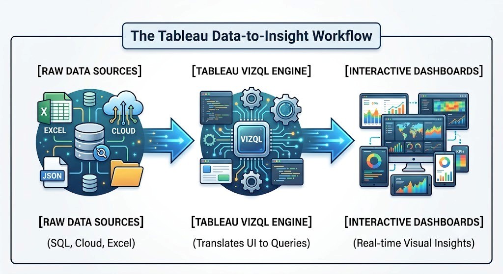
While other analytics software applications require extensive programming, Tableau makes use of the drag-and-drop mechanism. Consequently, Tableau allows data engineers and even those without technical skills to find patterns, make trends visible, and monitor KPIs.
Power of Visual Processing
In order to comprehend how powerful Tableau is, let us look at the key principle used in data science called Anscombe’s Quartet. Developed by the statistician, Francis Anscombe, in 1973, this quartet includes four different datasets that have similar simple descriptive statistics such as the mean, variance, and correlation coefficient.
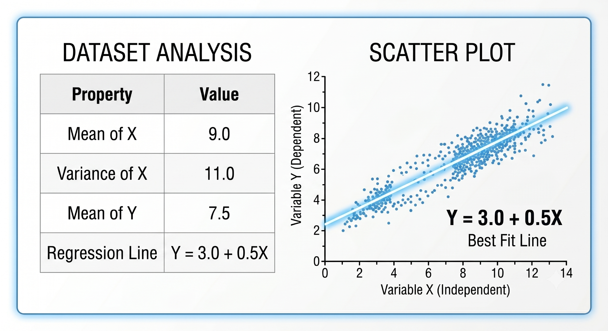
However, on plotting this data on graphs, there is a completely different picture seen. The first graph shows a straight line while the second graph shows a perfectly parabolic curve, the third graph a rigid line with one huge outlier while the fourth graph is a vertical cluster with one data point.
The quartet of Anscombe teaches an essential lesson about the nature of numerical summaries – they obscure rather than clarify the underlying reality of the data. It is precisely this that Tableau capitalizes on.
2. Why Do Companies Prefer Using Tableau?
Tableau's preeminence in the worldwide world of business intelligence stems from some technical strengths, including the following:
Multi-Source Connectivity: Tableau can natively connect to various sources, including flat files (Excel, CSV, JSON, XML), relational database tables (MySQL, PostgreSQL, Oracle), cloud data warehouses (Amazon Redshift, Google BigQuery, Snowflake), and web applications (Google Analytics, Salesforce).
Live vs. In-Memory Acceleration: Users have an option of connecting the data live using Live Connections or storing millions of rows in the In-Memory Hyper Extraction Engine of Tableau for quick sub-second querying.
Data Visualization with Intelligent Recommendations: The Show Me panel provides intelligent recommendations on what type of charts will be the most statistically valid for the selected dimensions and measures.
Geo Intelligence: Geospatial intelligence in Tableau is possible with geocoding that identifies countries, states, cities, and zip codes to form maps in one click.
3. Decomposition of the Tableau Products Suite
A data professional in the enterprise world should know how Tableau products interact within the data pipeline of the organization.
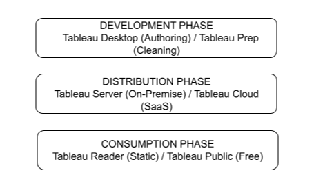
Tableau software suite comprises several specialized tools targeted at different environments and user personas during the entire data life cycle. Tableau Desktop is a desktop-native tool used for development and analysis which allows Data Analysts and BI Developers to create dashboards and complex calculated fields. Data Preparation is provided by another desktop-native tool, Tableau Prep, which allows Data Engineers and ETL Specialists to perform visual data cleaning, pivoting, and profiling.
When the time comes for enterprise deployment, one can publish dashboards either using Tableau Server—an environment running in the on-premise or private cloud for enterprise IT and management providing secure governance, automation, and sharing—or using Tableau Cloud—a fully managed Software as a Service (SaaS) solution hosted on AWS for agile and remote enterprises. To enable broader distribution, one can publish workloads in Tableau Public which is a free web-based environment for publishing and analyzing open data targeted primarily at students, journalists, and hobbyists. Finally, executives who simply want to look through published reports can use Tableau Reader, a desktop-native application aimed exclusively at opening and filtering packaged workbooks.
4. Under the Hood: Tableau Architecture & User Interface Overview
The power driving Tableau’s drag-and-drop feature is VizQL, which stands for Visual Inquiry Language. VizQL is Tableau’s own proprietary language that converts a user’s interactions with a visual representation into structured queries in SQL, MDX, or TQL depending on the backend database used. The process doesn’t require writing code.
Upon dragging a field to the canvas, VizQL analyzes your data structure and divides fields into two major types of data within the Data Pane:
Dimensions vs. Measures
It is crucial to know the difference between them for developing any Tableau model:
Dimensions: qualitative values that define characteristics of the dataset and that cannot be aggregated out-of-the-box. They are used to slice and dice the data set. The examples are Region, Customer Name, Category, and Order Date.
Measures: numeric value which can be calculated and aggregated for further calculations. They provide data for charts and graphs. The examples are Sales, Profit, Discount Ratio, and Shipping Cost.
Worksheet User Interface Navigation
The Tableau user interface contains operational areas known as Shelves and Cards:
Row and Column Shelves: The row and column shelves define the axis structure of your chart. If a dimension is added to the Columns shelf, it will result in creation of distinct vertical bars (X-axis structure). When a measure is added to the Rows shelf, the quantitative horizontal bars (Y-axis data marks) are created.
Filter Shelf: The filtering area in Tableau that helps limit the data used in your visualization. It allows filtering of data either by creating certain ranges for a measure (for example, Sales > $5,000) or choosing particular members of a dimension (for example, Region = North America).
Page Shelf: The shelf allows splitting one chart into multiple pages depending on a certain attribute (Order Year). It allows switching and animation over time.
Marks Card: The visual design area in Tableau. In Marks Card, by assigning some measures to specific attributes, you have an ability to influence your charts appearance Color: Connects data values with colors or color ranges.
Size: Controls the size of visual elements such as lines, bars or scatterplots depending on numeric values.
Label: Shows the data values in text form on visual elements.
Increases the level of details of your visualization without changing the number of rows and columns.
Tooltip: Determines the content that will be shown on hover over a certain data point.
5. Complete 12 Module Tableau Developer Course
In our Tableau Course at OnlineITGuru, we have carefully laid out a training process that will allow you to grow from a total novice to a highly experienced enterprise-level BI developer. Below is the complete step-by-step curriculum created by our experts in the industry.
🎯 Important: Want to be well versed in all the 12 modules through the guidance of industry experts? Go through our Weekend/Weekday Batch Timings & Fee structure at tableau online training.
Module 1: Introduction to BI & Tableau Basics
Basic concepts in Business Intelligence, Data Warehousing and Dimensional Modeling.
Tableau in the context of today’s data architectures.
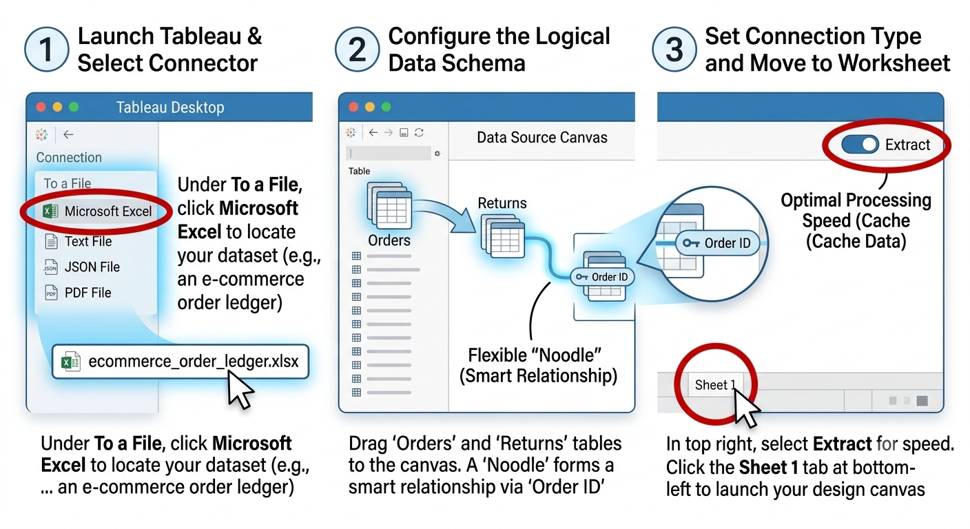
Connecting and setting up Tableau Desktop to work with native file formats.
This module provides information on the Start Screen, Data Source screen, and workspace environment.
Module 2: Data Connections to Enterprise Data and Data Architecture Creating connections with Relational Databases (SQL Server, MySQL) and Cloud Systems.Comparison between Live Connections and Cached
Hyper Extracts: Understanding the advantage gained from performance.
Pointers on Structural Changes: modifying metadata, renaming fields, changing data types, and aliasing.
Module 3: Data Transformation in Modern Times: Relationships, Joins, Blends & Unions
Modern Tableau Logical Layer (Relationships / Noodles) compared to Physical Layer (Standard Joins).
Setting up Inner, Left, Right and Full Outer joins.
Data Blending: Knowing the appropriate situations and methods for combining two or more data sources that vary in level of detail.
Structural Unions of two or more data sets having same structure.
Module 4: Basic Visualization Tools Creating basic charts through Show Me pane
Creating Bar, Line, Area, and Pie Charts
Tracking two different metrics during same time period through Dual Axis and Combo charts
Crosstabs, Highlight Tables and Heat maps for analysis of tabular data
Module 5: Intermediate Tools Grouping, Sets, and Filtering
Components of filters: Context Filter, Dimension Filter, Measure Filter, and Table Calculation filter.
Order of Operations (Tableau’s internal query evaluation sequence).
Static & Dynamic Groups for dimensional entities consolidation.
Dynamic Sets (In/Out evaluation) for cohort analysis & focus comparison.
Building structural Bins for numeric measures distributions & Histograms.
Module 6: Advanced Functions DAX is used in Tableau for Data Analysis. Numerous logical, date, numerical, and string functions exist.
The student also gains knowledge about type conversion and conditional logic with the help of IF-THEN-ELSE and CASE statements..
Learning about aggregations and row level calculations
Creating basic table calculations such as Running totals, % of total, YoY Growth.
Module 7: LOD Expression Master Class
Learn about the need of LOD Expressions when working with data that has multiple levels of detail.
FIXED LOD: Computing measures based on some fixed dimensions irrespective of the sheet's filters.
INCLUDE LOD: Computing aggregates along with some specified dimensions along with whatever dimensions are present in the sheet.
EXCLUDE LOD: Not including certain dimensions while calculating the aggregation in the sheet for specific percentages.
Module 8: Geographical Visualization and Advanced Visualizations
Setting up roles for geographic fields to create customized location maps
Creating Symbol maps, filled maps and density maps
Using custom background map layers, Mapbox, and Spatial files.
Creating Scatter Plots, Trend lines, Forecasting and Box Plots.
Module 9: Creating Enterprise Dashboards and Device Layouts
Combining several worksheets into an organized dashboard layout.
The course also covers responsive designs through custom layouts on any screen, including those on desktops, tablets, and mobiles.
Use of Tiled and Floating layouts.
Use of web objects, images, and dynamic text elements.
Module 10: Interactive Dashboard & Action Engine Implementation of Filter Actions for applying filters on secondary worksheets whenever there is a click on marks in the main chart.
Implementation of Highlight Actions for highlighting specific categories in the chart.
Implementation of URL Actions for opening either internal web pages or web applications from an external source.
Dynamic changing of dimension, measure, or cohort groups with the help of UI actions through Parameter Actions and Set Actions.
Module 11: Deployment of Tableau at enterprise level
Publishing of secured data sources and packaged workbooks
Setting up roles for users, the access right to different content and organization of sites
Automatically refreshing extracts through Tableau Bridge
Using security features like Row Level Security (RLS) to secure data on the basis of user's regional or group assignment
Module 12: Capstone project, Certification exam preparation, Interview preparation
Implementing capstone projects in the fields of e-commerce, finance, healthcare, and logistics
Preparation for Tableau Certified Data Analyst exam.
Resume writing sessions along with building a Tableau Public Portfolio and interview preparation.
2. Step-by-Step Tutorial: Creating Your First Performance Dashboard
To bring the theory and practice together, let’s have a look at the process chain followed by the developer to create an industry-grade performance dashboard.
Step 1: Connecting to the Data Source
Step 2: Develop Individual Analytical Charts
Here is how you should develop two crucial sheets which will be the basis for the dashboard.
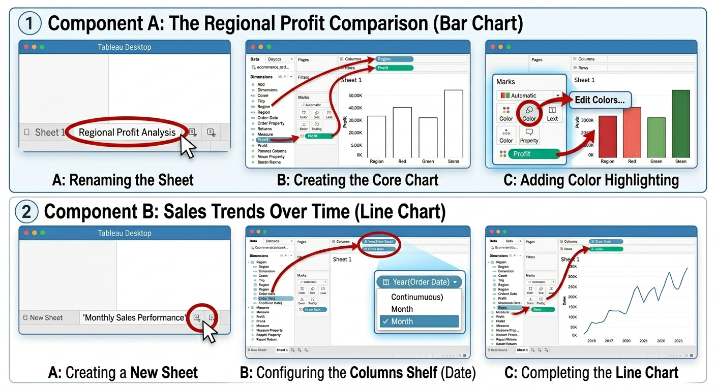
Component A: Regional Profit Comparison (Bar Chart)
Rename your current worksheet as Regional Profit Analysis.
Select the dimension named as Region from the Data Pane on the left and drag it onto the Columns Shelf.
Select the measure called Profit and then drag it onto the Rows Shelf. The program will create a basic vertical bar chart showing you your overall profits by region.
To color code this view, select the measure Profit from the Data Pane again and drop it directly onto the Color Property of the Marks Card. Select the Color property block, click on Edit Colors and pick the Red-Green Diverging palette.
Component B: Sales Trend Over Time (Line Graph)
Click the New Worksheet button and rename it as Monthly Sales Performance.
Drag the Order Date dimension onto the Columns Shelf. By default, Tableau aggregates dates as Year. Click on the drop down arrow next to the Year(Order Date) pill that is now available on the shelf and change it to continuous Month.
Now drag the Sales measure onto the Rows Shelf and Tableau will transform it into a basic line chart.
Step 3: Combine Worksheets into an Interactive Dashboard
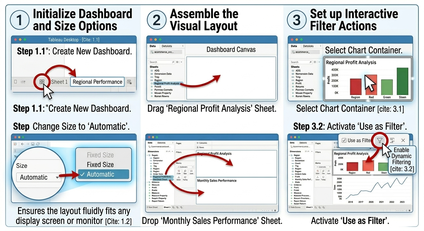
Initialize Dashboard and Size Options:Step 1.Select the New Dashboard button below the workspace. Change the setting under the left-hand side Size option from Fixed Size to Automatic. It is an automatic adjustment to your layout to fit any size of display screen or monitor.
Assemble the Visual Layout:Step 2.Click and drag your Regional Profit Analysis sheet from the Sheets panel located on the left side to the empty dashboard workspace. After that, click and drag your Monthly Sales Performance sheet to drop it close to the bottom of the dashboard workspace.
Set up Interactive Filter Actions:Step 3.Select the Regional Profit Analysis chart container on your dashboard. You will notice a gray border surrounding the selected chart. Click the funnel icon on the right-hand side of the menu inside the gray border
Enhance Your Analytic Proficiency: Creation of simple dashboards is just the beginning. For gaining expertise on advanced real-time data joining, customized mapping, and calculations with the help of live instructors, sign up for the Tableau Developer Course Program.
Preparing Your Training for Enterprise BI's Future
In order to distinguish oneself from other curricula on the BI training market, one needs more than just standard visual designs. Modern organizations require employees who know the ins and outs of the infrastructure platform, data management, advanced AI integration automation, and database performance tuning in real-time. By incorporating such enterprise modules into your curriculum offered by Online IT Guru, you are addressing the needs of enterprise IT architects, data engineers, and advanced analytics managers.
6. Advanced Enterprise Topics & Governance
The deployment of a BI system in its entirety within an organization demands highly advanced governance policies for server architecture, migration of assets, and stringent data security protocols.
Architecture of Environment & Deep Monitoring: With several thousand employees using active dashboards at one go, generic tracking metrics will fail to uncover key system bottlenecks. Corporate infrastructures depend upon highly specific monitoring systems:
Tableau Resource Monitoring Tool: This dedicated tool helps understand the impact of background processing on the physical hardware of servers. It constantly monitors the localized workloads of the servers, pinpoints slow queries of databases, and highlights memory constraints. Any drop in performance triggers automated alerts which are sent straight to internal messaging services such as Slack.
Insights for Admin & Data API for Platform: The data administrator working from the cloud can assess user adoption, monitor dashboard loading times, and monitor trends in platform usage throughout the company's cloud infrastructure.
Automated Content Lifecycle Management
Transferring analytical workbooks from sandboxes to staging and production environments manually involves the risk of substantial human error. For automating this activity, corporate teams make use of the Tableau Content Migration Tool. This automation software helps developers create automated and scheduled deployment workflows. It supports the re-mapping of permission settings, automatic updating of database connection strings, as well as the recalculation of localization of values without disturbing the dashboard structure.
Robust Data Security Policies
Deployment of data for enterprises requires strict security policies to protect corporate assets:
Customer Managed Encryption Keys (CMEK): Enterprises can employ their externally hosted cloud keys (for instance, AWS KMS or Azure Key Vault) to encrypt their local data extracts, totally eliminating the master encryption key from the standard Tableau file system.
Row Level Security (RLS) and Multitenancy: Robust user filtering ensures that whenever a regional manager accesses a worldwide report, he sees only the row level information pertaining to his region, leaving all the financial metrics totally invisible to him.
7. Tableau’s Future: The BI Tool of Modern Era of AI
Tableau has transformed from a conventional BI platform to a sophisticated one powered by artificial intelligence. Training on these new capabilities will help ensure that your students keep up with the times.
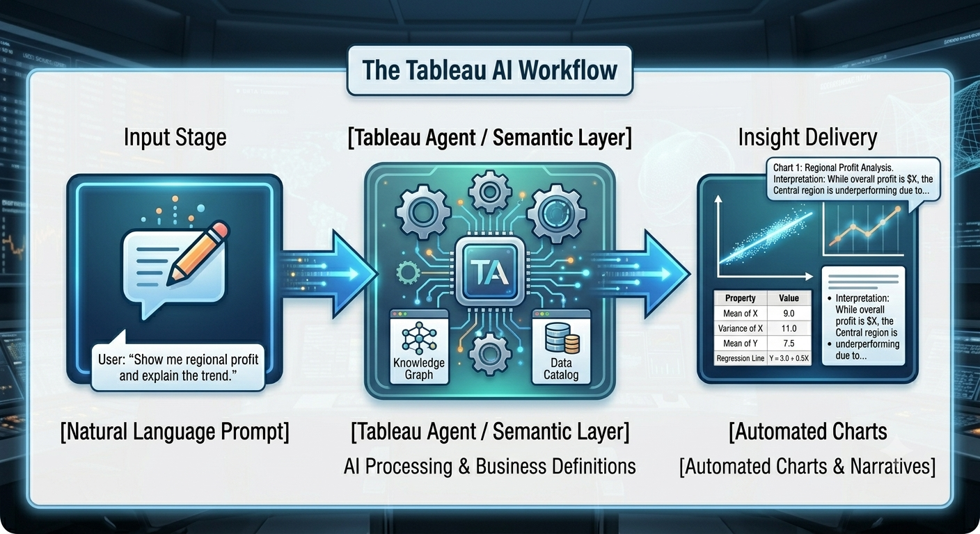
[Natural Language Prompt] ──> [Tableau Agent / Semantic Layer] ──> [Automated Charts & Narratives]
A. Tableau Agent & Conversational Analytics
Originally called Einstein Copilot, the Tableau Agent adds agentic AI to the very heart of the data preparation and analysis process:
In Tableau Prep: Data engineers can input simple instructions in natural language (for example, "Remove any outliers less than the 5th percentile and separate customer names"), and the agent creates the data cleansing logic.
In Dashboards: Business users can enter spontaneous queries in published views (for instance, "Why was there a decline in sales in the central region in the past month?") and the agent provides custom charts and textual explanation of the change.
B. Tableau Pulse and Semantic Intelligence
Tableau Pulse alters the way in which executives consume information by delivering metric updates directly to their communication channels based on priorities and personalization. This platform sustains the business context in the form of Semantic Learning Layer. Rather than doing standard mathematical calculations, the platform validates the information in relation to actual business goals and labels metrics as "On Track" or "Off Track" with paced summaries.
C. Composable Data Architecture
The rebuilding of schemas results in flawed data silos. Using composable data sources, authors can safely merge various published Tableau data sources into a new schema. Any modification done in an upstream master dataset will be cascaded through all composed datasets.
Conclusion
The move from data architecture solutions to corporate intelligence is not anymore a matter of luxury but a fundamental necessity for companies today. With solutions such as Tableau that are equipped with semantic intelligence, conversational AI and powerful cloud settings, the need for skilled individuals to manage and analyze company data becomes even more critical within the international market environment.
The training program offered tableau classes online for beginners has been designed specifically to fill this crucial gap in the industry. Through the development of practical workflows, enterprise administration and performance management, our participants will not only be skilled at using one particular software but will become real analytical problem solvers who can implement effective data policies for any corporation.