
Microsoft Power BI Enterprise Analytics & Architecture: The Comprehensive Reference Manual
Last updated on Jun 29, 2026

To be able to transform the business data of the corporation into a concise and high-performance analytical pipeline, there is a need to have knowledge about enterprise architecture, operational schema modeling, data security, and dynamic semantic processing. The technical reference guide, which is consistent with the power bi online training, provides a complete blueprint for the process.
1. Global Power BI Ecosystem and Power BI Deployment Architecture
In order for enterprise-level deployments of business intelligence, one must be familiar with how the flow of data occurs, processing boundaries, and the environment for staging the data. The Power BI system works as an ecosystem of applications and cloud-based engines.
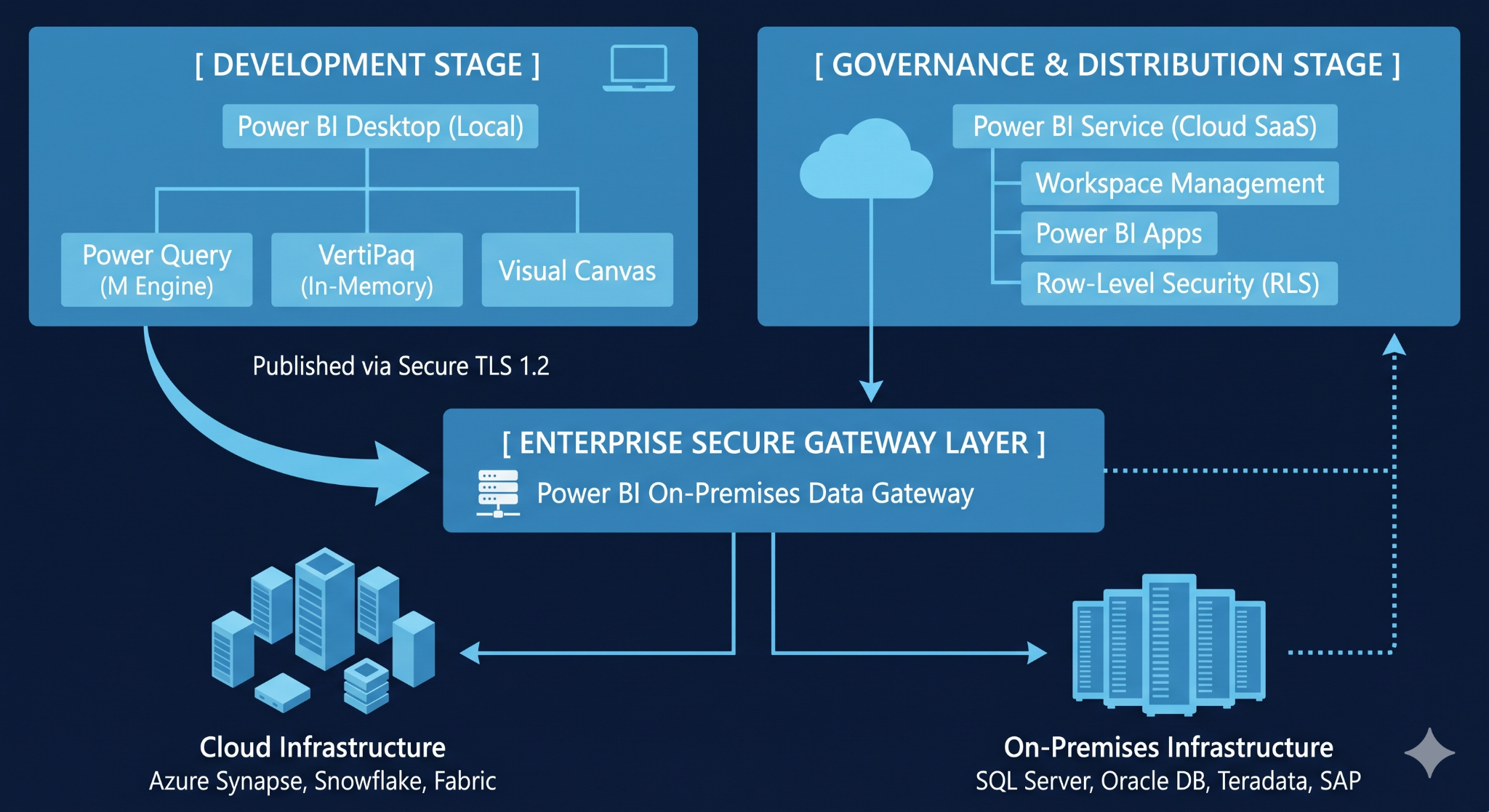
Power BI Architectural Subsystems
Power BI Desktop: The main application development environment for the developer. This is a multi-threaded development environment that contains three proprietary engines: the Power Query Mashup Engine, the VertiPaq in-memory database engine, and the canvas rendering engine.
Power BI Service: A cloud-based SaaS multi-tenant environment hosted on Microsoft Azure. This is the environment where analytical report rendering, automatic dataset refresh, and team workspace coordination are orchestrated through Active Directory integrated governance.
Power BI On-premises Data Gateway: A background Windows service hosted behind the corporate firewall. This makes use of outbound encrypted tunnels through Azure Service Bus in order to extract database data into cloud reports without the need to open any inbound ports on the corporate router.
Environment Management & Architecture Staging
Enterprise implementations create a segregation between development operations and business user activity through the use of isolated system environments:
Development Environment (Dev_Env): Isolated sandbox environment for BI developers to create data connections, define schemas, and develop raw DAX expressions.
Production Environment (Prod_Env): Highly secure environment with reviewed dashboards. Data consumption by business users is done only via Power BI Apps, a read-only environment that prevents accidental changes to design elements.
2. Data Ingestion Process: The Power Query Architecture and the Working of the M-Language
The Power Query Engine performs the Extract, Transform and Load (ETL) process in data preparation. All transformations performed visually are converted into an orderly form of code that is called the M-Language (Mashup Language).
Working of Query Folding
Query folding is the process by which the Power Query engine converts all transformations such as filtering, joining of tables, or changing column names into a single database query.
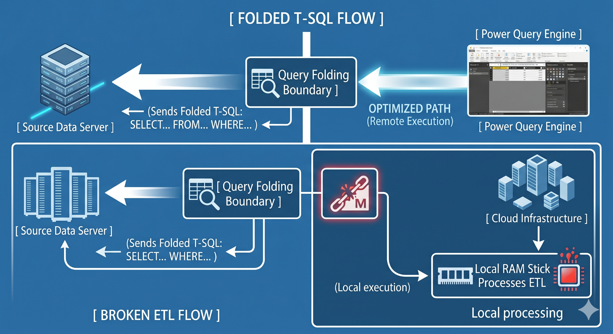
In case the step disrupts the folding chain, Power BI will have to download the whole, unfiltered and unprocessed data set into memory on the local machine for processing, which will lead to network overload.
Factors that Affect Query Folding:
Ordering of Operations: Try placing all the structural filters and column deletions at the very start of your query. This will reduce the amount of data transferred through the network.
Query Folding Blockers: Combining columns from different data types, use of custom JavaScript/Python scripts or certain string indices will instantly terminate the process of query folding.
Restrictions of Raw SQL: Creating an initial database connection via entering custom SQL into the connection wizard will lock the query pipeline, thus preventing further dynamic folding.
Production M-Script Template
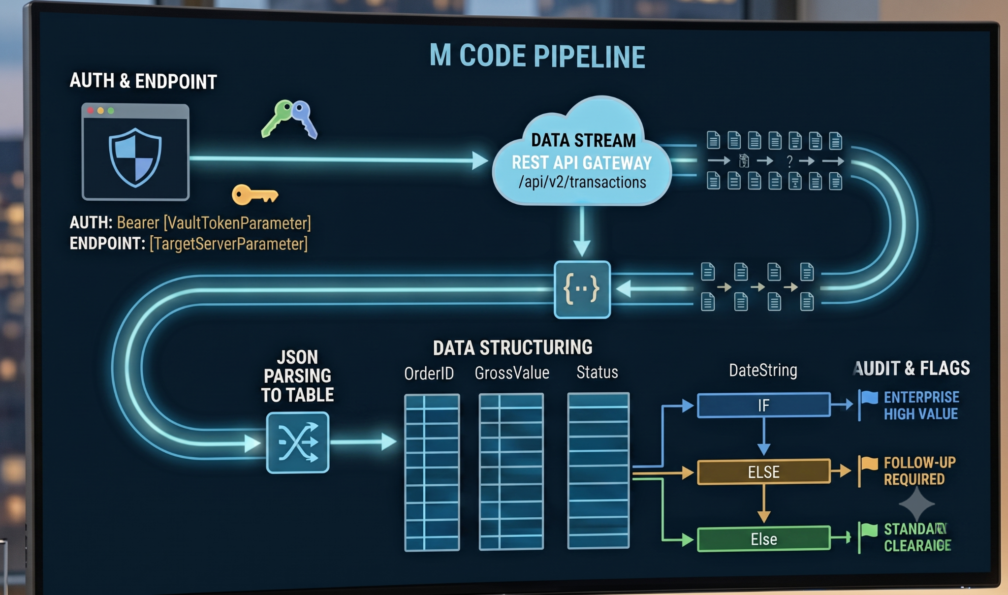
The following M-Script illustrates parameterization, data types, API header inclusion, and condition flags:
3. High Performance Relational Modeling & VertiPaq Engine
Data processing by Power BI is different from that of traditional transactional databases. Rather than the conventional process, Power BI uses the VertiPaq Engine, which is an in-memory, columnar relational database database management system.
Optimization for Star Schema
For efficient use of the columnar engine's compression technology, the data structure must be optimized into an explicit Star Schema. The data structure will contain two table categories:
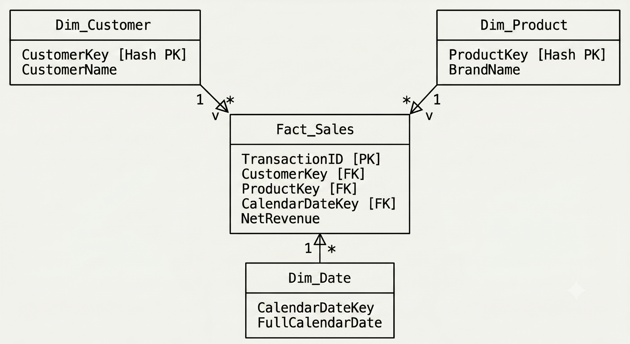
Fact Tables: Critical data structures housing numeric, historical transaction metric values (e.g., number of sales, cost amounts, count figures). This table consists of millions of records and will stay long, narrow, and numeric.
Dimension Tables: Tables consisting of textual attributes that are used to filter, slice, and categorize data (e.g., customer attributes, product levels, geographic locations).
Key Constraint: The relationship between the group of numbers of mid points of fact dimension and construct to \rightarrow $ through cross-filtering direction as Single. Never use both directions while linking primary entities as it can create confusion in relationships and model performance.
Data Compression Algorithms Used
VertiPaq databases use column-based data storage format, where the data is organized into columns rather than rows. In order to minimize memory used by large amounts of data, VertiPaq applies three data compression algorithms:
Value encoding: Values of the mathematical data type are encoded into the smaller sizes of data. For instance, if some column stores order ids starting from 10,000,000 and ending up at 10,000,500, only the difference between 0 and 500 is stored in memory.
Dictionary encoding: Unique string values are separated and placed into the separate list, while the main column is substituted by integer keys, which link back to the dictionary.
Run-length encoding (RLE): Sequences of the same data are compressed. As a consequence, for cases when 100,000 duplicate records ("Active") are present, one record will be overridden by the new record that consists of two values, which are the provided value and the number of duplicate records ("Active," "100000").
4. Blueprinting of DAX Analysis: Context & Architecture of Execution
Data Analysis Expressions (DAX) is the programming language used for calculation within the Power BI model. Efficient coding of DAX formulas calls for a clear understanding of the layers of calculations which determine the results.
Comparison of Structure: Calculated Columns & Evaluation Measures
DAX Context - The Two Pillars
1. Row Context
"The current row" idea. Row context appears automatically while creating a calculated column or using an iterator function (SUMX, AVERAGEX, FILTER). The row context goes row-by-row to calculate things but is unable to view other rows and apply filters.
2. Filter Context
All filters that are currently applied to a report visual. Filter context is formed by row/column headers, slicers, page filters, and filters from a report.
Context Transition
Context transition takes place when Row Context becomes a Filter Context. The context transition starts when an expression is put inside the CALCULATE function. CALCULATE function analyzes the current row, picks up its unique keys, and uses them as active filters for the whole data model.
The CALCULATE function evaluates the current row to find its key value and applies it as an active filter to the entire data model. Context transitions are discussed in detail in the power bi online training.
Enterprise Production DAX Code Blocks
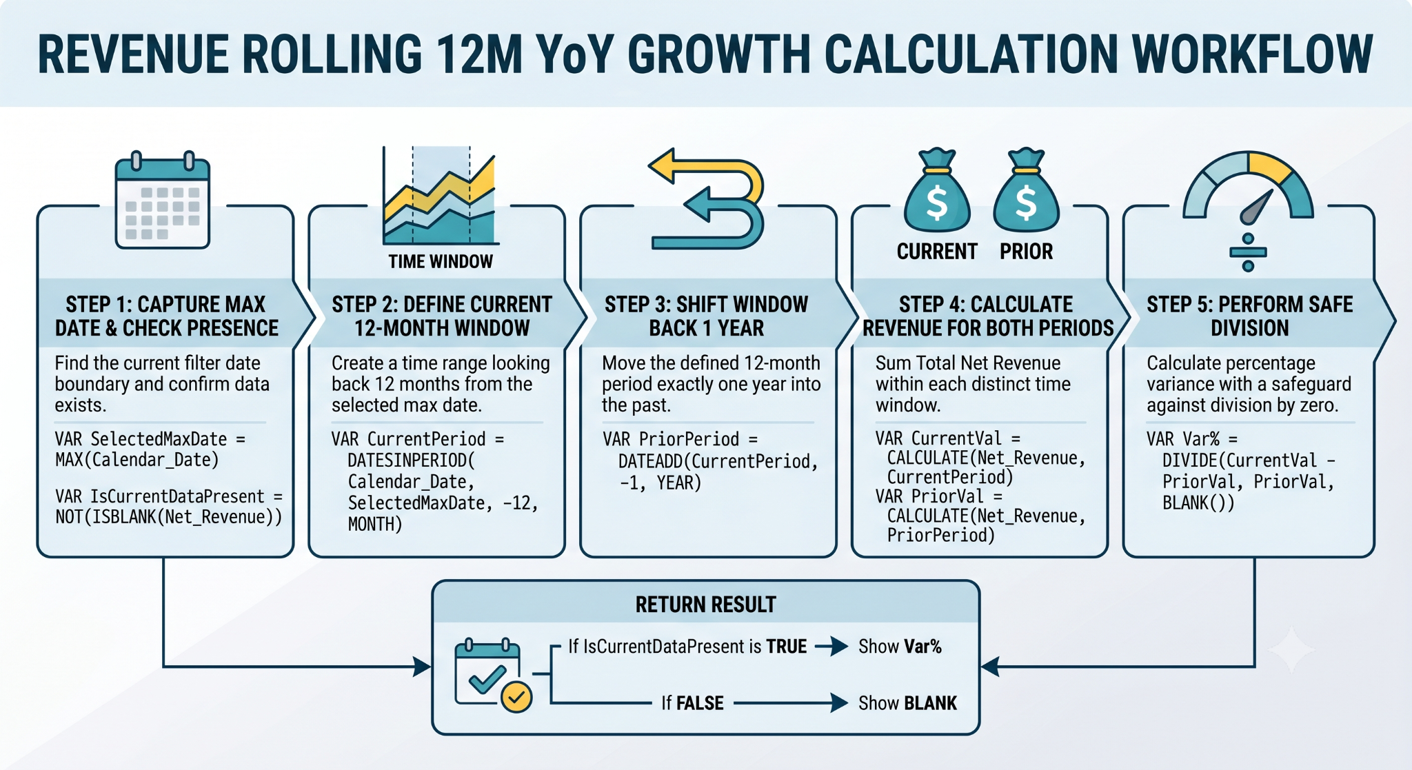
Pattern 1: Multiple Criteria Rolling Average and Control of Filter Context
The pattern below ignores the current layout of the report to calculate the 12-month rolling average of the transaction calculation.
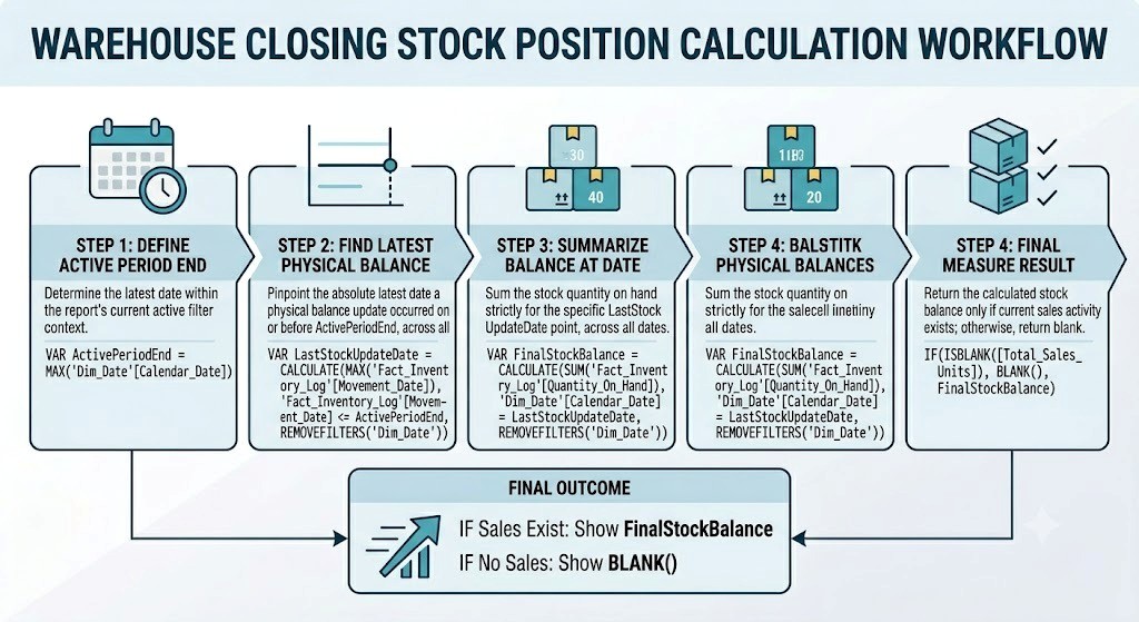
Pattern 2: Optimized Semi-Additive Inventory Balancing
The calculation of balance sheet ratios or inventory counts needs to find the absolute last day on which any transactions occurred.
Optimization Rule for Performance: Do not pass a whole table into the filter argument (like FILTER(Table, Table[Column] = "Value")). This would result in scanning all the rows and columns in this table. Instead, use the column of interest as an argument for your predicate in the CALCULATE statement: CALCULATE([Measure], Table[Column] = "Value"). In this case, the system will retrieve the value from the dictionary index of this column.
5. Enterprise Governance and Security Architecture
The roll-out of a BI solution to thousands of enterprise users involves strict control of data access and security.
Dynamic Row-Level Security (RLS) Approach
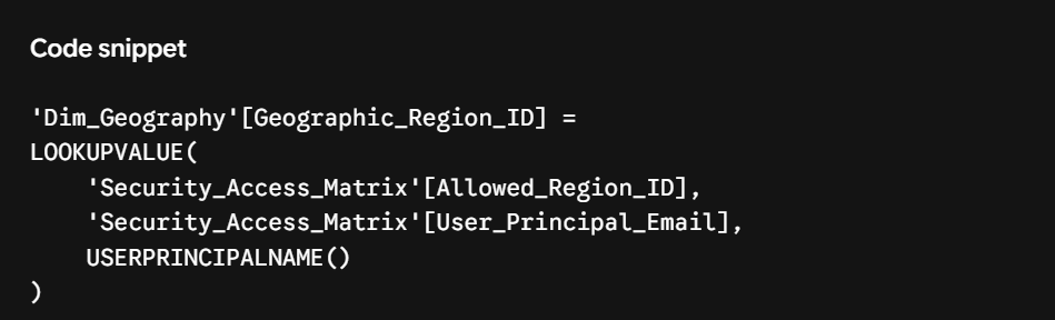
Instead of creating different versions of one dashboard for various teams worldwide, opt for a dynamic row-level security (RLS) approach that will enable you to control access permissions from one master dashboard.
For implementing this security design pattern, generate an operational mapping table (Security_Access_Matrix), which will link each employee user to its corresponding data key. Further, implement the below-mentioned filtering condition within Power BI's Manage Roles:
6. Business Intelligence Report Types in Production
A business intelligence environment provides reports for various user groups whose needs differ in the manner of presenting the information. There are several fundamental types of reports in Power BI, which can be used in a business context.
1. Interactive Reports
Target Group: Business analysts, line-of-business managers, operations group leaders.
Basic Components: Based on a typical fluid canvas in Power BI Desktop (.pbix file format). Utilizes cross-filters, slicer synchronization, and tooltips. Allows clicking on a data point in a particular chart to apply filters on all other visuals on the page.
Primary Dataset Type: In-Memory Import or hybrid DirectQuery.
2. Paginated Reports
Intended Audience: Financial auditors, regulatory compliance team members, operational dispatch personnel.
Mechanics: Built using the Power BI Report Builder standalone design tool (.rdl file). Such reports are specifically designed to print well or be exported into PDF/Excel format, and include exact rules for page size and run into thousands of lines without being cut off.
Main Data Source: Predefined parameters are linked directly into the company's relational tables.
3. Analytical Reports
Intended Audience: Data scientists, corporate strategists, forecasters.
Mechanics: Highly visual data exploration techniques such as scatter charts with clustering, trend lines, and intelligent decomposition tree.
4. Optimized Mobile Reports
Intended Audience: Service personnel, sales force, executives traveling.
Mechanics of Operation: Defined in Power BI Desktop through the Mobile Viewport. Charts are arranged in a vertically oriented one-column layout that can be easily navigated using the native iOS/Android apps.
7. Enhanced Interactivity: Bookmarks, Selection Windows, and Visual Synchronizations
In order to provide flat dashboards with a sense of app-like behavior, designers need to have skills in navigation techniques.
App-like User Interface Navigation Using Bookmarks and Selection Panes
A bookmark allows you to save the exact state of the report page—filters position, slicers placement, and visuals visibility.
USER CLICKS DESIGNATED SIDE-PANEL BUTTON
▼
Selection Pane Logic Triggers via Bookmark
Toggle Slicer_Panel Container: Visible (True)
Toggle Main_Bar_Chart Object: Hidden (True)
▼
Report Canvas Re-renders Application UI State
Step by Step Implementation of the Toggleable Slide Out Filter Panes:
Create a panel having a typical shape on your canvas and add your desired slice filters within that panel.
Now put all these elements within the Selection Pane and name it as Slicer_Panel.
Open the Bookmarks Pane and make a new Bookmark under the name Show_Filters. Make sure to specify Selected Visuals as the scope of configuration target in order not to get affected by global chart selections.
Make the Slicer_Panel visible, select all parts of this panel, right click on your bookmark and click on Update.
Make the Slicer_Panel invisible and create another bookmark named Hide_Filters.
An image button can be created in your canvas, which has direct actions associated with the bookmark options. Thus, your end-users have an easy toggle control for the visual interface.
Slicer Cross-Filtering & Synchronization Rules
The basic rule is that when a slicer is placed on the report page, it filters all visuals available in the canvas. In order to change this rule:
Interaction Editing: Select your primary control slicer and go to the formatting menu and click Edit Interactions. You will see icons above all visuals in the canvas, which will allow you to select whether this particular visual filters or ignores the selected slicer.
Synchronizing Cross-Page Slicers: Access the Sync Slicers configuration window. Using this menu, you will be able to connect one slicer choice on several different report pages at once, ensuring users get a uniform filter experience while exploring the data set.
8. Dynamic Structuring: Static Lists vs. Numerical Binning
If your data model doesn’t have required descriptive grouping categories, you will be able to create column buckets using the structure layer.
Static List Grouping
Execution Step: Right-click an already present text field (for example, CountryRegion) from the fields data column list and then select New Group. Instruct Power BI Desktop to use List as a group type.
Scenario: Creating sales groups for different countries in one region (joining "India," "Singapore," and "Japan" as APAC_Region). This application give you an additional proportional column without any changes of M-code.
Dynamic Numerical Binning
Rule of Execution: Right-click on a numeric field like (Customer Age or Transaction Amount) and click on 'New Group'. In the configuration settings for the new group, select the bin option.
Sizing Options
Bin Size: Set the size for the bins (e.g., 10 bins per age group). The Power BI application will divide the data provided by the user into sequential bins (0-10, 11-20, 21-30).
Number of Bins: Click on 'Number of Bins', and the system will automatically determine the maximum and minimum values.
9. Advanced Visualization Configuration: Layout Properties
Visual selections and formatting play a pivotal role in developing clear and easy to understand dashboards for decision-making by the stakeholders.
Chart Selection Criteria
100% Stacked Bar/Column Chart: Do not choose this visual type for the purpose of complicated product comparison. Rather, employ it in part-to-whole categorical representation on static time periods (for instance, monitoring monthly market share ratios).
Matrix Visuals: This visual is similar to the pivot table but more sophisticated one. This type is mandatory for financial reports and audit logs since it helps expand row groups without distorting totals.
Scatter Charts with Play Axes: This visual shows changes in the correlation over time. It becomes possible to insert a date field (like Calendar Year) into the Play Axis field slot; then the user will be able to press the play button to observe movement of data bubbles through the chart grid.
ArcGIS Maps & Filled Map Visuals: This visual type is good for geographical plots. Be sure to categorize all location fields under the modeling ribbon tab (marking them as text, like City, State or Country) for achieving geocoding precision during cloud rendering.
Visual Properties for Advanced Configuration
In order to achieve the highest level of professionalism in visual designing of your dashboard:
Types of Join (Round, Bevel, Miter): Alter the properties of how corners should be rendered for your borders and trend line points in accordance with your company's design system.
Color Saturation and Sentiment Color Rules: Create rules for the conditional color change based on performance indicators. For instance, KPI values can be configured to turn into a different red color (#E11D48) when profit margin values drop under some certain threshold.
10. Analytics System Development Workflow
Development of stable production analytics systems involves following a certain structure throughout all development phases:
1.Requirements Engineering & Discovery:
Phase 1.
Come up with your key business questions and set appropriate performance metrics. Identify where your target data resides, verify the ability to access that data, and pick the right method of data access (Import or DirectQuery).
2.Engineered Ingestion (Power Query ETL):
Phase 2.
Establish secure connections to your source databases. Prepare the raw data by removing extra columns, specifying robust data types, and doing transformations in a way which would guarantee the preservation of query folding.
3.Relational Data Modeling:
Phase 3.
Structure the clean data tables according to Star Schema structure. Make a one-to-many relationship between your dimension tables containing description and numeric fact tables without any additional lookup path.
4.Advanced DAX Measure Formulation:
Phase 4.
Develop your main calculation metrics using DAX language properly. Do not use computationally expensive row iterators where regular measures will do, and make sure the complex time intelligence formulas handle the context transition properly.
5.User Interface Layout & Design:
Phase 5.
Create the report layout in a visual hierarchy. Start from placing important business KPIs at the top level, trend lines in the middle and detailed data matrices at the bottom. Use report tooltips and bookmarks selectively to simplify the layout design.
6. Security Setup and Cloud Deployment:
Phase 6.
You can enable security constraints through the Dynamic Row-Level Security feature using the USERPRINCIPALNAME() function, publish the report to a secure cloud workspace, set up the refresh timing using On-Premises Data Gateway and disseminate the dashboard on the read-only Power BI App.
11. Strict Lab Layout Plan & Environment Execution Staging
As part of preparing for technical certification training such as the PL-300 Microsoft Data Analyst exam, programmers need to address the challenges in realistic scenarios. Getting recognized through a power bi classes online is confirmation of these deployment skills.
Lab Exercise 1: Creation of Parameterized Multi-source ETL pipelines.
Task: Consume the global transaction tables from a local database and integrate the regional parameters in spreadsheets along with environment variable control.
Step 1:
You need to download the Power BI Desktop application on your computer first. Next, you need to navigate to Home tab and choose Get Data -> SQL Server option. After choosing the option, you need to enter the path of your database connection.
Step 2:
Now, go to the Power Query Editor window and click on Manage Parameters to create a new parameter as TargetServerParameter of Text type and whose value is the name of the used server.
Step 3:
In this step, you should go to the Advanced Editor window. Here, you should see the auto-generated M code. You should change the server name with the variable name TargetServerParametre.
Step 4:
Choose your first sales transactions query. Go to Append Queries as New and add your local transactions query with your cloud transactions log into one data feed.
Step 5:
Click on the right side of your incoming date field column and choose to derive the Calendar Quarter Start Date from the menu options for transformation. This will bring temporal tracking to your dataset without any scripts.
Lab Exercise 2: Creating High-Performance Star Schema and Fixing Faulty Relations
Objective: To connect different tables into one high-performance Star Schema and fix faulty relations between keys.
Step 1:
Go to the Model View part of the workspace. Place your numerical transaction table (Fact_Sales) in the center of the layout and your lookup tables (Dim_Customer, Dim_Product, Dim_Date) in the ring around it.
Step 2:
Drag and drop the CustomerKey key of the customer dimension table to the CustomerKey key of the sales fact table in the center.
Step 3:
Double-click the connection line for the relationship in order to access the relationship configuration window. Make sure that the relationship properties have been defined properly – Cardinality as One-to-Many (1:*), and Cross-filter Direction as a single.
Step 4:
In case you encounter errors regarding mismatching transactional keys while trying to configure the relationship, go back to Power Query and use the Table.TransformColumnTypes function to make sure that both keys have exactly the same data type (e.g. cast both to Int64.Type).
Step 5:
Make all the foreign keys (FK) in the fact table invisible by clicking on the visibility eyeball icon. In this way, you will make sure that your end-users pick descriptive fields from the dimension tables only, which should keep your charts working fast and efficiently.