
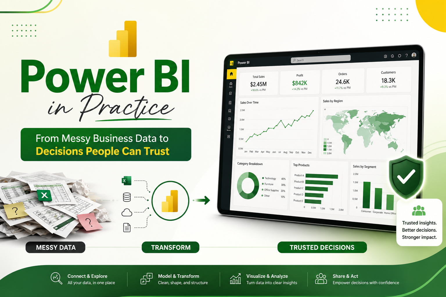
Power BI in Practice: From Messy Business Data to Decisions People Can Trust
Last updated on Aug 26, 2026
Why Power BI Matters Beyond the Dashboard
A dashboard is often the part of Power BI that people notice first. It is also the part that can create the wrong impression. A polished page of charts does not automatically mean that the underlying analysis is sound. In real organizations, the harder work usually happens before anyone sees the final visual: identifying the right sources, cleaning inconsistent values, deciding how tables should relate to one another, defining measures correctly, and making sure the people who consume the report are seeing data they are actually allowed to see.
That is why Power BI is better understood as an analytics workflow than as a chart-making application. Microsoft describes the Power BI environment around activities such as connecting to data, preparing and modeling it, creating reports, sharing content, and managing access. Power BI Desktop provides the main development environment, while the Power BI service supports publishing, collaboration, dashboards, apps, refresh, and governance. The practical value appears when an organization moves from a question such as “How much did we sell?” to a more useful sequence of questions: Which products drove the change? Which regions are underperforming? Is the decline seasonal? Are customers buying less often or spending less per order? What should a manager investigate next? A good Power BI solution helps people move through those questions without rebuilding the analysis from scratch every time.
What Actually Happens Inside a Power BI Solution?
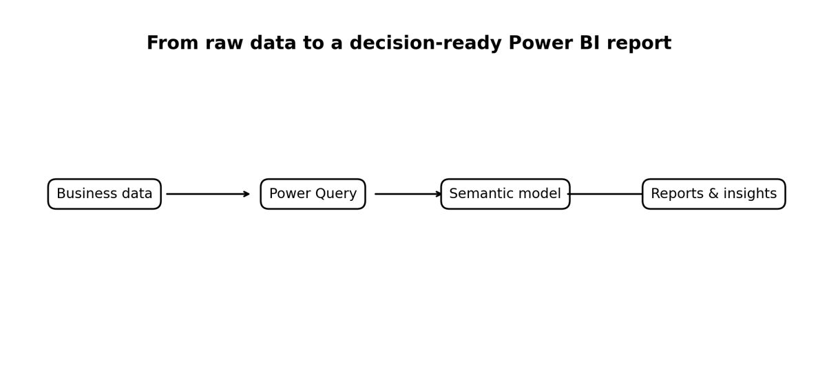
A typical Power BI solution has several layers, even when the user experiences it as one report. Data may come from Excel workbooks, relational databases, cloud services, files, APIs, or other supported sources. Power Query is used to connect to those sources and transform the data. The transformed tables are then organized into a semantic model, where relationships, business logic, measures, and metadata give the raw fields analytical meaning. Reports sit on top of that model and turn the results into interactive visual experiences.
This separation is important because each layer solves a different problem. Power Query is primarily about shaping data. The model is about structure and relationships. DAX is used for calculations and analytical logic. The report is about communication and exploration. The service adds distribution, collaboration, refresh, security, and governance. Microsoft’s current PL-300 study guide reflects this workflow closely. The exam measures four broad skill areas: preparing data, modeling data, visualizing and analyzing data, and managing and securing Power BI. The first three areas each account for 25–30% of the assessment, while management and security account for 15–20%. Those proportions are revealing: the platform is not simply about building attractive charts.
Power Query: The Work Most People Underestimate
The quality of an analysis is constrained by the quality of the data underneath it. Imagine a sales table in which “Delhi,” “New Delhi,” and “DEL” represent the same region. A visual can display the records perfectly, but a regional comparison may still be wrong. The same problem occurs with inconsistent dates, numbers stored as text, duplicate records, blank categories, mismatched product codes, and columns that contain multiple concepts at once.
Power Query is designed for this preparation stage. In Power BI Desktop, the Power Query Editor provides tools to connect to one or more data sources, profile data, transform columns, merge or append queries, and prepare tables before loading them into the model. A strong workflow treats these transformations as repeatable data preparation steps rather than manual cleanup performed every morning. The key mindset is to ask what the data should mean before deciding how to transform it. Removing a column simply because it looks messy may discard information needed later. Combining tables without understanding their keys can create duplicate rows. Changing a data type can fix one problem while creating another. Good Power Query work is therefore less about knowing every button and more about understanding the business structure represented by the data.
For learners, this is one reason hands-on practice matters. A spreadsheet with clean sample data can make Power BI seem easy. A real export from an operational system teaches much more: you learn to inspect the data, identify inconsistencies, document transformations, and build a repeatable preparation process.
Data Modeling Is Where the Analysis Becomes Reliable
Once data is clean enough to analyze, the next challenge is structure. A model is not just a collection of tables. Relationships determine how filters move through the model and therefore influence what a measure returns. If the model has ambiguous relationships or duplicated facts, a visually correct report can still produce misleading results.
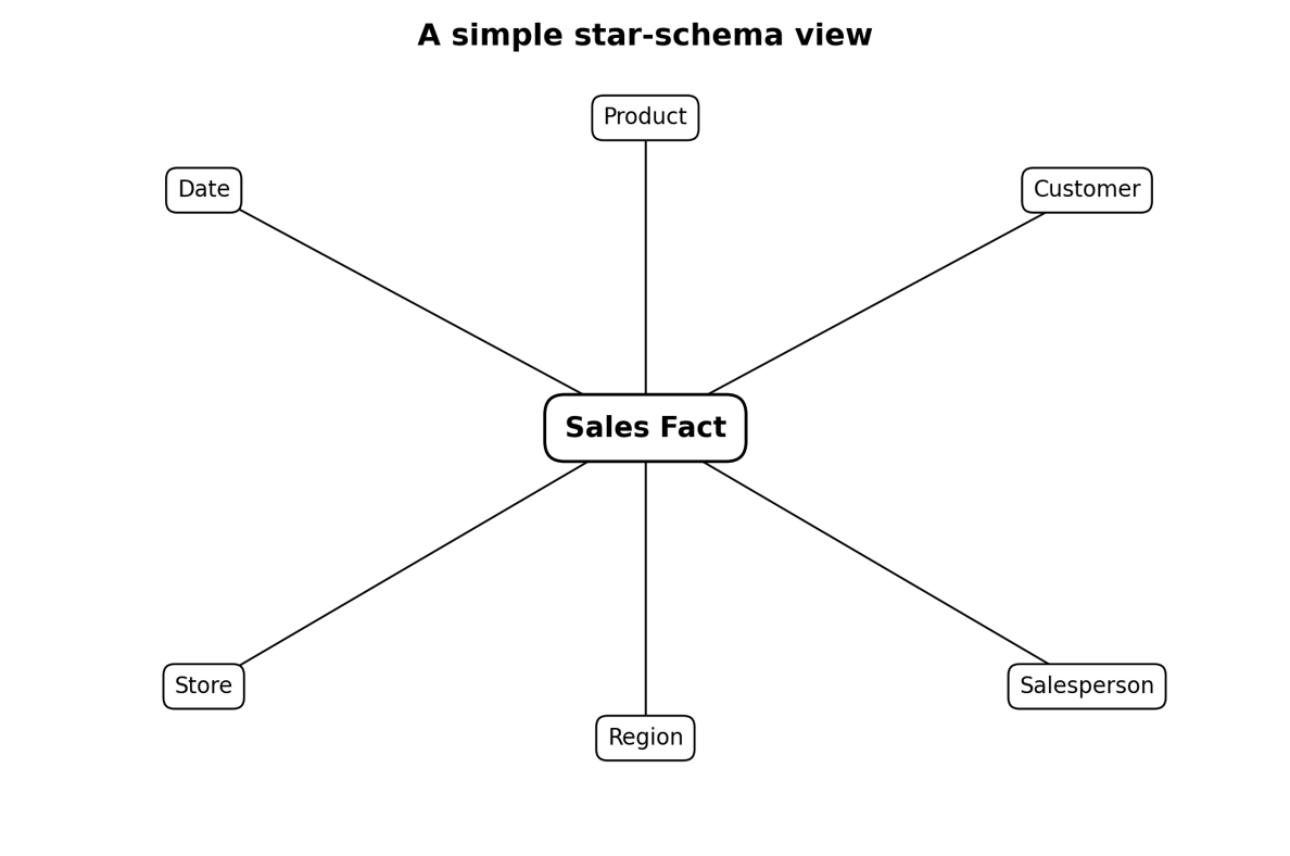
A common pattern is the star schema: a central fact table containing business events or measurements, surrounded by dimension tables that describe those events. For a sales model, the fact table might contain order amount, quantity, date key, product key, customer key, and store key. Dimension tables can describe dates, products, customers, stores, or regions. The result is easier to reason about because the business event is separated from the descriptive context used to analyze it.
A Simple Star Schema Makes the Logic Easier to See
The model below is deliberately simplified. In an actual organization, the number of dimensions and facts can be much larger, and the best architecture depends on the source systems and analytical requirements. The point is to show why modeling decisions matter before visual design begins.
DAX: Turning a Model Into Business Logic
DAX, or Data Analysis Expressions, is the formula language used in Power BI for calculations and analytical logic. Microsoft’s documentation describes DAX as a collection of functions, operators, and constants that can be used in expressions to calculate and return values. The distinction between a simple field and a measure is important because measures are evaluated in the context of the report interaction. Consider a business asking for revenue, year-to-date revenue, prior-year revenue, and year-over-year growth. These are not merely four columns waiting to be displayed. They are business definitions that need to respond correctly when a user filters by product, month, region, or customer segment. DAX provides the mechanism for expressing that logic.
One of the most important concepts for a new analyst is filter context. A measure can return a different result depending on which filters are active in the visual or report. Functions such as CALCULATE are central to changing or extending that context. Time-intelligence calculations add another layer because they require a reliable date structure and careful handling of periods. This is also where memorizing formulas can become a trap. A learner may remember a DAX expression but still struggle to explain why it works. Stronger practice starts with the business question, identifies the grain of the data, checks the relationships, and then writes the measure. The formula becomes the final step rather than the starting point.
A Simple Star Schema Makes the Logic Easier to See
The model below is deliberately simplified. In an actual organization, the number of dimensions and facts can be much larger, and the best architecture depends on the source systems and analytical requirements. The point is to show why modeling decisions matter before visual design begins.
DAX: Turning a Model Into Business Logic
DAX, or Data Analysis Expressions, is the formula language used in Power BI for calculations and analytical logic. Microsoft’s documentation describes DAX as a collection of functions, operators, and constants that can be used in expressions to calculate and return values. The distinction between a simple field and a measure is important because measures are evaluated in the context of the report interaction.
Consider a business asking for revenue, year-to-date revenue, prior-year revenue, and year-over-year growth. These are not merely four columns waiting to be displayed. They are business definitions that need to respond correctly when a user filters by product, month, region, or customer segment. DAX provides the mechanism for expressing that logic. One of the most important concepts for a new analyst is filter context. A measure can return a different result depending on which filters are active in the visual or report. Functions such as CALCULATE are central to changing or extending that context. Time-intelligence calculations add another layer because they require a reliable date structure and careful handling of periods.
This is also where memorizing formulas can become a trap. A learner may remember a DAX expression but still struggle to explain why it works. Stronger practice starts with the business question, identifies the grain of the data, checks the relationships, and then writes the measure. The formula becomes the final step rather than the starting point.
A Report Should Help Someone Decide Something
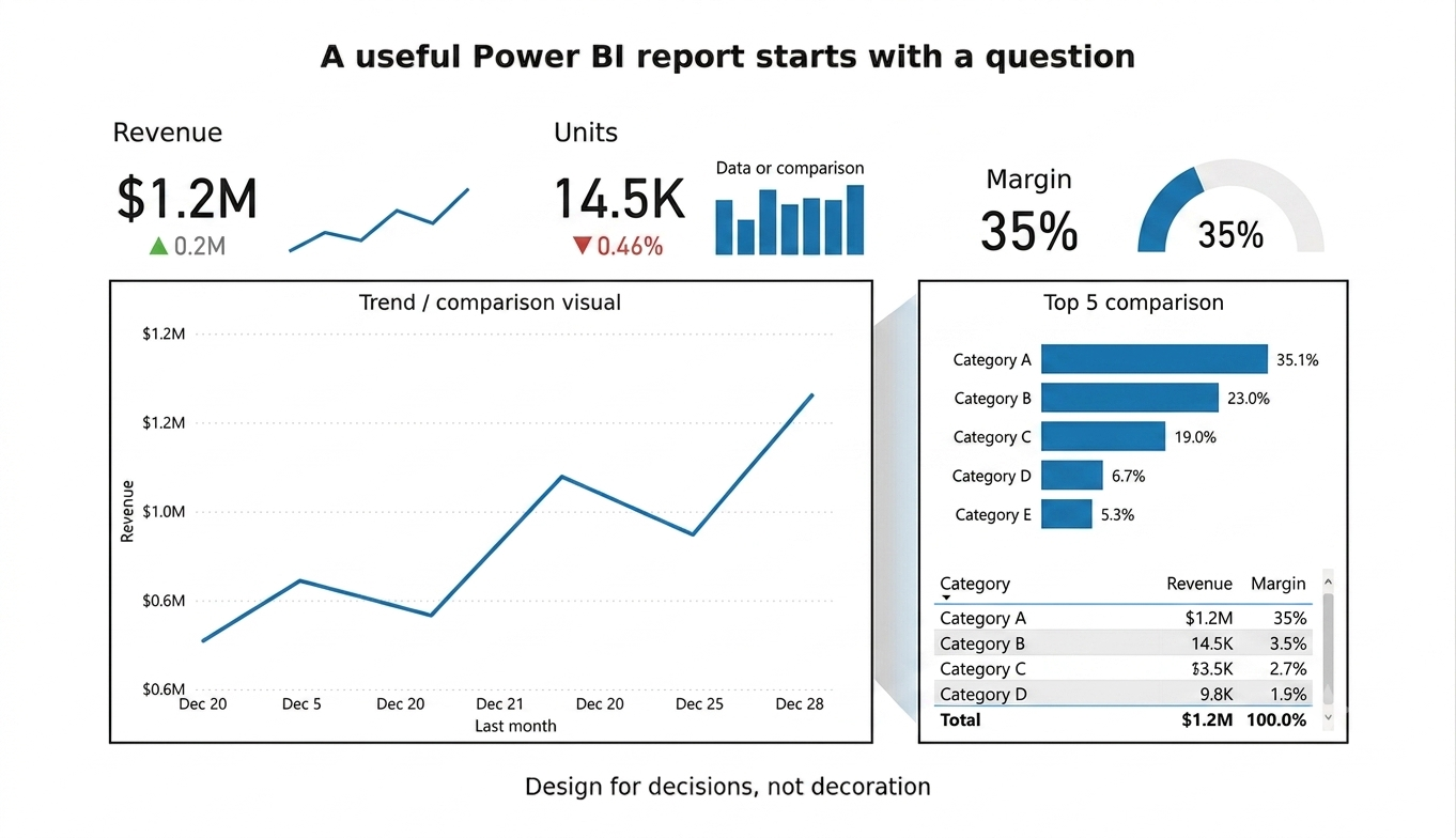
A report becomes useful when its visuals reduce the effort required to understand a business situation. That does not mean every report needs a dramatic design. In fact, many effective reports are relatively restrained. They establish a clear hierarchy: headline measures first, trends and comparisons next, and supporting detail where it is needed.
A sales manager might want a first page showing revenue against target, recent trend, contribution by region, and a product-level exception view. An operations manager might care about throughput, backlog, service-level performance, and aging. The right visual therefore depends on the question, not on which chart looks most impressive. Power BI supports filtering, slicers, drill-through, bookmarks, tooltips, navigation, conditional formatting, and other interaction patterns. Used carefully, these features allow a report to serve both executives and analysts without turning every page into a wall of controls. The test should be simple: can the user find the important signal quickly, and can they investigate it without getting lost?
Dashboard, Report, and Semantic Model Are Not the Same Thing
These terms are often used interchangeably, but they describe different parts of the Power BI experience. Microsoft defines a dashboard in the Power BI service as a single-page canvas that highlights key information. Reports can contain multiple pages and provide richer interactive analysis. Both can depend on semantic models that contain the data structure and business logic. That distinction matters when designing a solution. A dashboard may be appropriate for monitoring a small number of important indicators. A report is usually better for exploration and detailed analysis. A semantic model is the reusable foundation that makes consistent reporting possible across different experiences.
The practical lesson is that a strong Power BI implementation should not be judged only by the final page. If five teams independently calculate “customer retention” five different ways, a beautiful dashboard has not solved the underlying analytical problem. Shared definitions and a well-managed model can be more valuable than another visual.
Where Power BI Fits in a Modern Data Team
Power BI rarely exists in isolation. In a mature data environment, analysts may work with data engineers, analytics engineers, database administrators, application teams, finance teams, sales operations, and business stakeholders. The analyst’s job is often to translate between these groups. A stakeholder may describe a problem in business language: “Our western region is missing its number.” A data engineer may think in terms of pipelines and tables. A Power BI developer thinks about data models, measures, report behavior, refresh, and access. The useful professional is the person who can connect those perspectives.
Dashboard, Report, and Semantic Model Are Not the Same Thing
These terms are often used interchangeably, but they describe different parts of the Power BI experience. Microsoft defines a dashboard in the Power BI service as a single-page canvas that highlights key information. Reports can contain multiple pages and provide richer interactive analysis. Both can depend on semantic models that contain the data structure and business logic.
That distinction matters when designing a solution. A dashboard may be appropriate for monitoring a small number of important indicators. A report is usually better for exploration and detailed analysis. A semantic model is the reusable foundation that makes consistent reporting possible across different experiences. The practical lesson is that a strong Power BI implementation should not be judged only by the final page. If five teams independently calculate “customer retention” five different ways, a beautiful dashboard has not solved the underlying analytical problem. Shared definitions and a well-managed model can be more valuable than another visual.
Where Power BI Fits in a Modern Data Team
Power BI rarely exists in isolation. In a mature data environment, analysts may work with data engineers, analytics engineers, database administrators, application teams, finance teams, sales operations, and business stakeholders. The analyst’s job is often to translate between these groups.
A stakeholder may describe a problem in business language: “Our western region is missing its number.” A data engineer may think in terms of pipelines and tables. A Power BI developer thinks about data models, measures, report behavior, refresh, and access. The useful professional is the person who can connect those perspectives.
Why Projects Beat Passive Learning
Watching tutorials can explain what a feature does. Projects reveal whether you can use it when the requirements are incomplete. A realistic practice project should begin with a business scenario rather than a list of Power BI features.
For example, create a retail performance model with sales, product, customer, store, and date data. Start by defining the questions the business wants answered. Clean the source data in Power Query. Build relationships. Create measures for revenue, units, average order value, margin, and period growth. Design a report with a management page and an investigation page. Then deliberately introduce problems—missing dates, duplicated product codes, inconsistent region names—and see whether your model and measures still behave correctly. The project becomes much stronger if you document assumptions. State what counts as revenue. Explain how returns are treated. Identify the date used for sales reporting. Record which users should see which regions. These details mirror the conversations that happen in real reporting work.
What the Current PL-300 Exam Actually Tests
A power bi certification can add structure to a learning plan because the current PL-300 blueprint gives learners a concrete set of skills to measure. It should not, however, be treated as a substitute for project experience. The strongest combination is certification preparation plus a few complete projects in which you can demonstrate data cleaning, modeling, DAX, report design, and secure sharing.
For people who want a formal benchmark, Microsoft offers the Microsoft Certified: Power BI Data Analyst Associate credential, assessed through Exam PL-300. The current Microsoft Learn study guide, updated for the April 20, 2026 skills measurement, describes the target role as someone who prepares, models, visualizes, analyzes, manages, and secures Power BI solutions.
The exam blueprint is useful even for learners who do not immediately plan to take the test. It shows that preparation and modeling are as important as visualization. The current guide lists Prepare the data at 25–30%, Model the data at 25–30%, Visualize and analyze the data at 25–30%, and Manage and secure Power BI at 15–20%. It also explicitly calls out proficiency with Power Query and DAX.
The guide says a score of 700 or greater is required to pass. Microsoft also notes that certifications can have renewal requirements and that exam objectives can be updated as the product evolves. Anyone planning a certification attempt should therefore check the current Microsoft Learn exam page and skills outline rather than relying on an old preparation article.
How to Choose a Course Without Wasting Time
For a learner starting from scratch, a Power BI course is most useful when it follows the same sequence used in real projects: source data first, transformation next, modeling after that, and reporting only once the analytical foundation is stable. A practical curriculum should also include exercises that force you to troubleshoot bad data and explain your calculations, because that is where much of the real learning happens.
Look for a curriculum that includes data preparation, modeling, DAX, visualization, and the Power BI service. If a course spends most of its time on chart formatting but barely explains relationships or data quality, it is incomplete for professional analytics work. If certification is the goal, the course should map its exercises to the current PL-300 skills rather than to an outdated exam blueprint. Hands-on work is another important test. A course should make you build something, debug it, and explain the result. Exercises should not only say “click this button.” They should ask why a relationship is needed, why a measure changes under a filter, or why a visual shows an unexpected result.
A Course on Power BI Should End With a Portfolio, Not Just Notes
When comparing a course on power bi, pay attention to whether the curriculum teaches the Power BI service as well as Desktop. Publishing, workspaces, refresh, permissions, row-level security, and governance become important as soon as a report is shared beyond the person who built it. A course that teaches only visual formatting can be useful for a narrow purpose, but it does not cover the full professional workflow.
If the goal is employability, the best outcome of training is evidence that you can solve a problem. A portfolio project can be small, but it should be complete. Include a short business brief, source-data description, transformation steps, model diagram, key measures, report screenshots, and a short explanation of the decisions you made. This approach also helps during interviews. Instead of saying “I know Power BI,” you can explain how you handled a many-to-one relationship, why you used a measure instead of a calculated column, how you validated a total, or how you implemented row-level security. Those examples show practical understanding.
A portfolio does not need confidential company data. Public datasets, synthetic business data, or carefully anonymized examples can demonstrate the same technical thinking. The important part is the reasoning behind the solution.
Security and Governance Are Part of the Job
A report can be technically accurate and still be unsafe to publish. Business data may contain information that should not be visible to every employee. Power BI includes governance and security capabilities such as workspace roles, access controls, semantic-model permissions, sensitivity labels, and row-level security.
Row-level security is especially relevant when one report serves multiple groups. A regional sales report, for example, may need to show each manager only the records associated with their permitted region. Implementing this correctly requires understanding the model, identity or group mapping, and the intended access pattern. It should be tested with representative users rather than assumed to work because the report opens successfully. Governance also includes refresh and ownership. Someone needs to know where the data comes from, when it refreshes, what happens when a source changes, and who is responsible if a KPI suddenly looks wrong. In professional analytics, reliability is part of the deliverable.
Performance: When a Good Report Becomes a Slow Report
Performance problems often appear when a solution grows. A report that works with a small sample may become sluggish when the model contains millions of rows, complex relationships, inefficient measures, or unnecessary columns. The first response should not be to remove useful analysis blindly. Instead, inspect the model and identify the bottleneck. Microsoft’s current PL-300 objectives include performance optimization through reducing unnecessary rows and columns, improving poorly performing measures and relationships, reducing granularity when appropriate, and using tools such as Performance Analyzer and DAX query view.
Good performance is usually the result of several small decisions. Keep only the fields that have a purpose. Use appropriate data types. Avoid unnecessary high-cardinality columns. Build relationships deliberately. Write measures with an understanding of evaluation context. Test the report with realistic data volumes rather than a tiny development sample.
The Real Career Value of Power BI
Power BI can be a useful career skill because it sits close to business decisions. Companies do not usually need another chart for its own sake; they need faster reporting, clearer performance visibility, better operational monitoring, and more consistent metrics. For a beginner, the most valuable combination is therefore not “Power BI alone.” It is Power BI plus business understanding, SQL fundamentals, spreadsheet fluency, data modeling, and communication. Depending on the role, statistics, finance, marketing, operations, or domain knowledge can add further value.
A strong analyst can explain both the number and the reason the number matters. They can challenge a KPI definition when it is ambiguous. They can recognize when a data problem is being mistaken for a business problem. They can communicate uncertainty instead of presenting every metric as absolute truth. Those habits are difficult to automate and remain valuable across analytics tools.
Conclusion: Learn the System, Not Just the Software
Power BI is easiest to understand when you stop thinking of it as a collection of charts and start thinking of it as a chain of decisions. Data must be acquired and cleaned. Tables must be modeled. Business logic must be expressed consistently. Visuals must answer real questions. Reports must be shared responsibly. Refresh, security, and governance must be maintained after publication.
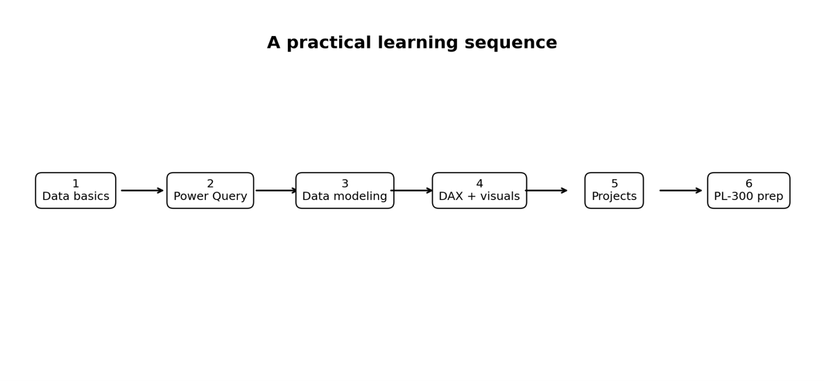
That perspective also makes learning more efficient. Start with data and business questions. Learn Power Query. Build a sound model. Learn DAX through practical calculations. Design reports around decisions. Then learn the service, security, and performance concepts that make a solution usable at scale. Whether your objective is a new analytics role, stronger reporting skills, or preparation for the Microsoft Power BI Data Analyst Associate pathway, the most durable advantage comes from being able to explain what your analysis means and why people should trust it. The software will continue to change. The underlying discipline of turning reliable data into useful decisions will not.