
Scaling Predictive Models with TabPy Inside Enterprise Tableau
Last updated on Sep 14, 2026
Typically, there is a pattern that characterizes the development of business intelligence: business systems capture the transactions, data pipelines process and aggregate the rows of data, and dashboards show what happened during the previous day, month, or quarter. This backward-oriented approach has been useful to enterprises in their early stages of digital transformation. At some point, there is a natural limitation to retrospective reporting. Understanding the number of churned customers last month will help a company analyze the situation but not prevent churning of the currently existing accounts. That is why more and more businesses have started applying machine learning and data science methodologies. It is the responsibility of data scientists to create prediction models in Python or R to forecast demand, detect anomalies, and calculate conversion scores.
Although there is a major friction point between both data science laboratories and executive boardrooms. Data scientists usually do scripting and create models using the notebook environment and calculate their predictions using offline data sets. Business stakeholders consume operational data through front-end analytical tools like Tableau, where they observe the key indicators of the performance, apply regional filters, and change the scope of analysis, as before bridging these two environments meant just processing pre-scored data offline. Through a structured tableau online course experts with a deeper understanding of how that works find that static scoring very soon becomes a major bottleneck, making it impossible to fulfill reporting requirements.
Predictive scoring works perfectly for straightforward questions, however, it is insufficient when it comes to cases when users want to analyze new and hypothetical situations. For instance, the system fails to tell users how the company’s customer churn probability changes with different marketing discount ratios (i.e. grows from 5% to 20%). It is also impossible to recalculate logistic bottlenecks from the stage, once the user interacts with the scenario slider. The hurdles of real-time predictive analytics are that communication is required between the affected parties i.e. visualization and algorithm engines. This is where external service extensions, including TabPy, come into play.
TabPy serves as a bridge connecting the visualization software Tableau with the external calculation engine. By using TabPy, the system expands the boundaries of the visualization software allowing users to conduct a full-fledged analysis.
Architecture of Real-Time Analytical Coupling
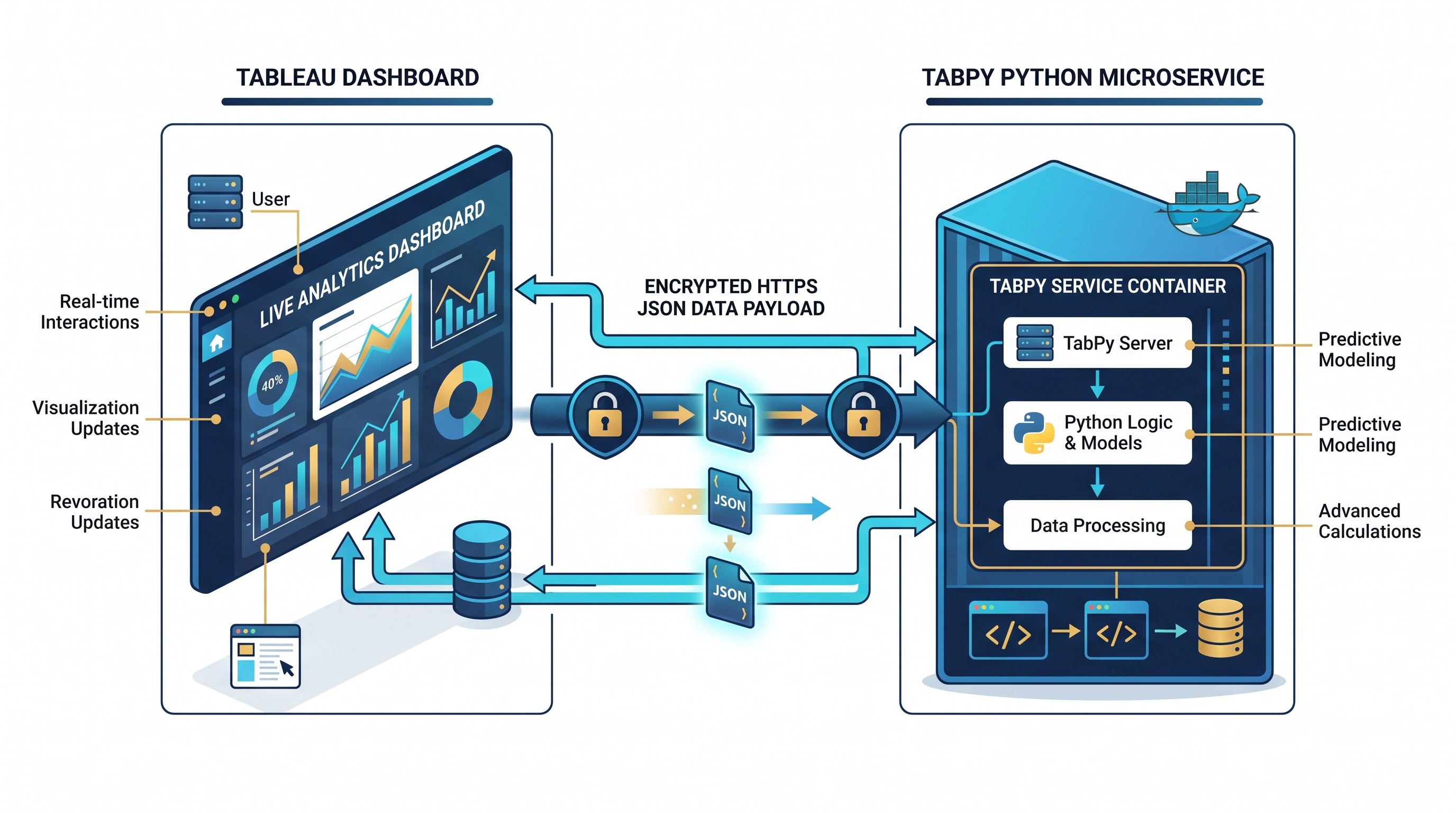
You need to understand the way integrations work with external services, and it involves tracing the journey of a single data item as it appears in different systems. For example, when a user operates with a standard Tableau dashboard, the local visualization engine translates shelves, marks, and filters into queries that correspond to the corresponding data store.
The aggregate results come back to the local memory engine, which will derive table calculations and manage their layouts.
When TabPy enters the architecture, another node connects to this process. TabPy is a light-weight Python process that can run from the same computer, be placed in a containerized enterprise microservice or work from a private cloud cluster. This solution uses standard HTTP(S) networking protocols to create a node.
Whenever a worksheet that has a calculation for an external service recalculates, the visualization engine puts the requested visual marks into vectors. Instead of interpreting the Python code directly, Tableau packages these vectors with the Python script or function address in a network payload. This payload is sent to the TabPy endpoint over the network. The TabPy demon receives the payload, decodes the serialized data vectors, uses them in a separate Python runtime environment, and returns the response to Tableau in the form of an array.
Tableau then uses the received array to map it back to the visual canvas
The same methodology is applicable to R through RServe. Even though there are differences in their runtime and memory settings, the communication topology remains the same.
The remote delegation approach has significant effects on the level of responsiveness of dashboards and the precision of their analytics. Since data goes over a network barrier, the structures of the data exchanged between the systems should remain synchronized. The number of records forwarded down the outbound channel has to match the number of records returned in the response received back in the inbound direction. For instance, if Tableau transfers over fifty regional marks, then the network script has to return fifty scored data values. This one-to-one contract in dimensionality creates an important condition for developing analyst systems connected at different geographical locations.
The development of Live Scoring Capabilities
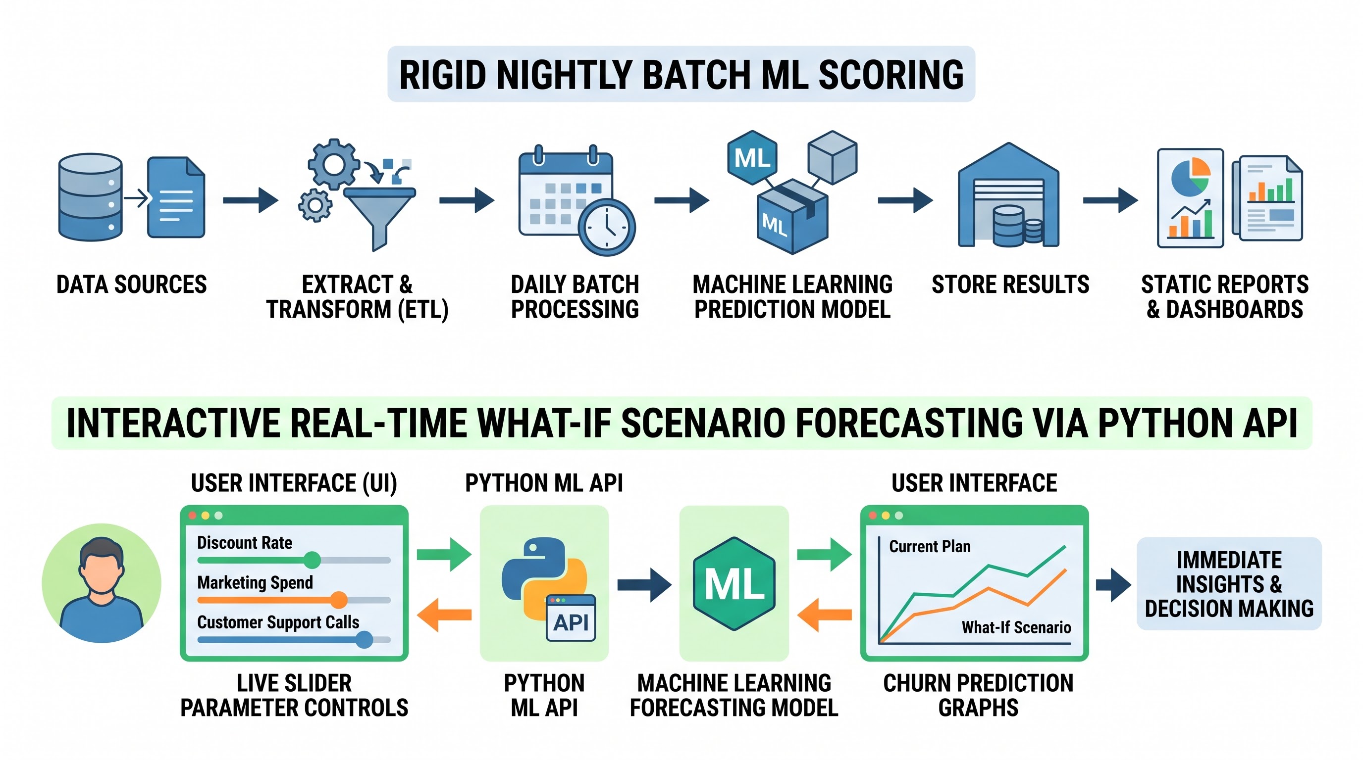
To justify the need for live scoring it is necessary to analyze the limitations of various conventional offline analytical pipelines. In a standard batch score system, a predictive model runs on a nightly basis. The pipeline extracts rows from the company data warehouse; the extracted records are cleaned, and the missing attributes are imputed. Then the received records pass through the serialized model and the newly scored column is written into the target table in the database.
This workflow works well as long as analytical queries remain unchanged from one month to the next. For example, determining credit risk from historical financial data usually does not call for the need for recalculation every minute. Unfortunately, this is rarely the case in today's business environment. The main problem with pre-assessed data lies in its unawareness of the agents' decisions.
The retail pricing team is attempting to set optimal promotional discounts. When making a decision, the customer considers not only personal traits and past purchasing decisions but also一些 of the price manager's newly chosen variables in pricing: the height of the discount, the configuration of the bundles, and the length of the campaign. The price of batch scoring means that the data science team has to carry out the processing of all possible options of discount schemes, timeframes, and customer segments, which leads to the generation of a huge amount of redundant data that simply clogs up data storage systems and makes it hard to get information out of the dashboards.
Even worse, the pre-score process makes it impossible for the business user to participate in the whole exploratory process. Once the analyst wants to test some hypotheses outside of the pre-calculated grid, the dashboard fails. The analyst will need to submit a request to the data engineering department for a revised batch script, wait for the processing night and check the dashboard in the morning.
As for the TabPy implementation, this process takes only a few seconds. Once the business user changes the slider indicating the discount, the model calculates the scenario and displays the expected results.
Preparing for Implementation and Making the TabPy Environment
To implement this innovative solution in business processes, one needs to have a specifically designed environment for working with the TabPy software. Although TabPy could be installed on a personal computer for experimental purposes, successful implementation requires a robust design.
In an environment for collaborative production, TabPy is usually used in a separate virtual environment and often employs the use of containerization. By isolating the environment, it ensures that specific versions of packages, for example, certain implementations of some numerical computation packages, machine learning frameworks, and statistical libraries, are unchanged since the version used by the team for developing the model is made use of. Different versions of a package may lead to tiny differences or even errors in running an application.
Another important architectural issue is security. When the clients run programs without security measures in place, it leads to a lot of governance challenges because of the risk posed by any unauthorized users who can run a script through TabPy. To secure a TabPy installation, the use of secured connections is required using TLS (transport layer security) so that all traffic between the server and TabPy remains encrypted. It is also highly recommended to employ some authentication keys, which guarantees that no unauthorized users can access the system from outside.
As soon as the host daemon gets activated, the visualization environment uses centralized administration settings to connect to the service. The analysts set the connection parameters such as target host domain, port settings, and necessary security details before making sure the data source will work correctly. By reaching this stage, each workbook that is published in that visualization cluster receives access to the analytical service, thus converting the computing node into the common utility for the whole organization. Learning to use these server setups and enterprise connection settings is the main focus of specific online tableau training that have been designed for the modern data engineer and a visual analyst.
Inline Scripting Versus Deployed Endpoint Functions
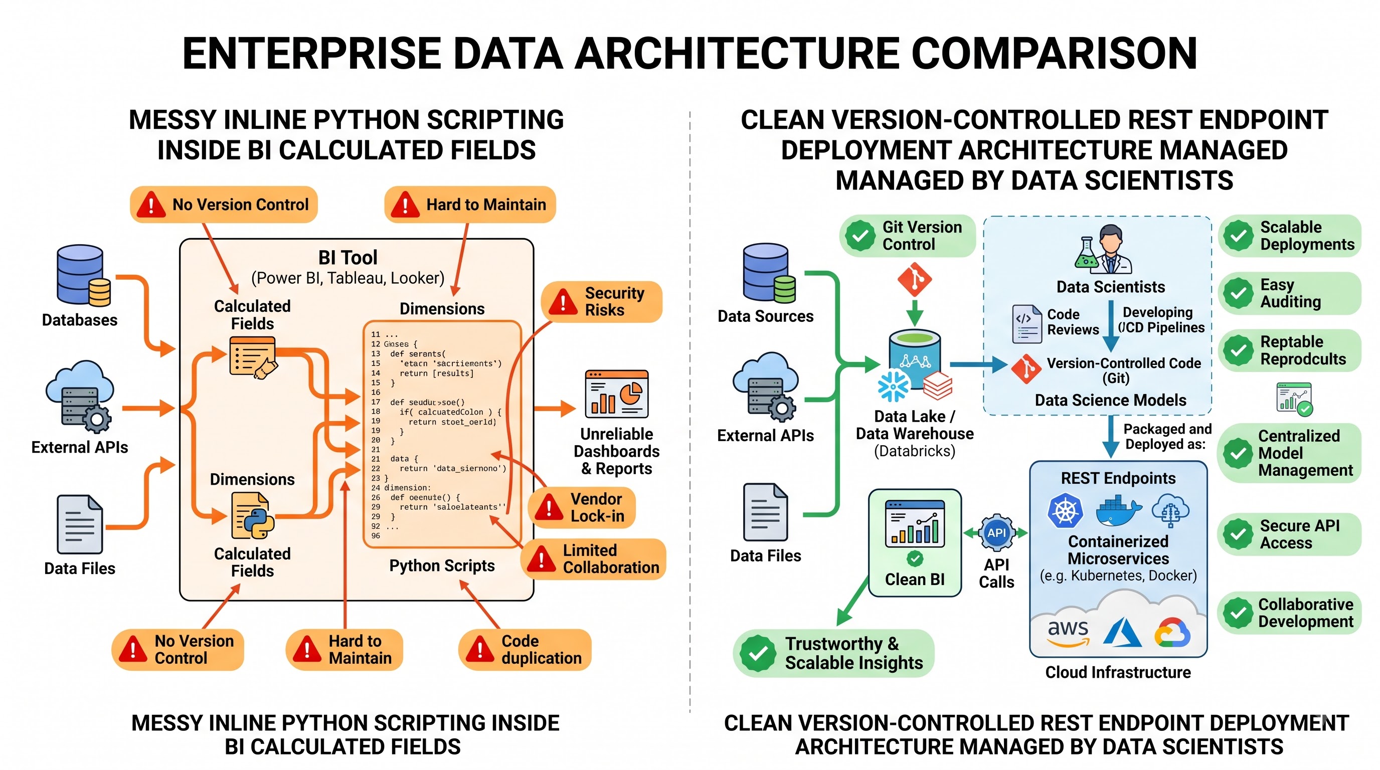
In the process of writing integration logic in dashboard calculations, analysts have two choices to make concerning the operating mechanism they are going to use: inline scripting or deployed endpoint functions.
The quickest approach to validate results is inline scripting. In this implementation, the analyst writes the scripting logic in the dashboard calculation area. The calculation sends the whole script code across the network every time it is refreshed, as the calculation keeps both code and data mapping. The remote service receives the script code from the calculation, reads it, assigns local handles for incoming data arrays, executes the code, and sends the results back.
Although inline scripting gives an instant result when doing analysis, it has serious quality and organization issues when being expanded on an enterprise level. First of all, the implementation of multi-line code directly in business intelligence calculations leads to spreading the analytical logic on most of the visual workbooks. If the data scientist changes the preprocessing parameters or other coefficients in the equation, each workbook with inline scripts will have to be modified manually.
Next, inline scripts carry a significant parsing overhead as well as initialization for each dashboard call. This is due to the fact that required code string is repeatedly parsed by outside service and model dependencies reinitialized with each back-and-forth trip between the server and dashboard.
The answer to this operational problem is provided by TabPy as well. Specifically, the way TabPy solves the issue is through the deployment of endpoints. According to the new model, the data science team doesn’t simply consider external service as an interpreter anymore but rather as an API gateway. This implies that the team uses well-established development practices to write their data preparation and modeling code in development repositories with version control. Once the model is tested, the model weights are serialized and the whole scoring function is deployed as an endpoint.
According to the endpoint concept, it is no longer necessary that the dashboard calculate the entire code each time. The dashboard calculation only has to send a single request which indicates the endpoint and the data vectors and parameter values selected by the user.
This division of responsibilities creates an optimal division of tasks. Data scientists are totally in charge of everything related to the management of the lifecycle of the model, including tracking drift in variables, changing parameters, and replacing models internally without interruptions to visual interfaces. At the same time, intelligence developers concentrate on visualization, user experience, and interactive functionality so that they provide access to the analytical model.
Controlling Different Types of Data, Dimensions, and Aggregation Methods
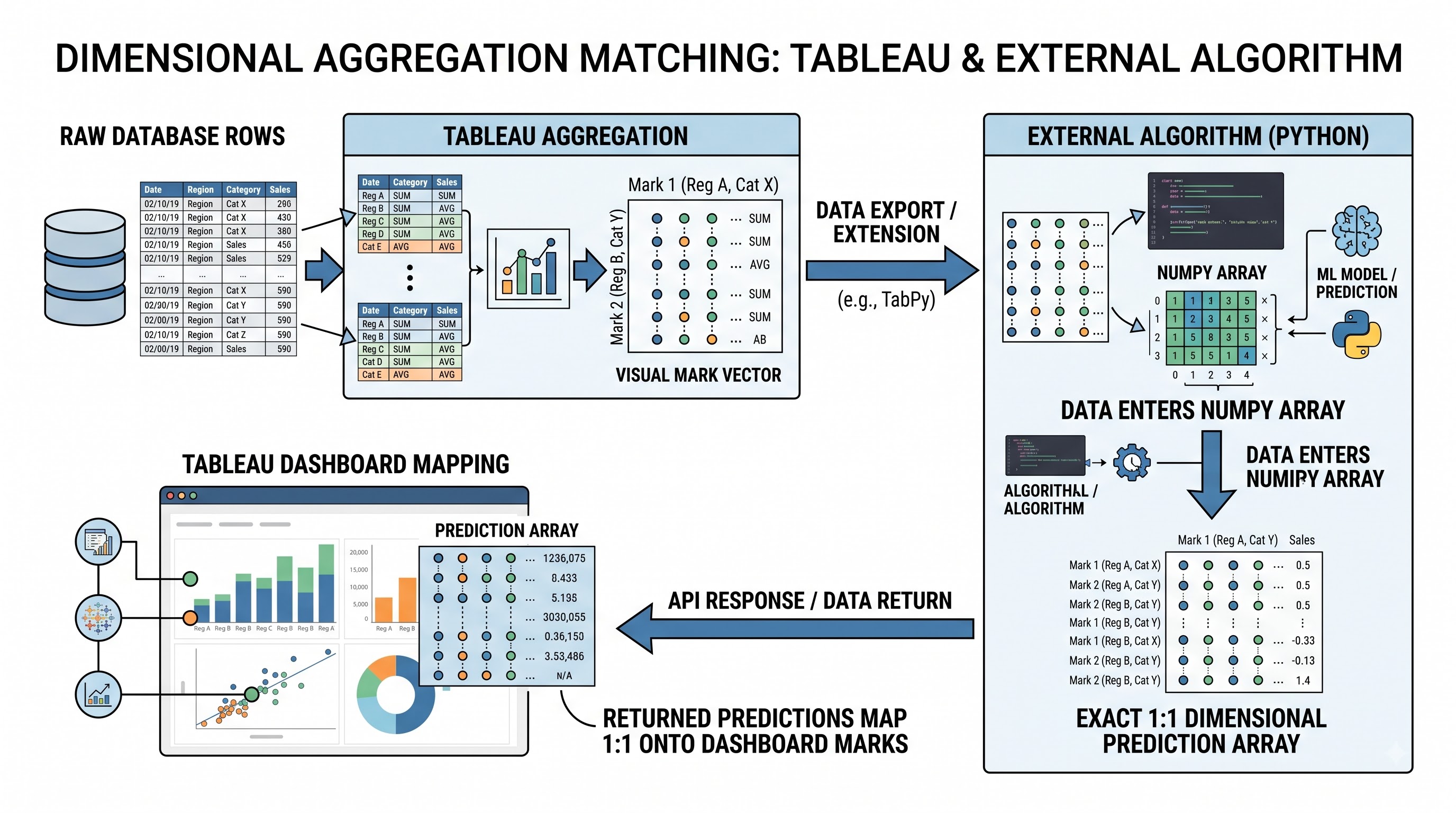
Satisfactory performance of visual environments and external analytical systems requires a perfect knowledge of data levels. Teams that try to integrate external scripts usually face aggregation mismatch errors.
Visualization technology is essentially established on theories of dimensions and measures. Dimensions determine the extent of detail in visual indicators of data— for example, dots in a scatterplot, bars in a bar chart, or sections on a map— while measures present the quantitative data collected at that particular level. Anyone who has done tableau training online knows that when using an external script, all inputs sent to the engine of execution must be aggregate expressions; otherwise, an immediate error is caused by using raw dimension columns.
The reason for this is that the visual query resolves this way. At the start, the visual engine makes a request to the database and processes rows according to the dimensions of the content on the shelves. After the aggregation has been done, the visual engine forms patterns from the received data and sends it to the external service. So, if the dashboard visualizes sales performance data calculations at the regional level, there will be a number of elements in the data vector that corresponds to the number of regions presented on a dashboard.
If data scientists have been working with uncollected raw transactional datasets, they should remember that if the predictive model needs customer-specific features such as recency, frequency, and monetary scores, the spreadsheet should be constructed based on specific customers. However, if the visuals are based on the product category, then the external model will get aggregates of the categories rather than the actual customers, making predictions worthless.
Moreover, the correct mapping should be taken into account. The data coming from the visual will arrive in the backend in the form of standard sequential lists and they have to be converted into formats that contemporary machine learning libraries support, such as multi-dimensional arrays or data frames. Once the processing is over, the output returned to the visual tool should be converted back into standard one-dimensional lists containing primitive data types like floating-point numbers, integers, strings, or booleans. If there are any discrepancies in the total number of elements inputted or if there are any nulls in the array, the entire process will fail and will result in the absence of visual representation for the user.
Designing Dynamic Parameter Sensitivity and What-If Analysis
The application of what-if sensitivity analysis represents the peak of external analytical merging. In standard reporting settings, an executive is able to see how things are in the company, but when it comes to answering the question "What will happen next?" speculation is required.
Interactive parameters and online computational scoring are combined in interfaces to make dashboards act like interactive forecasting platforms. The parameters of visualization tools function as overall independent variables. Unlike dimensional filters that limit the number of rows retrieved from a data store, parameters are user-controlled values which can be of any numeric, text, or date.
Once an analyst connects a parameter to a third party algorithm, the parameter is sent to the external runtime at the same time as all the input data.
A company that sells software for businesses is able to identify the likelihood of enterprise account cancellations. The initial model makes predictions on the cancellation chances of an account based on info about use of software, tickets for service under the subscription, duration of contract and utilization rates. The designer of the visual aspect of the solution included two new factors: one being aimed at addressing proactive engagement with the customers, and the other representing the upgrade of the system itself.
Once the customer representative runs the organization on the visual presentation, the program puts out historical data of the client. The machine learning model assesses this special input, taking into account an increase in the use of the software that will be made possible by the upgrade of the software, as well as the influence of the proactive client interaction.
The executive has the capability to adjust a slider to change the budget of the proposed intervention. As a result, he sees the predicted churn drop below the acceptable risk. This degree of interaction alters the dynamics of strategic conversations. Instead of debating subjective interpretations of historical data, cross-functional teams can utilize dashboards to validate operational hypotheses.
Performance Optimization and Enterprise Latency
Though real-time scoring gives a wonderful opportunity for explorative flexibility, it still causes some network and computational latency. In a typical visualization, all of the processing of queries happens through optimized database engines or top-quality data stores that are built for the timely aggregation of data. However, adding an external HTTP round-trip to the chain can drastically affect the performance characteristics of the data it creates.
Latency in a composite framework originates from three major causes: network message serialization, processing difficulties, and visual symbols quantity. Every time calculation involves a third party service, it has to go through the process of data serialization, transferring data through the company intranet or the internet connection, data unpacking, data processing, and data serialization compared to the previous situation, as well as followed by data transmission. In case an analyst creates a scatter plot having two hundred thousand different marks, and sending this amount of records every time a user clicks, network congestion will reduce the quality of user experience due to huge delays associated with data sending from one place to the other.
In order to achieve the necessary quality of service, architects need to adhere to strict rules connected to visualization methodologies.
For example, the initial perspectives should aim to present information by means of fast, native aggregation methods. Visual actions and context filters can be applied afterwards for limiting the operative cohort to a smaller group, such as the most at-risk five hundred accounts, after which the predictions can be performed using external scripts. In this way the requests to and from the external scoring systems are limited to tens, hundreds, or several thousands of rows, which helps not to overload the network communications when the data visualisation is taking place.
In a similar manner, computational optimization at the server level becomes crucial here as well. The fact that machine learning models are used in production means that loading the serialized weights of the model into memory happens to be an expensive process.
Using pre-established endpoints ensures the model artifact operates as soon as the server launches. Every subsequent request generates feature vectors, enabling the inference to occur within milliseconds. Additionally, running deep learning computations on hardware powered by specialized GPUs facilitates the completion of complex computations efficiently.
Addressing Security, Access Control, and Auditing
When deploying an external virtual scoring model within a regulated enterprise, it is critical to comply with all safety, compliance, and governance regulations. Creating a link between the dashboard and the execution platform creates a channel for computational execution, which can lead to various vulnerabilities if proper controls are not put in place.
Authentication is the first line of defence. It is absolutely essential that a deployed production system does not allow anonymous access through networks. Connections to the visualisation cluster from the computational backend require a mutual relationship of trust, using API tokens, service accounts or directory access permissions to make sure that only valid visual server nodes are able to send requests.
Another pillar of security is the isolation of networks. The machine where executing runtime is stored needs to be within a secure private network and be protected from the access from the internet. In general, modern cloud architecture requires that both visualisation and computation workers are positioned in the same virtual private cloud, restricting access through previously established firewall settings.
Last but not least, there are additional challenges related to privacy of data and the location where data should be stored. Many industries such as finance and health care require that information about the rights of the data holders is kept in a highly secure way. When making scripts for the interaction with external systems the teams need to make sure what data would be transmitted into other networks.
Anonymization techniques such as identifying the patient and stripping the patient’s social security number or the direct identification key can be utilized at the database level before storing the records in the database without exposing the real identities of the patients. The prediction modeling technique working through the external model must work only with features relevant for the calculation of the score.
The last one is the organizational aspect that requires transparency in auditing. When there is a need to serve models through specialized endpoints, it is essential that an auditing system keeps track of all prediction requests making it possible to record all the relevant information about the requests including the user making the request, time when the request was sent, input feature distribution, and the output of the algorithm used to make a prediction.
Taking the Next Step
Shift from descriptive intelligence to predictive modeling requires a command of visual analytics, calculations, and external API integrations. An online tableau course provides people with an organized environment, real-life projects, and hands-on skills necessary to use TabPy and advanced enterprise dashboards.