
Tableau: Investigate the Story Behind the Numbers
Last updated on Sep 8, 2026
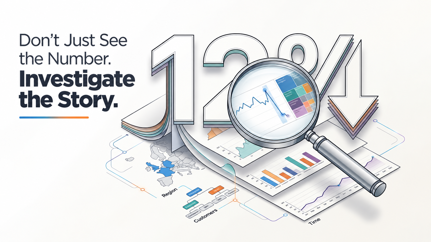
At 9:15 on a Monday morning, a sales manager notices something that shouldn't be there.
Quarterly revenue is down 12%.
The number is clear enough to cause concern, but it doesn't explain anything. Did customers stop buying? Did one region perform badly? Did a product lose demand? Was the decline gradual, or did something change suddenly? There are dozens of possible explanations, and the first one that comes to mind is not necessarily the right one.
This is where business analysis becomes interesting. The difficult part is rarely noticing that a number changed. The difficult part is figuring out what is hiding behind that change. A dashboard can report the problem, but a well-designed analytical environment can help someone investigate it. Instead of treating Tableau as a place where charts are assembled and presented, it can be viewed as a space where a business question is gradually broken apart until the underlying story becomes visible.
When a Number Creates More Questions Than Answers
Most business problems don't arrive as neatly defined analytical questions. Someone usually notices an unexpected movement in a report and asks an analyst to find out what happened. That first observation becomes the starting point of an investigation.
Consider the 12% revenue decline. Looking at the overall number tells us almost nothing about its source. The analyst might begin by comparing regions and discover that three regions are relatively stable while one has dropped significantly. That immediately changes the scope of the problem. The next question becomes whether the decline is concentrated among particular customers or products. A time-based view might then reveal that the decline began only six weeks ago rather than at the beginning of the quarter.
None of those individual views provides the complete answer. Together, however, they progressively reduce uncertainty. What started as a company-wide concern begins to look like a much narrower business problem. The investigation is not about finding a chart that answers everything; it is about using each view to decide what question should be asked next.
The Dashboard Becomes the Place Where the Investigation Moves
Traditional reporting often works in one direction. Data is collected, a report is prepared, and a conclusion is presented to someone else. That model works well when the questions are already known. Investigation is different because the next question often doesn't exist until the previous one has been explored.
An analyst might notice that revenue is falling in a particular region and then examine the customer segments within it. Perhaps enterprise customers are performing normally while smaller customers have reduced their purchases. The analyst can then look at the products those customers typically buy and compare the same period against previous years. Each interaction changes the level of detail without requiring the entire analysis to be rebuilt from scratch.
That is one of the most useful ways to think about Tableau. The dashboard is not necessarily the final destination of analysis. It can be the environment in which analysis continues. A good dashboard gives users enough context to recognize a signal and enough flexibility to follow it.
The First Explanation Is Often the One Worth Challenging
There is a natural human tendency to explain a problem as soon as we see it. If sales fall, we blame demand. If customers leave, we suspect pricing. If a campaign performs poorly, we assume the campaign itself failed. These explanations can be reasonable, but reasonable is not the same as proven.
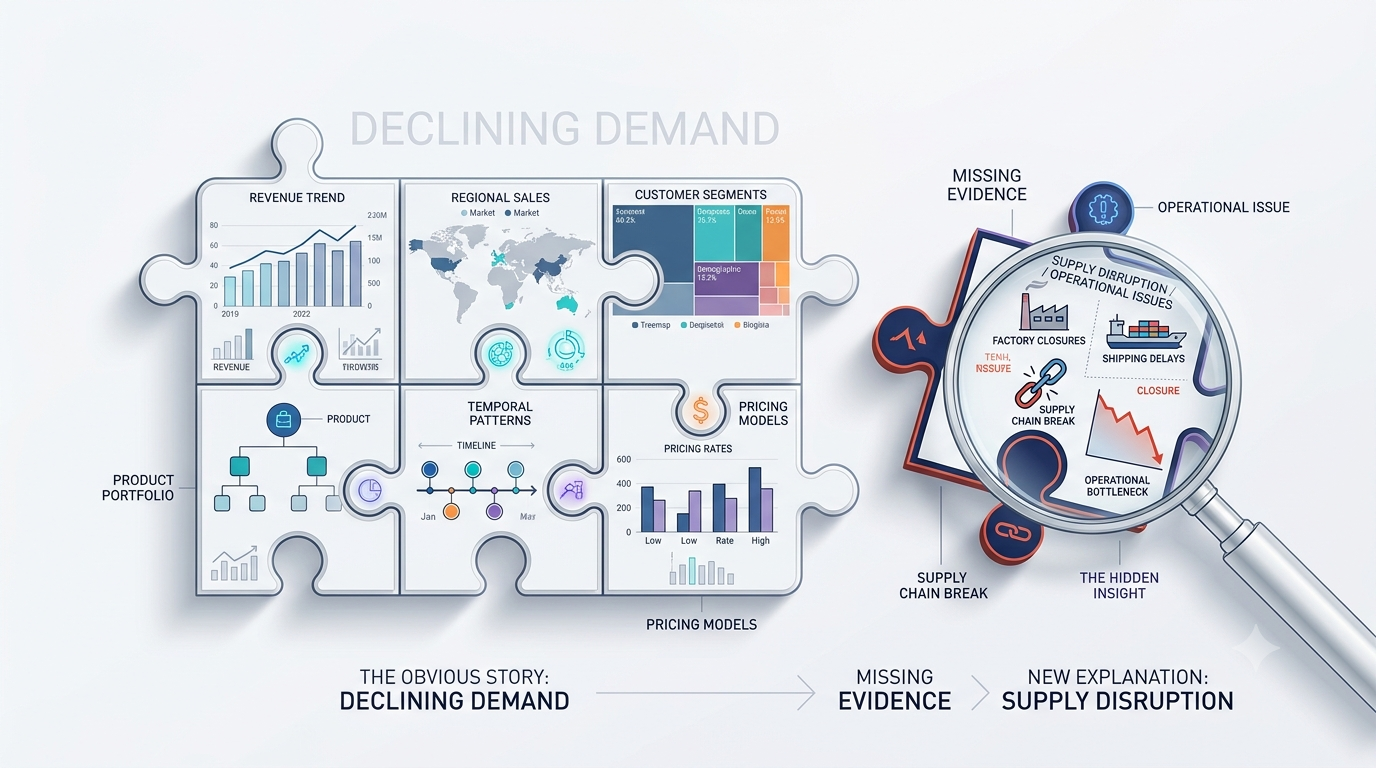
Suppose the sales team initially believes the 12% decline means customers are spending less. An analyst begins exploring the data and finds that the number of new customers has actually increased. The decline is coming primarily from existing customers. Further investigation shows that most of those customers are concentrated in one product category, and the timing coincides with a supply disruption.
The original explanation was not absurd. It was simply incomplete. This is one of the more valuable roles of interactive analysis: it gives people a practical way to test their assumptions instead of quietly building a story around the first explanation that sounds convincing. That matters because dashboards are often used in situations where decisions have consequences. A misleading assumption at the beginning of an investigation can influence forecasts, budgets, customer strategies, and management priorities long before anyone realizes that the original interpretation was wrong.
A Good Investigation Gets Smaller Before It Gets Clearer
One of the most revealing moments in data analysis happens when a large problem starts becoming smaller. A company might begin with a statement such as, “Customer churn has increased.” That sounds like a broad organizational problem. But once the data is explored, the picture may become much more specific. Enterprise customers may show almost no change, while recently acquired customers account for most of the increase. The timeline may then reveal that the change began shortly after a pricing update.
At this point, the question has evolved. The company doesn't simply have a churn problem. It has a question about how a particular group of newer customers responded to a particular change. This narrowing process is important because business decisions become more useful as the problem becomes more precise. “Why are customers leaving?” is difficult to act on. “Why did recently acquired customers begin leaving after the pricing change?” gives a team somewhere to investigate.
Tableau's interactive nature can support this kind of exploration because analysts can move between high-level patterns and detailed views without losing sight of the broader context. The value isn't the ability to drill down for its own sake. The value is being able to follow a suspicious pattern far enough to determine whether it deserves attention.
But Finding a Pattern Doesn't Mean Finding the Cause
There is a point in almost every investigation where the data appears to tell a convincing story. That is also where an analyst needs to slow down. Imagine a dashboard showing that customer cancellations increased shortly after a product redesign. The timing is interesting, but it doesn't establish causation. Perhaps the redesign happened at the same time as a pricing change. Perhaps the customers affected by the redesign were already more likely to leave. Perhaps a competitor launched a major promotion during the same period.
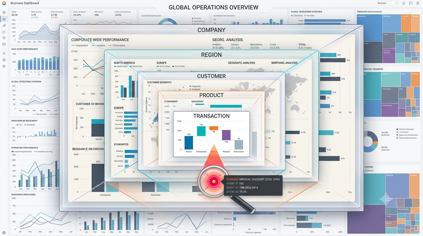
Visualization can make relationships easier to see, but it cannot remove the need for analytical judgment. This distinction is particularly important because the human brain is very good at turning patterns into explanations. When two lines move together, we instinctively connect them. When an unusual event happens immediately after another event, we naturally assume there is a relationship. A responsible analyst treats the visualization as evidence worth investigating rather than proof that the explanation is correct. The best Tableau workflow therefore doesn't stop at “I found a pattern.” It continues with questions such as whether the pattern is consistent across different segments, whether there are alternative explanations, whether the underlying data is reliable, and what additional evidence would be needed before acting on the conclusion.
The Skill Is Bigger Than Learning the Software
This changes the way Tableau should be approached by people learning it. The technical side is important: visualizations, calculated fields, filters, dashboards, data relationships, and other capabilities all matter. But becoming comfortable with the software is only part of becoming effective at analysis.
People beginning their tableau software learning journey often concentrate on reproducing dashboards they have seen elsewhere. That is a useful way to understand the mechanics, but the more valuable progression comes when the learner starts designing views around questions. Instead of asking which chart looks best, they begin asking what a user needs to discover, what comparison will reveal it, and what the next analytical step should be if something unusual appears.
That shift turns Tableau from a collection of features into a way of thinking about information. The software still matters, but the analyst's curiosity becomes the engine driving the investigation.
The Person Building the Dashboard Has a Different Responsibility
There is also an important part of the investigation that happens before anyone begins clicking through a dashboard. Someone has to make sure the data is structured correctly. Calculations need to represent the intended business logic. Relationships between datasets need to make sense. Filters should behave predictably. Performance needs to be good enough that users can explore without constantly waiting for the dashboard to respond. Security and access also matter when sensitive business information is involved.
These details can seem technical and separate from analysis, but they directly influence what users are able to discover. A poorly designed calculation can create a false pattern. A confusing filter can hide an important segment. A slow dashboard can discourage exploration and push users back toward static reports. This is why tableau developer training should not be viewed purely as learning how to construct dashboards. Good development creates the technical foundation for trustworthy investigation. The developer is effectively building the environment in which analysts and decision-makers will form their conclusions.
The Best Dashboard Doesn't Tell People What to Think
There is a subtle difference between a dashboard that gives users an answer and one that helps them understand a problem. An answer might say that revenue declined 12%. An investigative experience helps someone understand that the decline was concentrated in one region, among existing customers, within two product categories, beginning at a particular point in time. It then gives them enough context to investigate whether the timing corresponds with changes in pricing, supply, customer behavior, or other business conditions.
That doesn't mean every dashboard should become an enormous analytical playground. Too many charts, filters, and metrics can make investigation harder rather than easier. Users need structure, context, and a clear visual hierarchy. The dashboard should make important signals noticeable without forcing the user down a predetermined path. The objective is not to make the user admire the dashboard.
It is to make the data easier to question.
When the Investigation Changes the Original Question
Return to the sales manager from the beginning.
The initial question was simple:
Why is revenue down 12%?
After exploring the data, that question has changed several times. The decline isn't evenly distributed across the business. It is concentrated in one region. Within that region, existing customers are responsible for most of the movement. Within that customer group, two product categories account for much of the decline. The change began around the same time as a supply problem. The final question is no longer about revenue in general. It might be:
Did the supply disruption cause existing customers in those categories to reduce their purchases, and how quickly can their purchasing behavior recover?
That is a dramatically better business question. It is narrower, testable, and connected to a possible action.
And that is perhaps the most interesting way to understand Tableau as an investigation tool. Its value isn't simply that it helps people see more data. It can help them move from a vague concern to a question that the business can actually investigate.
The Investigation Is the Real Story
Business data rarely arrives with an explanation attached to it. A number moves, a pattern appears, and someone has to decide whether it matters. The temptation is to treat the first visible answer as the conclusion. But meaningful analysis usually takes longer. It requires moving between perspectives, challenging assumptions, looking for contradictions, and distinguishing an interesting relationship from a genuine explanation.
Tableau can support that process because it allows analysis to remain interactive. The user can start with the signal, follow the evidence, change the perspective, and continue exploring as new questions emerge. When the experience is designed well, the dashboard becomes less like a static report and more like a working space for reasoning.
The most valuable outcome, then, isn't simply a more attractive visualization or a faster report. It is reaching a point where the business can say:“We started with a number we didn't understand. Now we know what changed, where to look, what we still need to prove, and what question comes next.”
That is when data stops being something a business merely looks at—and becomes something it can investigate.