
The Silicon Evolution: How Tableau Rewrote the DNA of Business Intelligence
Last updated on Sep 15, 2026
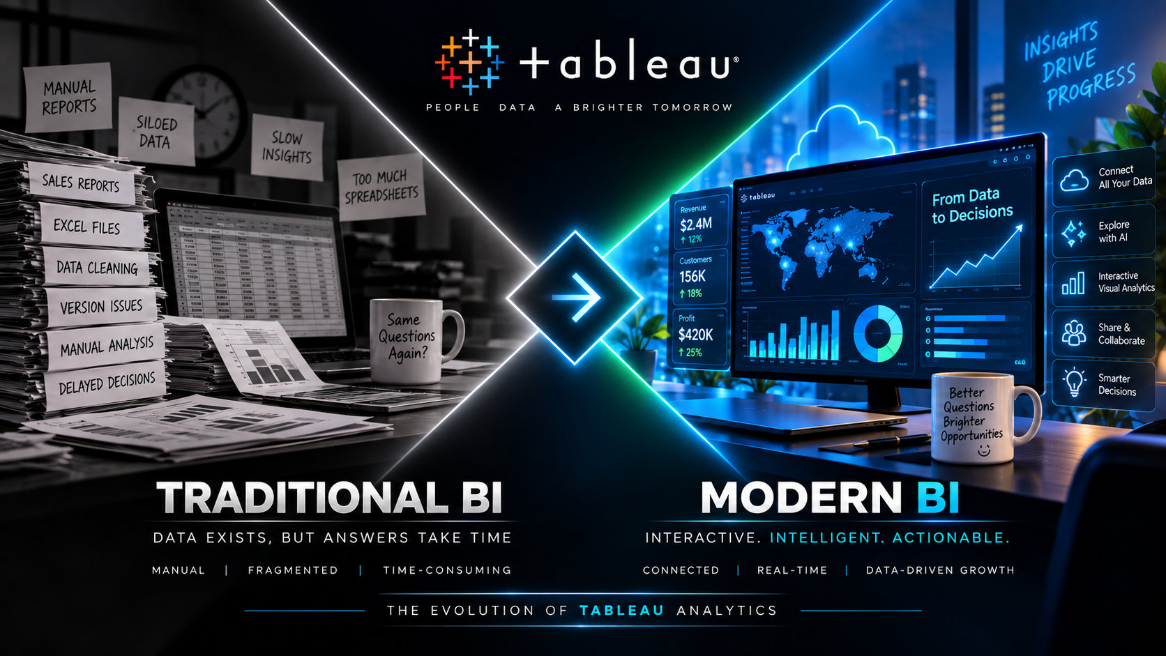
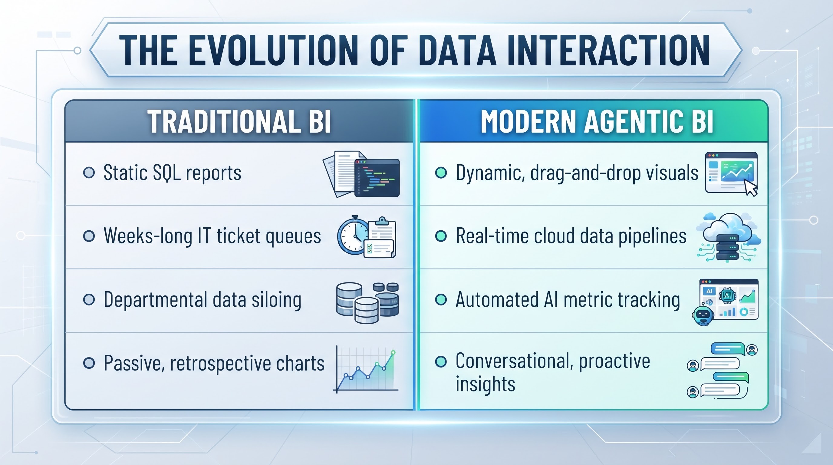
There was a time when looking at corporate data felt like reading ancient hieroglyphics through a foggy lens. Business intelligence was a slow-moving, back-office process trapped inside rigid databases and endless, static spreadsheet exports. If an executive wanted to track sales performance across three continents, the request went into an IT ticket queue, took three weeks to process, and returned as a sixty-page PDF that was outdated before the ink even dried.
That broken ecosystem was entirely upended when software pioneers introduced visual, drag-and-drop data exploration. Rather than forcing analysts to write complex SQL scripts just to change a chart's axis, modern platforms made data tactile. Users could suddenly drag a dimension onto a canvas, map thousands of rows in milliseconds, and discover underlying patterns instantly. This shift marked the death of passive reporting and born the era of active data discovery, completely changing how decisions get made at scale.
The Dark Ages of Relational Databases and Static Reporting
To appreciate how far data technology has come, one must understand the absolute gridlock of the late twentieth-century data stack. In those days, corporate databases were treated like fortified castles. The SQL servers and relational database management systems were guarded by system administrators who viewed non-technical users with deep suspicion. Giving a finance manager or a marketing director direct access to the database was considered an unacceptable security and performance risk.
As a result, business intelligence became a centralized, bureaucratic assembly line. Business teams would write specification documents outlining the exact numbers they needed to see. These documents were submitted to IT departments, where database engineers would write custom extraction queries and build rigid online analytical processing cubes. By the time the final report arrived, business conditions had shifted, competitors had moved, and the data was essentially an autopsy of what happened weeks ago rather than a radar for what was happening now.
This bottleneck created a massive shadow IT culture within corporations. Frustrated by long IT turnaround times, analysts began exporting static CSV files onto their local machines and cobbling together monstrous spreadsheets. These spreadsheets were held together by fragile formulas, cross-sheet references, and manual copy-pasting. While this gave analysts speed, it introduced catastrophic risks: version control disappeared, sensitive data sat unencrypted on desktop computers, and two department heads would regularly arrive at the same board meeting with completely contradictory figures pulled from different versions of the same spreadsheet.
The Stanford Breakthrough and the Birth of VizQL
The breakthrough that shattered this paradigm did not begin in a corporate boardroom, but in a computer science laboratory at Stanford University. Researchers recognized that the human brain processes visual information thousands of times faster than it processes tabular text or raw numbers. When human eyes look at a spreadsheet of ten thousand rows, they see a uniform grid of digits; when those same ten thousand rows are plotted onto a scatterplot, the human brain instantly notices clusters, outliers, trends, and anomalies.
The technological leap came in translating human visual inquiry directly into database operations. The development of VizQL—a visual query language—fundamentally unified the act of querying data with the act of visualizing it. Every drag, drop, hover, and filter action performed by a user on a canvas was automatically compiled into optimized SQL or MDX queries behind the scenes. The database was no longer a black box requiring code to unlock; it had become an interactive visual playground. This marked the democratizing moment for business intelligence. For the first time, a business strategist who had never written a line of code could explore millions of data points independently. They could click on an outlier in a bar chart, slice it by region, drill down into product categories, and filter by customer demographics in seconds. The feedback loop between asking a business question and receiving a visual answer was collapsed from weeks to milliseconds, changing visual analysis from a luxury into a fundamental business utility.
The Mechanics of Visual Analytics and Human Cognition
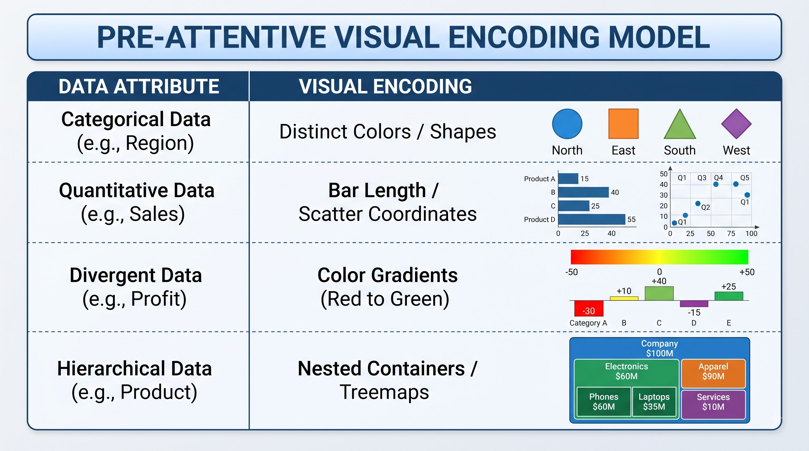
The genius of modern data visual platforms lies in their alignment with pre-attentive visual processing. Human vision relies on specific cues—color, shape, size, spatial orientation, and spatial position—to process information before conscious thought even takes over. Traditional reporting ignored these cognitive shortcuts, forcing decision-makers to manually read numbers line by line to calculate mathematical differences.
By mapping pre-attentive visual attributes directly to data fields, visual platforms leverage how human brains naturally function. A bar chart instantly uses length to communicate comparative magnitude. A color gradient mapped to a profit margin field immediately alerts the brain to low-performing regions through stark visual contrast. Spatial coordinates map relationships, allowing users to spot correlations across multi-dimensional variables without performing complex statistical regressions manually.
This cognitive alignment changed the nature of executive meetings. Instead of arguing over whose numbers were correct, leadership teams could look at an interactive dashboard projected onto a wall, debate the underlying strategy, and test hypotheses live during the meeting. If a CEO asked, "What happens if we drop shipping costs in Europe?", the analyst could adjust a slider control on the dashboard in real-time, displaying the recalculated financial projections instantaneously. As business demands grew, we needed structured talent to architect these visual ecosystems. Organizations realized that raw data was useless without skilled professionals who understood how to model data source connections, construct calculated fields, and optimize dashboard render times. Enrolling in a comprehensive tableau course is the standard path for analysts moving from simple spreadsheet work to enterprise-level data orchestration, bridging the gap between back-end databases and front-end business strategy.
Architectural Evolution: In-Memory Engines vs. Live Connections
As enterprise data volumes exploded from gigabytes to terabytes, visualization software had to evolve its underlying performance engine. Rendering millions of rows dynamically on a standard office computer screen introduced massive computational strain. If a dashboard took forty seconds to refresh every time a filter was clicked, the seamless flow of visual exploration was destroyed.
To solve this, software architects developed dual-mode query processing: hyper-fast in-memory data engines and direct live database connections. The in-memory approach extracts raw data from underlying transactional systems, compresses it heavily using columnar database architecture, and loads it directly into the server or desktop memory RAM. Because columnar stores only read the specific columns needed for a visualization rather than scanning entire database rows, query execution speeds jumped by orders of magnitude. On the other hand, live connections were perfected for scenarios where data freshness is paramount, such as monitoring active financial trading floors or tracking real-time logistics operations. Rather than pulling data into local memory, live queries are passed directly through to modern, high-performance cloud data warehouses. Advances in query optimization ensured that even when querying billions of rows live in the cloud, only the aggregated results necessary to render the specific visual elements are returned over the network, minimizing latency and maximizing computing efficiency.
Scaling Enterprise Governance Without Strangling Innovation
As visualization software spread across global enterprises like wildfire, IT departments faced a brand-new dilemma: how to allow thousands of employees to explore data freely without creating a chaotic "Wild West" environment. Left unchecked, self-service analytics can lead to server crashes, duplicate datasets, compliance breaches, and unauthorized exposure of sensitive personal information.
The solution required a modern approach to governed data self-service. Instead of locking down the entire data environment, platform administrators created centralized semantic layers and enterprise server deployments. In this hybrid model, IT engineers maintain control over data ingestion, security parameters, data cleaning pipelines, and row-level permissions. They publish certified, gold-standard data models to secure cloud servers, complete with pre-calculated key performance indicators and pre-defined relationships.
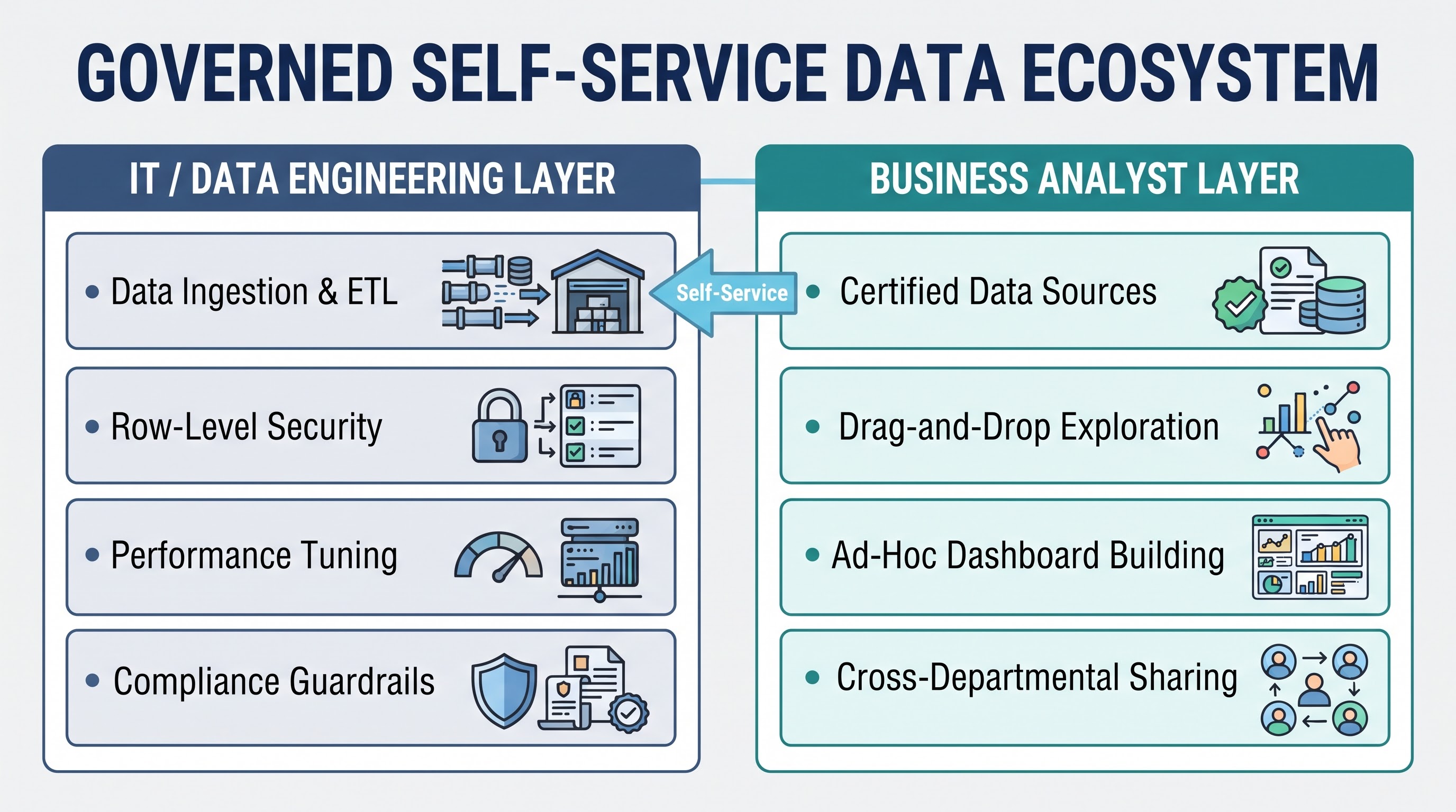
Business analysts are then given freedom to explore within these secure, certified environments. An analyst in marketing can drag and drop fields from a governed customer dataset to build ad-hoc dashboards, confident that the underlying revenue calculations are mathematically identical to those used by the finance team. Row-level security guarantees that a regional manager in Chicago only sees Midwestern sales numbers when opening a global report, while the Vice President sitting at headquarters sees the globally consolidated picture on the exact same dashboard. To stay competitive, professionals have had to master advanced platform mechanics, API integrations, and row-level security protocols. Taking a specialized tableau developer course emerged as a critical milestone for tech workers looking to build custom web-embedded analytics, automate extract refreshes, and design complex data layers that serve thousands of concurrent users across an enterprise without lagging.
The Migration to Cloud-Native Analytics Architectures
The modern era has brought an even sharper shift: the rise of cloud-native infrastructure and automated data governance. Dashboards are no longer standalone desktop creations hosted on localized servers; they are real-time, cloud-integrated assets that sync with vast enterprise warehouses like Snowflake, Amazon Redshift, Google Big Query, and Databricks. The role of the data specialist transformed from simply building pretty charts to engineering complex, scalable data models that run seamlessly across global networks.
Traditional on-premises visualization deployments required heavy server maintenance, manual hardware provisioning, complex load balancing, and dedicated system administrators to handle software upgrades. As organizations shifted their entire software stacks to cloud infrastructure, visualization tools had to undergo a fundamental refactoring. Monolithic server applications were broken down into microservices, containerized using technologies like Kubernetes, and redesigned to scale dynamically based on user traffic.
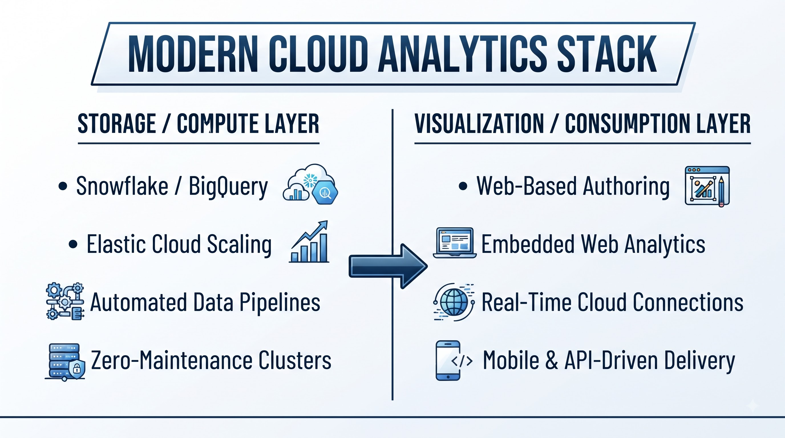
This transition to cloud-native platforms dramatically reduced the total cost of ownership for enterprises while dramatically increasing accessibility. Analysts no longer need heavy desktop client applications installed on high-powered workstations; they can author, edit, format, and publish enterprise-grade dashboards directly within a standard web browser or mobile interface. Cloud architecture also enabled seamless external portal embedding, allowing companies to securely embed interactive charts directly into client-facing applications and SaaS products.
The Natural Language and Conversational Analytics Paradigm
Despite the incredible success of drag-and-drop visualization, a fundamental barrier remained: users still had to learn how to operate a software interface, understand dimension versus measure classifications, and manually structure layout containers. For casual business users, executives, and operational staff who only interacted with data occasionally, even drag-and-drop interfaces presented a slight learning curve.
To bridge this final gap, platform developers began incorporating natural language processing engines directly into analytics platforms. This technology allowed users to type or speak plain-language questions into a search bar, such as "What were our top three selling products in California last quarter?" The system’s semantic engine parses the sentence, identifies the dimensions ("California", "last quarter"), identifies the measures and aggregations ("top three selling products"), converts the sentence into a precise visual query, and generates the correct chart automatically. While early natural language implementations struggled with complex industry jargon and ambiguous queries, recent integration with modern large language models has made conversational analytics exceptionally fluent. Users can now hold multi-turn conversations with their data systems. They can follow up a chart generation by asking, "Why did that drop in August?", prompting the system to run automated driver analysis behind the scenes and highlight the specific variables responsible for the variance.
The AI Revolution: Shift Toward Agentic and Proactive BI
Now, artificial intelligence is driving the next major leap in analytics. The paradigm is moving away from manual dashboard building toward proactive, agentic insights. Platforms like Tableau Pulse use natural language models to automatically surface critical anomalies, metric trends, and performance updates directly within tools like Slack or email. Instead of an analyst spending hours hunting through filters to find why revenue dipped in a specific region, generative algorithms detect the delta and plain-text explain the cause automatically.
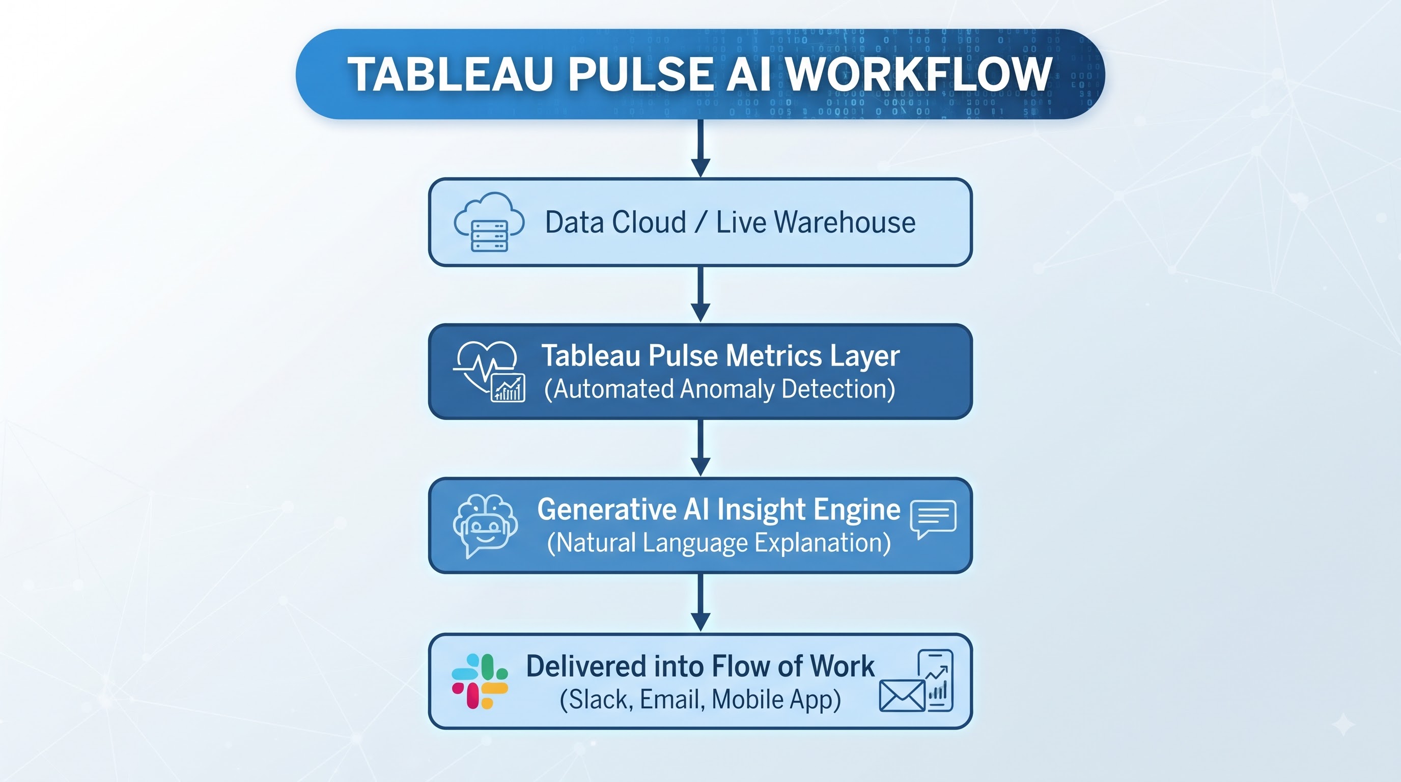
This represents a complete inversion of the traditional BI workflow. In traditional reporting, the user had to know what questions to ask, where to look, and how to interpret the charts. In an agentic analytics ecosystem, smart agents continuously monitor data pipelines in the background. When an anomaly occurs—such as a sudden spike in customer churn or an unexpected supply chain delay—the system proactively synthesizes the finding, constructs a summary visualization, writes a contextual narrative, and delivers it to the relevant manager's workflow application before human leadership even realized a problem existed.
This evolution doesn't make human expertise obsolete—it reshapes what skills matter most. Modern data literacy requires a deep understanding of data hygiene, semantic mapping, and visual storytelling. Professionals who invest time in tableau software learning are finding that the focus has shifted from memorizing toolbars to mastering the art of asking the right business questions, structuring underlying data cleanly, and framing insights so leaders can act instantly.
Data Storytelling: The Bridge Between Cold Analytics and Human Action
As dashboards became ubiquitous, a new organizational challenge emerged: dashboard fatigue. Executives found themselves looking at screens packed with forty different widgets, sparklines, and heatmaps, leaving them visually overwhelmed and unsure of where to direct company resources. The realization dawned that presenting data visually is only half the battle; the data must be structured into a coherent narrative to drive organizational alignment.
Data storytelling emerged as the discipline that combines data visualization with narrative structure and strategic context. Instead of presenting a raw dashboard, skilled communicators use feature capabilities like story points, annotated callouts, and guided visual pathways to walk decision-makers through a logical argument. They start with the macro context, highlight the specific problem, illustrate the root cause using drill-down analysis, and present clear strategic choices based on predictive modeling.
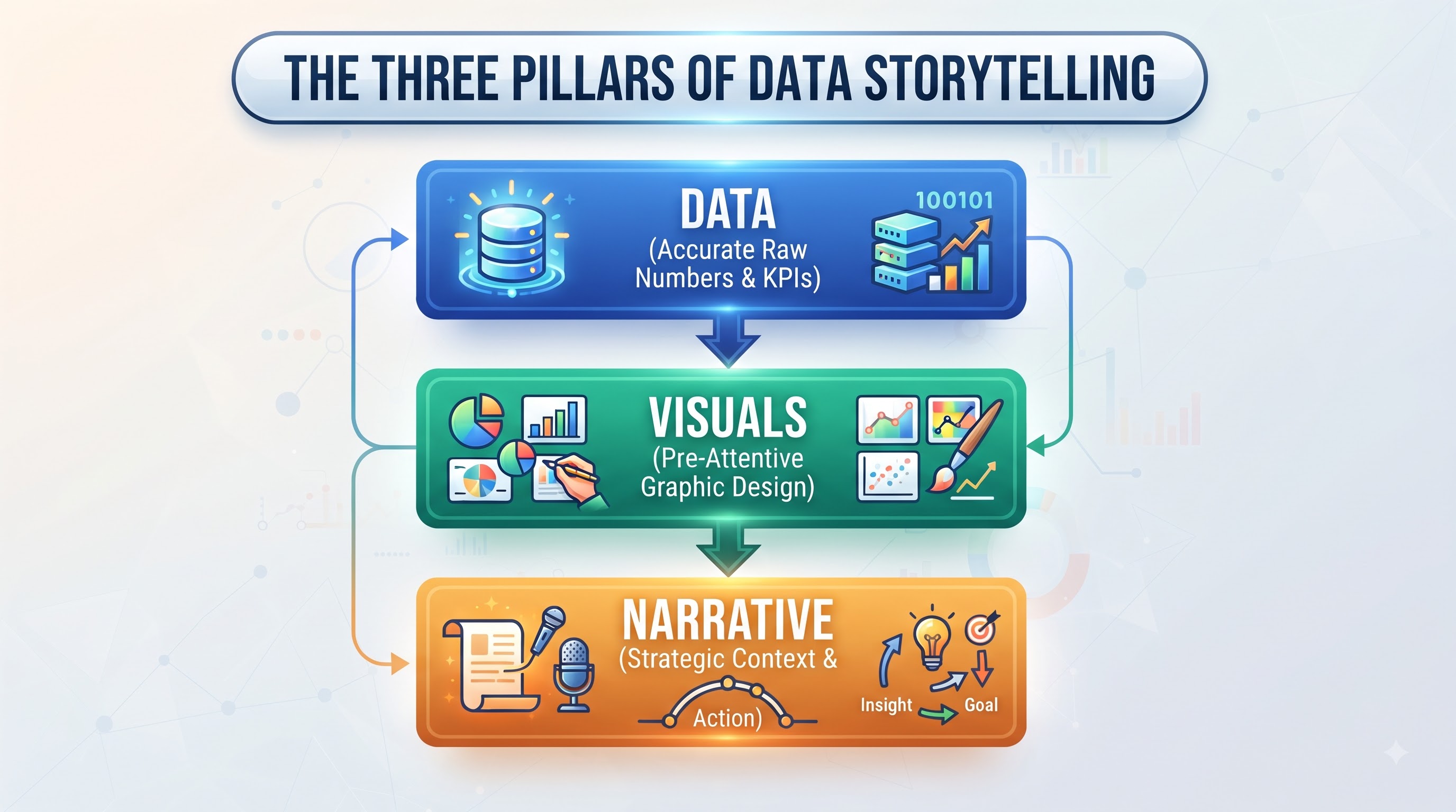
When data visualization is combined with narrative design, insights move from cold analytical facts to persuasive business arguments. A graph showing declining customer retention numbers might be ignored in a busy meeting; that same graph framed with an explanatory story highlighting specific customer pain points and showing the exact financial ROI of fixing those pain points triggers immediate executive action. Human beings are hardwired for stories, and data storytelling bridges the gap between raw compute power and human empathy.
Embedded Analytics and the Ubiquitous Data Experience
The final frontier in modern visualization technology is removing the boundary between analytics applications and daily operational tools. Historically, an employee had to leave their primary working environment—whether a Customer Relationship Management system, an Enterprise Resource Planning portal, or a custom internal tool—log into a separate BI server, navigate through folder structures, and open a dashboard to check performance metrics.
Embedded analytics eliminates this friction by bringing visual cards directly into the operational software employees use every second of the workday. Using modern JavaScript APIs, REST web services, and single sign-on authentication framework integrations, developers can embed fully interactive, secure charts directly into corporate web portals. In an embedded ecosystem, a sales representative viewing a client account inside their CRM system automatically sees an embedded analytics panel displaying that specific client's support ticket history, purchasing trends, and product usage metrics in real time. The representative does not need to learn a separate analytics tool or perform manual filtering; the embedded component automatically passes the client ID parameter from the host application to the analytics engine, rendering contextual insights instantly.
Strategic Implementation and the Future of Visual Analytics
Understanding this full trajectory—from static reports to real-time, AI-assisted decision making—is what separates basic report generators from true analytics leaders. Organizations don't just need people who can make graphs; they need architects who can connect raw enterprise infrastructure directly to human decision-making. Signing up for structured classes in tableau remains one of the most effective ways for career-driven professionals to master both the foundational physics of data visualization and the cutting-edge AI integrations shaping the future of business intelligence.
Looking forward, the integration of spatial computing, augmented reality, and voice-driven agentic assistants promises to make data exploration even more immersive. Imagine an operations manager walking through a physical manufacturing warehouse wearing spatial computing glasses, seeing real-time machinery efficiency stats projected directly above each assembly line, and speaking natural commands to re-route logistics flows instantly.
The core underlying objective, however, remains unchanged: taking the unimaginable volumes of raw data generated by our digital world and translating them into clear, visual, human understanding. The platforms that succeed will be those that continue to remove technical friction, protect data security, automate routine calculations, and empower every individual across an enterprise to turn raw information into meaningful, confident strategic action.