
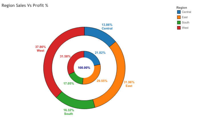
Tableau Donut Chart is like a pie chart, it divides the circle into many sections. Depending on the values. Donut chart offers more than one type of data, in a series that adds many rings to the chart. In the center of the chart an empty space, where we add certain labels, that show complete value or a parameter as total. By that, you can compare the segments at any time as you like.
Steps to Design Tableau Donut Chart:
1:Design Two aggregate measure Fields:
know more about Tableau Donut Chart by Tableau Online Training
We initiate it by designing two aggregate measure sections in the Row area. Here we must double click and write avg(o) and then press enter. After that, we must Enter one more Aggregate Measure.
2: Choosing Mark Type for Measures:
We must click on the mark type for the measure like the pie from the marks list. You must note it by designing two aggregate measures. Here we have two areas, for each metric in the marks card. We must utilize these two Areas for both metrics, to design our tableau donut chart.
3:Adding set of Fields to get Pie chart:
We must add a combination of Fields in color, label cards of the marks section. Most important we are adding these fields, in the initial AGG (avg(o)) of the field section. If you add these fields in an exact column. We get a pie chart. Three areas are known as labels, value labels, and sections.
We implement a Quick table calculation to SUN (sales), the area by right-clicking on it. When we select both options such as Quick table calculation and percent of the total. This implementation shows us the total sales for every category.
4: You must select the circle from the sequence:
Here we have to right-click on our second measure field, that is AGG(avg(o)), in the marks section and choose the circle option, as the mark type from the sequence list.
5: Changing the circle color and color card:
Here we have to modify or change the circle color from grey to white. For doing this, you have to select the options color, and then choose white from the shown color palette. After that, you must make sure that you are doing this step in the second measure area.
6: Adding measure field into label card:
If you closely look, our final step makes a white color on the low middle of the plot location. Before going to start, we must add a measure field, sales into the label card of the second exact measure section. This will add value, that shows complete sales for all three sections.
7: Selecting Dual Axis to set charts:
Combining these two charts, and if we go closer to our last tableau donut chart. For doing this, you must right click on the measure field name, that seen in rows section and then choose Dual Axis from the sequence menu.
8: You must select Size card to Decrease Size:
Here all we view is a white circle, with data labels surround it. It is Due to two charts, that completely overlap each other. If you want to see the second chart, then click on the size card and Decrease the size into the white circle.
9: Completing the Tableau Donut Chart:
Once if we set the size of the inside white circle, we can clearly see a donut chart, which has data labels and three sections. In the center of this chart, we have a complete sales value for all categories.
10: Modify the color scheme chart:
By clicking on the color card, we can change the color of the chart. In the same fashion, we can change the tooltip, in the tooltip card. In this method, our donut chart, shows all the sales values for three categories, sales value for every section. The sales percentage for every category is ready-made. All these three categories are completely shown in different colors that make it easy to recognize them.
Applications:
1.Quick, High-Level percentages and Shares.
2. You can only have a few Dimensions.
3. Values are more enough to Read.
4. Instead of the Pie chart, we can use Quick Filter.
I think you have understood the process of Designing a Tableau Donut Chart. In upcoming blogs, we will share more easy steps to design this chart. This is the advanced version of a pie chart.